Image courtesy of Scryfall.com
Color, Craft, and the Allure of Unconventional Borders
In the grand tapestry of Magic: The Gathering, border aesthetics sometimes spark as much conversation as the rules themselves. The idea of silver-border cards—humorously treated as a conduit to freer, more experimental play—has become a beloved cultural thread for fans who read the game like a comic book, look for art that sings, and crave design quirks that invite creative problem-solving. The conversation is less about rarity and more about feeling: the sense that the border itself is a wink, a nudge to try something outside the usual meta. 🧙♂️🔥💎
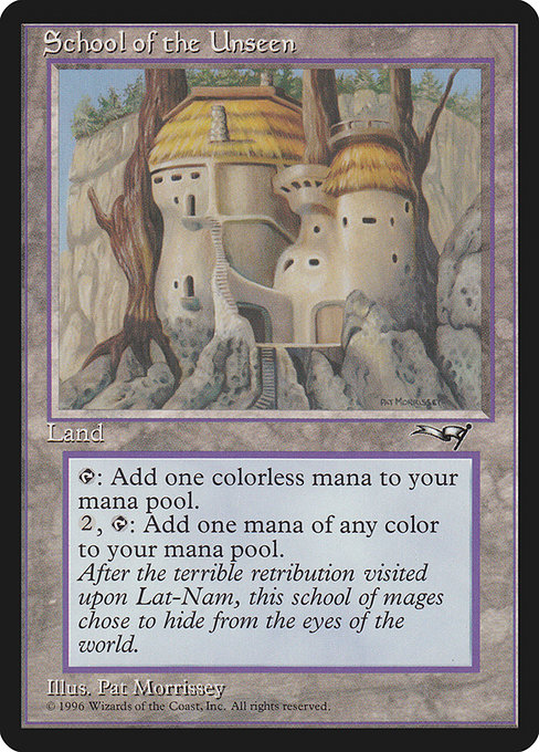
Within that playful frame, a card like School of the Unseen stands out as a perfect case study for how a single land can unlock big-picture creativity without shouting for attention. Released in Alliances (1996), this black-border land is straightforward in its text—but its implications ripple through deck-building philosophy. Its two abilities—T: Add {C} and {2}, {T}: Add one mana of any color—offer a tiny, portable toolkit for multi-color ambitions. The card’s design embodies a concept that modern designers still chase: low-cost, high-flexibility mana sources that let you imagine new color combinations without sacrificing tempo. 🧭🎨
After the terrible retribution visited upon Lat-Nam, this school of mages chose to hide from the eyes of the world.
Design that invites creative application
School of the Unseen is a land with a paradox at its core: it feels modest, yet it casually enables ambitious five-color decks. The first ability taps for colorless mana, a familiar safety net in early game plans, while the second ability—paying two mana plus tapping to add a single mana of any color—acts like a mini-fix, smoothing color gaps that would otherwise stall a multi-colored strategy. In a world of fast, flashy rares and flashy combo enablers, this land reminds us that good design often hides in plain sight. The flavor and mechanical aroma invite players to experiment with color identity, to imagine what their green-red-blue-black deck might look like when the border doesn’t constrain the imagination. ⚔️
From a collector’s angle, the card’s rarity—uncommon—and its age in Alliances contribute to its charm. It’s not the kind of piece that inflates into a top-tier relic, but it sits at a delightful intersection of nostalgia and utility. The fact that it can be found in nonfoil printing and is playable in formats like Legacy, Commander, and Duel (as per its legality) underscores how a seemingly modest card can anchor creative, multi-color builds in diverse play environments. The art by Pat Lewis adds another layer of appeal, with a vibe that feels like a bridge between old-world academies and modern spell-slinging. 🎲💎
Practical plays and archetype ideas
For players exploring five-color strategies, School of the Unseen functions as a reliable gateway. It delivers color once you’re ready to run a broad mana base, and its second ability provides a predictable path to color fixing when you’re not yet drawing the exact combination you need. In slower, resource-rich games, this land can pay off repeatedly—think of it as the quiet mentor who never shouts but always guides you toward the right color at the right time. It’s a door you can open again and again, with the knowledge that you’ll end up with the color needed for that 5-color commander or a big multicolor spell late in the game. 🧙♂️🪄
Competitive players might pair this land with mana accelerants or splashy multicolor staples to maximize reach. It doesn’t play the heavy-handed role of a fetchland or a dual land, but its flexibility makes it a fine fit in decks that value consistency over raw power. And in the spirit of silver-border “what-if” play, imagine using this card as a design constraint for a homebrew challenge: build a deck around color-symmetry and access to every color, then test how often you can cast a crucial spell without overloading your mana base. The result can be surprise victories and a lot of spicy story moments. 🧩🎲
Art, lore, and the mood of the Unseen
The artwork, as with many Alliances pieces, carries a mood of restraint and mystery. Pat Lewis’ illustration evokes a quiet corridor of knowledge: a place where magic hums under the surface and where the most important lessons are learned through careful, patient study. The flavor text references Lat-Nam’s retribution and a deliberate withdrawal from worldly eyes, which invites players to think about the ethics and costs of magical discovery. In a hobby where numbers and combos drive momentum, a card that nudges you toward a thoughtful, lore-rich approach feels both refreshing and essential. 🎨🧙♂️
Where silver borders meet real gameplay value
While silver-border cards exist as a cultural shorthand for playful, nonstandard games, the real lesson of this card is that constraints can fuel creativity. The dual mana function is an elegant reminder that “fixing” doesn’t always mean expensive mana rocks or perfect draw sequencing; sometimes it’s a simple, reliable source that helps you sculpt a color-rich plan over multiple turns. The card’s age and availability keep it grounded in history, yet its mechanics speak to evergreen design principles: flexibility, resilience, and the invitation to explore color identity with intention. And when you finally pull off a turn where you cast a five-color spell thanks to a single land’s two abilities, you’re sharing in a design moment as timeless as the game itself. 🧙♂️✨
For readers who want to extend the experience beyond the table, consider pairing the article’s themes with a comfortable, distraction-free workspace. A high-quality mouse pad—like the Ergonomic Memory Foam Mouse Pad with Wrist Rest Foot-Shaped—can be more than just a convenience; it sets the stage for long, creative sessions where you map multi-color lines of play and sketch out evolving board states. It’s a small reminder that good gear supports big ideas, both in lab and land. 🧰🎨
Ergonomic Memory Foam Mouse Pad with Wrist Rest Foot-Shaped