Image courtesy of TCGdex.net
Why Japanese Printings Look Different: A Deep Dive with Nidoran♀ (DP2-91)
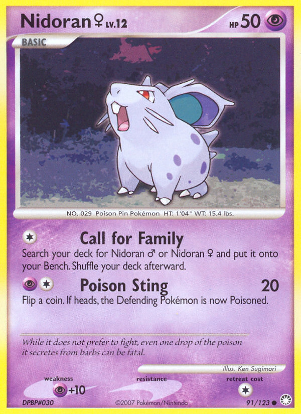
Pokémon TCG collecting isn’t just about what’s in your deck—it’s also about the stories that surround how a card looks on the physical page. The Japanese printings of early 2000s sets, including Nidoran♀ from Mysterious Treasures (DP2), often catch the eye of players and collectors with visual cues that differ from their English counterparts. You’ll notice subtle shifts in typography, layout, and color that speak to different printing traditions, paper stock, and localization choices. Ken Sugimori’s classic art for Nidoran♀ remains a constant across languages, yet the surrounding design tells a different tale depending on where and when the card was printed. The DP2 Nidoran♀ card is a quintessential example: a Basic Psychic-type Pokémon with 50 HP, illustrated by the enduringly iconic Ken Sugimori. Its dual attacks—Call for Family, a colorless search effect, and Poison Sting, a Psychic plus colorless attack that can poison the defending Pokémon—sit on a simple, readable card that emphasizes gameplay clarity. But the moment you pull this card from a Japanese pack or a local English release, you’ll notice how the surrounding visuals shift to reflect language-specific constraints and printing technologies of the era.Text, Typography, and Layout: Fitting a Different Script
One of the most obvious reasons Japanese printings look distinct is how text is arranged and typeset to accommodate the language. Japanese characters can be more compact or more expansive depending on the font used and the space available in the text box. As a result, the card name, attack names, effects, and flavor text in Japanese must be legible and well-placed, which sometimes leads to a slightly different line-wrapping pattern or a rearranged text box. Even when the same attacks retain English names for international releases, the accompanying explanation blocks and flavor text often feel visually different due to line length and spacing. In the case of DP2, the English printings carry the standard Pokemon TCG typography of the era, but Japanese printings often reflect localized phrasing and line breaks that can change how the card reads at a glance. This is more about reading flow than gameplay alteration, but it contributes to the distinct “feel” of Japanese cards in hand. The illustrator credit—Ken Sugimori—remains a steady beacon of the classic look across languages, reinforcing the sense that the core artwork is the bridge between printings, while the rest is language-driven adaptation.Color, Borders, and the Card Frame
Beyond text, you’ll notice differences in color balance and subtle frame details. Japanese print runs from this period sometimes employed slightly different ink recipes and paper stock, which can yield perceptible shifts in color saturation, especially in the Pokémon’s shading and the background. The DP2 set symbol and border treatment can appear a touch crisper or softer depending on the edition and printer batch. For Nidoran♀, the overall silhouette—its soft pink hue, gentle shading, and the blue-tinged Psychic motif—will be recognizable everywhere, but the fine print on the edges and the way the image sits within the frame can feel distinct when comparing JP and ENG reprints. These visual differences aren’t just cosmetic; they’re a reminder that physical production is a lived process. In Japanese printings, the card artwork often shares the same iconic composition, but the surrounding design language—fonts, spacing, and the subtle glow of the attack icons—reflects a different production ecosystem. It’s a celebration of craft across borders, not a shift in the Pokémon’s identity.Set Symbol, Rarity, and Collector Insights
Nidoran♀ from Mysterious Treasures wears the set insignia for DP2, a symbol that collectors use to identify print runs and edition history. While the card’s rarity—Common—doesn’t change between Japanese and English printings, the aesthetics around rarity markings and set symbols can vary. In some Japanese printings from the era, the foil treatment, stamp placement, or even the border weight around the symbol could diverge from English-language releases. These cues help seasoned collectors trace the card’s lineage: original Japanese printings, later reprints, and even regional promos. The DP2 era was also a bridge between older, bolder foil styles and newer, more polished finishes, which adds to the tactile storytelling of a card you might pull from a display. Nidoran♀’s HP of 50 and its two attacks—Call for Family (colorless) and Poison Sting (psychic + colorless for 20 with poison)—are timeless in their design. Call for Family is a classic early-game engine move, letting you search your deck for a Nidoran♂ or Nidoran♀ and place it on your Bench, then shuffling. Poison Sting introduces a chance to poison with a coin flip, a mechanic that made simple early battles feel strategic. The Psychic weakness—an expected vulnerability of a Psychic Pokémon in that era—remains a consistent thread across printings, emphasizing the subtle power balance in basic-line creatures. For collectors, these differences matter when assessing market value and collectability. While gameplay impact is language-agnostic, the visual language can influence a card’s desirability and preservation. Japanese printings often fetch premium in certain grades because of the pristine registration between text and art, or because a particular batch’s ink distribution yields a more striking presentation. The DP2 Nidoran♀ gives you a great lens into this wider conversation: a charming, playable card with a timeless illustration and a story told not just by the spec sheet, but by its printing lineage.Art, Lore, and Nostalgia
The image you see on DP2 Nidoran♀ is more than a description of stats—it’s a moment captured by Ken Sugimori, whose early 3D of the Pokémon world helped define the franchise’s visual language. In Japanese printings, Sugimori’s line work pairs with local typography to produce a look that’s distinctly “classic” in the JP market, evoking nostalgia for players who dug into the early 2000s booster boxes. This art-and-print relationship gives birth to an emotional memory for many collectors: the crisp linework, the soft pastel background, and the calm confidence of a Nidoran♀ that’s simply ready for battle or trade. If you’re evaluating this card from a gameplay or collection perspective, the DP2 Nidoran♀ remains a strong, approachable piece. Its low HP and straightforward attacks make it a sprite of early TCG design—simple to play, satisfying to collect, and charming to admire for years to come. Whether you’re pointing to the JP print for the elegance of its typography or the ENG print for the straightforward, readable layout, you’re witnessing a duality that makes Pokémon print culture so engaging. Neon Card Holder Phone Case MagSafe PolycarbonateMore from our network
Nidoran♀
Set: Mysterious Treasures | Card ID: dp2-91
Card Overview
- Category: Pokemon
- HP: 50
- Type: Psychic
- Stage: Basic
- Dex ID: 29
- Rarity: Common
- Regulation Mark: —
- Retreat Cost:
- Legal (Standard): No
- Legal (Expanded): No
Description
Attacks
| Name | Cost | Damage |
|---|---|---|
| Call for Family | Colorless | |
| Poison Sting | Psychic, Colorless | 20 |
Support Our Decentralized Network
Donate 💠More from our network
- https://blog.rusty-articles.xyz/blog/post/exploring-hidden-lore-in-minecrafts-world/
- https://blog.crypto-articles.xyz/blog/post/nft-data-buly-853-from-buly-collection-on-magiceden/
- https://blog.crypto-articles.xyz/blog/post/nft-data-gib-4393-from-gib-collection-on-magiceden/
- https://wiki.digital-vault.xyz/wiki/post/weedle-base-set/
- https://blog.crypto-articles.xyz/blog/post/nft-data-gib-3291-from-gib-collection-on-magiceden/