Image courtesy of Scryfall.com
Set-Level Rarity Visualization in a Classic White Knight
In the grand tapestry of Magic: The Gathering, rarity isn’t just a vanity metric for collectors. It’s a lens for designers and players to understand how a set balances power, color identity, and nostalgia. Visualizing the set as a network of rarities—common, uncommon, rare, and beyond—helps us see where the design team leaned when constructing the limited experience and how that distribution echoes through modern appreciation. 🧙♂️🔥💎
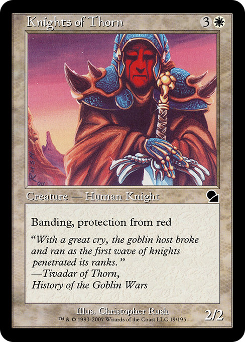
Take a closer look at a single, emblematic piece: Knights of Thorn from Masters Edition (me1). This white creature arrives with a cost of {3}{W}, a tidy 4 mana for a 2/2, and two defining abilities that feel almost ceremonial: Protection from red and banding. In the era this card hails from, banding was a trickier, more interlocking mechanic that rewarded players who thought about how groups of creatures could attack or block as a chorus rather than as solo performances. The protective aura—Protection from red—gives Knights of Thorn a stubborn edge against red aggression, while banding invites tactical thinking about how to allocate damage across a battalion. It’s not just about raw stats; it’s about positioning and rhythm on the battlefield. ⚔️🎨
Card at a glance
- Name: Knights of Thorn
- Mana cost: {3}{W}
- Type: Creature — Human Knight
- Power/Toughness: 2/2
- Color: White
- Rarity: Common
- Set: Masters Edition (me1)
- Keywords: Protection, Banding
- Flavor text: "With a great cry, the goblin host broke and ran as the first wave of knights penetrated its ranks." — Tivadar of Thorn, History of the Goblin Wars
- Artist: Christopher Rush
“With a great cry, the goblin host broke and ran as the first wave of knights penetrated its ranks.”
That flavor-rich line anchors a moment of chivalric momentum in a set that thrives on texture rather than brute force. Christopher Rush’s classic illustration style captures the era’s martial elegance, and the card’s white frames glow with the aura of protection that color represents. It’s a small snapshot of a broader design conversation: how do you balance a powerful, era-defining mechanic like banding with a relatively modest stat line and a common rarity? Knights of Thorn answers with a horse-trade of risk and reward—you can deploy a coordinated band, but you’re inviting careful planning from your opponent. 🧙♂️
Why rarity balance matters for set design
In a set like Masters Edition, which reprints beloved cards from earlier eras, the distribution of rarity is a living artifact of design history. Common cards often carry important tactical roles in limited play—think value springs, evergreen answers, or sturdy bodies that enable longer games. Knights of Thorn embodies white’s traditional toolkit: solid defense, orderly formation, and a bit of strategic complexity that rewards cooperative combat decisions. The presence of such a card as a common in a historically significant reprint set helps illuminate how rarity tiers were used to create predictable yet surprisingly dynamic draft environments. This is exactly the kind of signal marketers and designers want to visualize when they talk about set-level balance. 🎲
When we map the set as a color-rarity heatmap, Knights of Thorn tends to anchor the white-common quadrant. It’s a reminder that not every powerful or iconic card has to be a rare; some of the most enduring design flourishes show up at common, where player choices and drafting percentages matter just as much as raw power. For fans who love the lore as much as the math, the card’s protection-from-red aura nods to a long history of red-mageddon struggles in Goblin Wars-era conflicts, tying back to Tivadar’s Chronicles and a broader White-Against-Red dynamic that threads through the me1 era. 🔥⚔️
Visualizing the concept in practice
What does a set-level rarity visualization sound like, in concrete terms? Imagine a dashboard with color-coded layers—each rarity tier tinted to reflect how many cards sit in that tier, across each color. Knights of Thorn would appear as a bright beacon in the white-common layer, signaling a deliberate choice: to give players a dependable, situationally potent creature without inflating the power budget. Additional layers show color distribution, set type, and mechanics frequency (banding, protection, and other vintage-era keywords) to reveal how the design team balanced order and chaos. The visual narrative helps players grasp why certain common cards become quiet anchors of strategy, while rare cards bolt into the limelight for dramatic plays. 🧭🎨
For builders and collectors, this approach also enriches the storytelling around the set. A table or chart can show how many banding-enabled cards exist across rarities, how protection mechanics cluster around particular colors, and how many common creatures carried the ability to influence combat in groups. Knights of Thorn is a perfect case study: a sturdy white knight with a timeless aura, illustrating the elegance of old-school banding within a modern appreciation of rarity balance. The result is a more informed, more evocative conversation about the magic of set design and the joy of revisiting classic cards with fresh eyes. 💎
And if you’re organizing your collection or just showing off a favorite card at a local game night, a sleek display like a neon card holder can turn a casual reveal into a small theater production. The close-up of the Masters Edition frame, the art, and the lore—together with a tasteful promo accessory—creates a moment that feels both nostalgic and new. If you’re curious, this product pairing makes for a stylish way to present your cherished cards while you discuss the stories behind the numbers. 🎨
Neon Card Holder Phone Case MagSafe – Impact Resistant PolycarbonateMore from our network
- https://blog.digital-vault.xyz/blog/post/storytelling-as-balance-for-regisaur-alphas-dinosaur-power/
- https://blog.digital-vault.xyz/blog/post/where-to-find-free-digital-paper-resources-for-beginners/
- https://transparent-paper.shop/blog/post/six-kiloparsecs-away-a-hot-blue-giant-rewrites-evolution/
- https://crypto-acolytes.xyz/blog/post/minecraft-wandering-trader-explained-how-it-works/
- https://crypto-acolytes.xyz/blog/post/understanding-impermanent-loss-on-solana-liquidity-pools/