Image courtesy of Scryfall.com
Meta design patterns across Un-sets: a dive into Pure // Simple
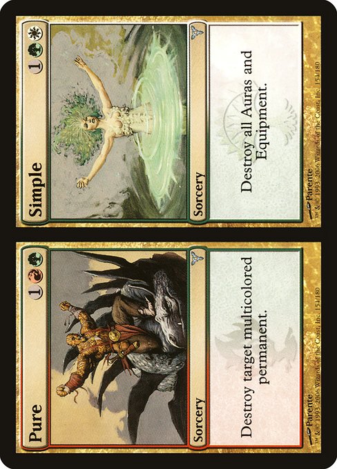
If you peruse MTG’s catalog through a nostalgic, humor-drenched lens, you’ll notice that Un-sets tend to celebrate patterns that feel both clever and collectible. Designers love to toy with identity, misdirection, and modular tools that adapt to whatever the board throws at you. Pure // Simple, a split card from Dissension, isn’t labeled an Un-set card, but its two-faced design epitomizes some of the most delightful meta patterns fans prize when they open a box full of “what ifs.” It’s a fantastic case study for how a single card can mirror the playful edge the Un-sets often bring to the table 🧙♂️🔥💎.
Split cards as modular design blueprints
Pure // Simple is a textbook example of a split card—the two halves tell a complementary story that’s greater than the sum of its parts. Each face sits on its own mana cost and flavor, yet they share a common ethos: targeted destruction. On the Pure side, you spend {1}{R}{G} to destroy a multicolored permanent, a niche but potent tool against the cascade of chromatic threats. On the Simple side, for {1}{G}{W}, you wipe the slate clean of Auras and Equipment—classic disruption that punishes a certain flavor of enchants and rocks. That dual-face structure maps beautifully onto the Un-set vibe, where players are invited to switch gears mid-game, think on their feet, and savor the “aha” moment when a plan comes together ⚔️🎲.
- Two tools, one card: A single card offers simultaneous options, encouraging players to plan around potential boards states.
- Flexibility over brute force: Instead of one overpowering effect, you get two context-sensitive choices that reward timing and tempo 🧙♂️.
- Value of trivia and memory: Remembering when to deploy the right half is half the fun—and a nod to Un-set style that rewards clever sequencing.
Guild watermark flavor and color identity
The two faces wear distinct guild vibes on their sleeves—Gruul’s chaotic, feral energy on Pure and Selesnya’s orderly, bloom-and-brood aura on Simple. The watermarks aren’t just cosmetic; they signal a color identity story that Magic players recognize: red-green for Pure’s aggressive, chaotic edge, and green-white for Simple’s orderly, creature-friendly discipline. It’s a triad of colors in a single card (G/R/W), and while the card itself lives in a traditional triple-color space, its design hints at how Un-sets love to explore color identity in playful, often non-linear ways 🧭🎨.
Paolo Parente’s art anchors the piece with a pulp-fantasy vibe that makes you grin before you even read the text. The splintered faces suggest two halves of a whole—one half that burns away your opponents’ multi-hued threats, the other that prunes away the enchantment-heavy battlefield build-up. It’s a small but satisfying commentary on how flavor and function can ride hand-in-hand, especially in a set where chaos and cleverness are celebrated together 🧙♂️🔥.
Strategic patterns in action: when to cast which face
In practical play, Pure // Simple invites a rhythm of choice. If your opponent has a stubborn multicolored permanent—perhaps a mana-dynamo Kavru or a shapeshifter in lurid play—Pure is your targeted hammer. It acts as a precise, surgical removal at a moment when a single threat demands dismissal. On the other hand, if your opponent’s board is teeming with Auras that fuel a rhythmic aura-tide (think strong equipment sets or a field full of enchantments), Simple becomes a broader sweep—the kind of mass disenchantment that can swing momentum in a single cast.
This kind of design also nudges players toward recognizing patterns Un-sets adore: timing as a resource, the value of multi-mode cards, and the satisfaction of catching an opponent off guard with a well-timed pivot. It’s not just about removing things; it’s about choosing the right identity for the moment, a playful ritual that echoes the “choose your fate” spirit of many Un-set staples 🧩⚡.
Humor, design philosophy, and the Un-set lens
Un-sets often shine brightest when they blend humor with solid design logic. Pure // Simple demonstrates how a split card can be both flavorful and functional, turning a two-face mechanic into a platform for decision-making under pressure. The dual guild motifs—Gruul’s riotous strength and Selesnya’s avian-green harmony—also invite players to imagine alternate universes where your deck’s strategy leans toward one quarter of the color wheel or another, without losing cohesion. Even when not slotted under a comedy banner, this type of design reads as a wink to players who enjoy the puzzle of how color, cost, and effect can align in unexpected ways 🃏✨.
Collectibility, price, and accessibility
As an uncommon from Dissension with foil and nonfoil variations, Pure // Simple remains approachable for many collectors and players. The card’s tri-color identity, combined with two powerful removal options, gives it a place on many casual and competitive shelves. Contemporary price tracking suggests a modest premium for foil prints, but its nonfoil variant sits comfortably within reach for budget-conscious collectors. The card’s enduring appeal isn’t just about completeness; it’s about the tactile nostalgia of playables that still spark conversations at kitchen-table tournaments and online decks alike. Modern and Legacy legality—along with Commander and other multi-player formats—keeps Pure // Simple relevant, decades after its release 🔎💎.
Art, lore, and the magic of two faces
Two faces, two costs, two distinct yet interconnected outcomes. The Pure side’s multicolored target destruction speaks to the way chaos can be handled when the color stew is just a little too rich. The Simple side’s blanket removal of Auras and Equipment nods to the evergreen challenge of taming aura-blink strategies and hardening battlefield control. It’s an elegant reminder that in MTG, sometimes the simplest concept—a pair of spells under one cover—can yield the richest gameplay moments, punctuated by bold art and smart mechanical signaling 🎨🗡️.
Practical deck-building takeaways
- Think in terms of board states: cast Pure if a single, critical multicolored permanent is dictating tempo; switch to Simple when you need to erase an entire suite of Auras and Equipment.
- In tri-color shells, a split card like this provides flexible interaction without sacrificing color balance.
- Pair with additional control and removal so that you can leverage the timing window created by Pure // Simple's two options.
- Appreciate the art and flavor as a design palate cleanser—it's not just about raw power, it's about the whole experience of playing with and around color identities 🧭🎭.
Where to find, collect, and nerd out
For enthusiasts chasing the full Dissension experience, Scryfall remains a trusted navigator for card art, rulings, and set history. The card’s collector number is 154 in the print run, and you’ll find both foil and nonfoil variants circulating in the market. If you’re building a nostalgia-driven cube or diving into multi-color triads, Pure // Simple is a sweet specimen of how design patterns from the Un-sets era still ripple through modern thinking about card identity and interaction.
As we chase the next quirky design, remember: the joy of MTG isn’t just in winning; it’s in recognizing the tiny patterns that connect sets, stories, and strategies across decades 🧙♂️🔥.