Image courtesy of Scryfall.com
Typography in Motion: Reading Wave Goodbye’s Card Layout
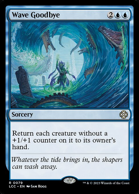
Magic: The Gathering has long been a playground for typography enthusiasts. The subtle choices—where to place the mana cost, how large to render the card name, and how the flavor text threads through the overall composition—shape not just readability but the very rhythm of play. Wave Goodbye, a rare blue sorcery from The Lost Caverns of Ixalan Commander (lcc), serves as a compelling case study in how layout design balances function and atmosphere. As we examine its structure, you’ll feel the canvas breathe with the tide of Ixalan’s coastlines, where blue mana and careful typography converge to guide your eye and your decisions 🧙♂️🔥💎.
A quick snapshot: the card at a glance
- Name: Wave Goodbye
- Mana cost: {2}{U}{U} (CMC 4)
- Type: Sorcery
- Set: The Lost Caverns of Ixalan Commander (lcc)
- Rarity: Rare
- Oracle text: Return each creature without a +1/+1 counter on it to its owner's hand.
- Flavor text: “Whatever the tide brings in, the shapers can wash away.”
- Artist: Sam Hogg
In this card, the typographic hierarchy is purposeful. The card name sits at the top in a bold, readable typeface, asserting its identity before any other information is absorbed. The mana cost anchors the upper-right, where blue symbols glow with a cooler cadence—an immediate visual cue that this spell speaks in a blue, tempo-heavy language. The type line, which reads “Sorcery,” is compact but decisive, demarcating the card’s role within a deck’s strategy than any longer-worded prose might. The body text, printed in a clear, readable sans-like face, explains the effect succinctly: a mass bounce with a precise condition—creatures that lack a +1/+1 counter. It’s not flashy on the surface, but it’s a masterclass in layout efficiency, especially for players scanning the battlefield mid-clip. The flavor text—short, evocative, and italicized—carves out Ixalan’s mood without stealing focus from the rules text. This is blue design: cool precision paired with oceanic imagination 🧙♂️🎨.
Typography decisions: color, contrast, and cadence
The Lost Caverns of Ixalan Commander employs a classic 2015 frame aesthetic, with a black border and a panel that respects generous margins around the text box. Wave Goodbye leverages blue’s natural contrast—white text on a pale background, with blue mana symbols popping on the cost line. This is not merely about aesthetics; it’s about cadence. In blue, tempo spells thrive on readability and timing. The spacing between the mana cost, the card name, and the rules text creates a rhythm that mirrors a calm sea’s surface before a swell: deliberate, measured, and impactful. Even the punctuation and line breaks in the oracle text are chosen to minimize cognitive load when you’re deciding whether returning a creature to its owner’s hand helps you stabilize or push for a win. The result is a clean, legible, and dignified layout that invites strategic contemplation as much as it invites the eye to skim for keywords 🧭⚖️.
Flavor, function, and the art of restraint
Sam Hogg’s artwork for Wave Goodbye leans into the moment when tides recede and the shore reveals what lies beneath. The flavor text—“Whatever the tide brings in, the shapers can wash away.”—is echoed by the card’s typographic restraint. There are no extra keywords to clutter the frame, no frantic font rotations to imply chaos; the text box remains steady, almost ceremonial in its presentation. This calm mirrors a blue deck’s temperament: use information cleanly, avoid overwhelming your opponent with a wall of text, and rely on timing rather than brute force. The art’s mood—cool, reflective, somewhat ethereal—finds a kinship with the card’s effect: a strategic retreat that also reshapes the battlefield by reducing clutter of unwelcome threats 🧙♂️⚔️.
Design implications for modern MTG typography
Wave Goodbye demonstrates how typography can reinforce game mechanics without shouting. When designing for a card with a text-heavy effect, the layout must guide players to the essential action first—the effect’s outcome—then invite them to ponder the nuance—the counter condition. The rare rarity and the nonfoil finish align with collector sensibilities; the typographic treatment remains accessible to casual players while still satisfying seasoned collectors who appreciate a neatly presented arc of rules, flavor, and artistry. Even the collector’s mindset is tapped here: a scarce card in a specialty Commander set, with a sophisticated balance of art and type, becomes a touchstone for how far a modern frame can lean into storytelling while maintaining legibility 🧙♂️💠.
Bringing it together: reading the layout like a sea map
For deck builders, the layout communicates payoff. Wave Goodbye offers a clear, multi-faceted interaction: you generate tempo by evicting non-countered threats, all while maintaining a polished, legible text block that doesn’t require a magnifying glass to parse. The design choices—blue color identity, the precise wording of the self-contained rules text, and the flavor accompaniment—work in concert to make the card feel inevitable once it’s drawn. This is design as a narrative instrument: typography that moves the story forward as much as the spell itself moves the board 🧙♂️🎲.
If you’re curious to explore more MTG typography and layout insights, the product cross-promo below is a fun gateway to tactile goods that complement the craft. Dive into the visual language of card frames and dodge the clutter by studying how a single card like Wave Goodbye uses space to tell its story with quiet authority.
Neon Gaming Mouse Pad Rectangular 1/16in Thick Non-SlipMore from our network
- https://blog.digital-vault.xyz/blog/post/unraveling-hidden-symbolism-in-reckless-crews-art/
- https://transparent-paper.shop/blog/post/tracing-solar-neighbors-via-a-red-hot-beacon-at-24-kpc/
- https://crypto-acolytes.xyz/blog/post/slay-the-spire-vs-monster-train-which-deck-building-game-wins/
- https://blog.digital-vault.xyz/blog/post/chic-ago-how-its-evolving-ability-reshapes-mtg-lore/
- https://transparent-paper.shop/blog/post/how-to-watermark-digital-downloads-safely-and-effectively/