Image courtesy of Scryfall.com
Typography and Layout: A Close Look at Kjeldoran Royal Guard
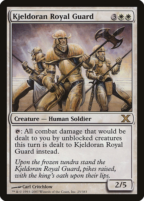
When you crack open a Tenth Edition core-set card, you’re not just peeking at a creature with a neat ability—you’re stepping into a carefully choreographed design language that Magic has refined for decades. Kjeldoran Royal Guard, a white (W) creature with a sturdy 2/5 body for a mana cost of {3}{W}{W}, sits at the intersection of form and function. Its presence on the page is a master class in readability, balance, and narrative cohesion 🧙♂️🔥. The core layout from that era emphasizes clarity: name, mana cost, type line, and then the all-important ability text, all wrapped in a frame that feels like a winter palace interior—sharp edges, clean borders, and a sense of restraint that suits white’s defensive playstyle ⚔️🎨.
Typography on Kjeldoran Royal Guard is understated but purposeful. The card name sits at the very top in a bold, slightly condensed type, ensuring it remains legible even when the name itself stretches across the line. The mana cost, displayed to the upper right, uses the iconic color-coded symbols that Wizards had already perfected by 2007, making it instantly recognizable at a glance in the heat of drafting or on the kitchen table during a late-night patch of sealed deck practice. The serif-like rendering on the name and the body copy, paired with the fortress-like black frame, contributes to a sense of formality and duty—an apt reflection of a royal guard’s oath 🛡️.
“Upon the frozen tundra stand the Kjeldoran Royal Guard, pikes raised, with the king's oath upon their lips.”
The art and flavor text work together to reinforce the card’s theme. Critchlow’s illustration presents a stalwart human soldier who appears as a bulwark against encroaching threats, perfectly matching the flavor line and the white color identity. The flavor text, though short, invites you to imagine a broader world where the Guard’s discipline and loyalty define the battlefield. This is White’s storytelling through layout—the quiet confidence of a card that communicates its role before you even read its stats 🧊💎.
In terms of mechanics and layout, Kjeldoran Royal Guard conceals a simple yet effective trick: its ability taps to redirect all combat damage that would be dealt to you by unblocked creatures to the Guard instead this turn. That one line of text sits in a compact block, with careful line breaks to keep it readable in long combats. The power/toughness line—2/5—adopts a respectable profile for a three-mana investment plus two white mana, signaling a reliable wall that can weather early aggression until you stabilize. The card’s rarity—rare in the 10e core set—signals to collectors and players alike that this is a sturdy staple piece with both strategic and aesthetic value 💎⚔️.
Layout choices go beyond beauty; they serve practical purposes for gameplay. The visual emphasis on the mana cost ensures players can quickly gauge resources during a game, which is critical for a card that thrives as a defensive anchor. The white border and the frame’s cool, restrained palette evoke a wintery, disciplined atmosphere—perfect for a card that forces opponents to shift their approach when their unblocked creatures threaten you. The 2003 frame, black border, and classic card back idiosyncrasies—all of which Kjeldoran Royal Guard inherits—craft a sense of continuity with the older, beloved printings while staying legible on modern screens and apps 🧙♂️🎲.
From a collector’s lens, Kjeldoran Royal Guard’s print run as part of the 10e (Tenth Edition) core set adds to its aura. The card is foil-enabled and nonfoil-compatible, with a nonfoil baseline price that’s accessible for new collectors and a foil option that often carries a premium, especially for players who chase the tactile shine of a rare white creature with a defensive heart. The set’s typographic choices—clean, legible, and evenly spaced—contribute to long-term readability, preserving the card’s legibility through generations of tables and digital clients. The lore and the mechanical identity align with white’s steadfast, protective playstyle, making this a natural fit for players who value resilience and strategic tempo 🧭🔥.
For designers, the Kjeldoran Royal Guard offers a compact case study in how typography, iconography, and flavor merge to communicate a card’s function without sacrificing aesthetic charm. The card’s name, type line, and rules text enjoy a rhythm that mirrors real-world signage—clear, measured, and confident. In a broader sense, the piece is a reminder of how a well-placed frame and thoughtfully chosen type can turn a simple creature into a legend on a battle-scarred table. If you love the tactile detective work of card design, this 10e entry deserves a bookmark and a nod in your design journal 🧩🎨.
And if you’re studying Magic’s design language while you brainstorm your next collection setup, a little handy cross-promotion goes a long way. For fans who appreciate the blend of style and utility on display here, consider adding a neon accent to your desk setup with a practical, modern gadget—the Neon Gaming Mouse Pad 9x7in Personalized Neoprene. It’s a playful nod to the era’s crisp lines and bold, readable typography, a perfect desk companion for drafting strategies or organizing your card notes with flair 🔥🧠.
Neon Gaming Mouse Pad 9x7in Personalized NeopreneMore from our network
- https://blog.digital-vault.xyz/blog/post/un-set-design-philosophy-for-magic-the-gatherings-aku-djinn/
- https://blog.digital-vault.xyz/blog/post/tracking-wildwood-escorts-power-curve-across-mtg-sets/
- https://transparent-paper.shop/blog/post/turn-templates-into-a-thriving-digital-business/
- https://crypto-acolytes.xyz/blog/post/how-web3-is-transforming-global-supply-chains/
- https://crypto-acolytes.xyz/blog/post/chilling-the-scariest-sound-effects-in-gaming/