
Image courtesy of Scryfall.com
Physical vs Digital MTG Card Design: a Case Study in Terror and Tempo
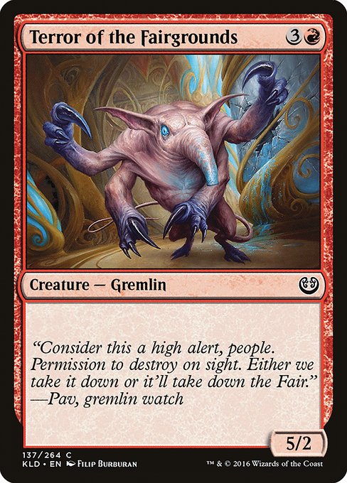
Magic: The Gathering has always danced between the tactile thrill of pulling a card from a sleeve and the glossy clarity of a digital interface. When you look at aKaladesh red gremlin that costs 3 colorless and 1 red mana, and you notice its sturdy 5/2 body for four mana, you’re witnessing a careful balance of speed, risk, and flavor that translates differently on paper and on screen. This particular card, a vanilla creature—no ability text to clutter the battlefield—provides a perfect lens for exploring how physical and digital design choices shape how players perceive power, tempo, and personality in MTG 🧙♂️🔥.
In the physical world, the card’s Kaladesh frame, black border, and gear-laden artwork by Filip Burburan convey a very tactile brutality. The Kaladesh set is famous for its brass-and-cog aesthetic, and Terror of the Fairgrounds embodies that hardware-forward vibe. The mana cost of {3}{R} announces an adrenaline rush—four mana on the table and a 5/2 to smash through early boards. It’s the sort of card that invites a player to commit early, swing with purpose, and weather the counterplay that red decks traditionally invite with reckless abandon ⚔️.
On the digital side, the same card appears with crisp, scalable art and user-friendly overlays. Digital clients can amplify the quick-read value of a 4CMC creature: the mana cost is rendered large enough to confirm color identity, the power/toughness is neatly aligned, and the rarity edge—common in this case—signals a different kind of strategic option in your deck-building slate. Yet the digital presentation also nudges you toward a comfort zone: instant color-coded cues, hover-over flavor, and accessible rules references that a physical card can only offer through a stack of rulebooks and a diligent reader. The net effect? Digital interfaces can flatten some of the friction of evaluating a vanilla creature while preserving its ogre-like crunch on the board 🧩🎨.
“Consider this a high alert, people. Permission to destroy on sight. Either we take it down or it’ll take down the Fair.” — Pav, gremlin watch
Flavor text on the physical card anchors the gremlin’s menace and adds a bite-sized story to a relatively straightforward stat line. In digital environments, that flavor often remains visible, but the emphasis leans more toward the creature’s numeric footprint and color identity. The result is a design dichotomy: physical cards lean into narrative heft, while digital cards lean into legibility and tempo assessment 🧙♂️.
What the raw numbers tell us about the design intent
- Mana cost and stat line: A 4-mana investment for a 5/2 is a strong early pressure creature in red. In limited formats, it nearly screams “first pick” for a red deck looking to establish board presence quickly. In constructed, it’s a tempo card that can trade efficiently while remaining vulnerable to mass removal or blockers. The math is aggressive but fair, which is exactly what Kaladesh’s color pie loves to reward in creature-heavy decks 🔥.
- Rarity and print considerations: Classified as common, this card demonstrates a design principle: even staples at common rarity must fulfill a clear role—efficient tempo, reliable performance, and a dash of flavor. The foil and non-foil finishes broaden collector engagement, albeit with a modest market footprint compared to rare and mythic staples. Scryfall’s price snapshot—roughly a few cents in USD for non-foil and a few dimes for foil alloys—reflects that practical value while still acknowledging the card’s place in red’s aggressive toolkit 💎.
- Lore and flavor: The flavor text centers on vigilance and the looming threat of the Fairgrounds’ chaos. Thematically, Terror of the Fairgrounds fits the Kaladesh motif of machine-born mischief. In both physical and digital renditions, flavor reinforces the idea that speed and aggression come with a price—the gremlins are as likely to bite their masters as to bite their opponents 🎲.
- Color identity and etiquette: As a red card, it embodies the red ethos of haste and direct damage, pushing the player to commit to combat rather than stall for longer strategic plans. Digital interfaces help new players grasp color identity at a glance (red = fast, aggressive, direct) while physical cards reward nuanced deck-building with tactile joy and collection value 🧙♂️.
Design adaptation: translating tactile momentum into a digital rhythm
When moving a card like this from paper to pixel, designers face two core questions: readability and rhythm. Readability asks whether a viewer can instantly identify mana cost, color, and combat stats in a crowded battlefield. Rhythm asks whether the card’s tempo—how quickly it accelerates the game state—reads the same in both formats. For Terror of the Fairgrounds, the answer is a confident “yes,” but with caveats. On mobile, the four-mana investment looks decisive; on a large monitor, the artist’s brass-and-bronze textures pop with details that the card frame preserves without crowding the numbers. That balance—crafting a strong first impression while preserving long-term clarity—is where digital design often refines what physical design begins 🧭.
Another dimension is accessibility. The flavor text remains a narrative pocket for flavor seekers; but in digital formats, players can toggle rules interactions or consult an oracle text panel that confirms the card’s exact capabilities. For a vanilla creature, this distinction is subtle, yet it matters when you’re building a complex Kaladesh or red-heavy deck that leans on tempo and aggression. The human factor—the thrill of swinging in with a 5/2 and hearing the crowd cheer—does not vanish in digital realms; it simply arrives through a different sensory channel 🧙♂️.
Finally, cross-promotional opportunities are worth noting. You’ll find archival and collector interest around common cards like this one—yes, even when they’re not the sexiest pull in a draft—because curated collections celebrate the broader era’s design experiments. The Kaladesh era’s emphasis on artifacts, energy, and mechanical whimsy shaped a generation of players who learned to balance speed, risk, and tempo in both physical sleeves and digital dashboards 💥.
Phone Grip Kickstand Click-On HolderMore from our network
- https://blog.rusty-articles.xyz/blog/post/timeless-construction-modern-desk-presence-custom-vegan-pu-leather-mouse-pad/
- https://blog.crypto-articles.xyz/blog/post/nft-data-bagtardio-1793-from-bagtardio-collection-on-magiceden/
- https://blog.crypto-articles.xyz/blog/post/community-decklists-spotlight-psychic-energy-synergy-with-your-favorite-pokemon/
- https://crypto-acolytes.xyz/blog/post/nft-stats-kode-3233-from-kode-collection/
- https://blog.crypto-articles.xyz/blog/post/nft-data-midevil-1354-from-midevils-collection-on-magiceden/

Terror of the Fairgrounds
ID: 04623df9-8fa9-44cc-b528-c2c484626d1f
Oracle ID: 75a20db5-5ce8-4e5d-a815-e69bc3dd8d4c
Multiverse IDs: 417710
TCGPlayer ID: 122675
Cardmarket ID: 292478
Colors: R
Color Identity: R
Keywords:
Rarity: Common
Released: 2016-09-30
Artist: Filip Burburan
Frame: 2015
Border: black
EDHRec Rank: 28171
Set: Kaladesh (kld)
Collector #: 137
Legalities
- Standard — not_legal
- Future — not_legal
- Historic — not_legal
- Timeless — not_legal
- Gladiator — not_legal
- Pioneer — legal
- Modern — legal
- Legacy — legal
- Pauper — legal
- Vintage — legal
- Penny — legal
- Commander — legal
- Oathbreaker — legal
- Standardbrawl — not_legal
- Brawl — not_legal
- Alchemy — not_legal
- Paupercommander — legal
- Duel — legal
- Oldschool — not_legal
- Premodern — not_legal
- Predh — not_legal
Prices
- USD: 0.03
- USD_FOIL: 0.25
- EUR: 0.02
- EUR_FOIL: 0.11
- TIX: 0.03
More from our network
- https://crypto-acolytes.xyz/blog/post/nft-stats-goatys-509-from-goatys-collection/
- https://articles.digital-vault.xyz/blog/post/moon-heron-strategic-design-lessons-from-playtesting-feedback/
- https://crypto-acolytes.xyz/blog/post/nft-stats-bug-suckers-vhs-tape-from-portals-backed-assets-collection/
- https://crypto-acolytes.xyz/blog/post/nft-stats-geek-2733-from-geeks-collection/
- https://articles.digital-vault.xyz/blog/post/anorith-alternate-art-vs-full-art-a-collectors-guide/