Image courtesy of Scryfall.com
Frame and Flair: How Card Art Evolves Across MTG's Reprint Landscape
Magic: The Gathering has always been a dialogue between rules and visuals. The moment you glimpse a blue creature with Flash like Sister of Silence stepping onto the battlefield, you’re invited into a whole conversation about art direction, frame choices, and the ways reprints or crossovers reinterpret a card’s aura. This particular piece comes from a Warhammer 40,000 Commander crossover—a curious fusion of two beloved universes that showcases how frame and flair can tilt a player’s perception before a card’s text even lands on the table. 🧙🔥💎
Card snapshot: Sister of Silence in a Warhammer 40,000 Commander context
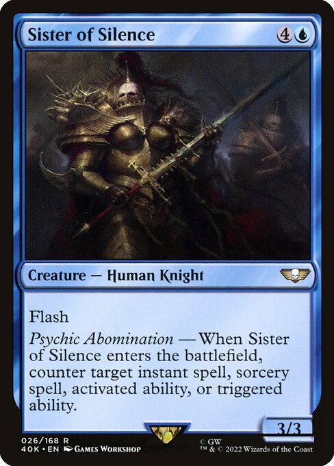
From a gameplay lens, this blue rarity is a fascinating study in timing and control. It costs {4}{U} for a 5-mana card, a 3/3 creature with Flash, giving blue decks another powerful tool with a touch of battlefield disruption. The mechanical centerpiece—Psychic Abomination—reads: “When this creature enters, counter target instant spell, sorcery spell, activated ability, or triggered ability.” In layman terms, you get a live, ETB-counter for key spells the moment Sister of Silence slips in, potentially halting critical plays from an opponent as you flash in to disrupt the stack. ⚔️
- Mana cost: {4}{U} (CMC 5)
- Color identity: Blue (U)
- Type: Creature — Human Knight
- Power/Toughness: 3/3
- Rarity: Rare
- Set: Warhammer 40,000 Commander (Universes Beyond crossover)
- Keywords: Flash, Psychic Abomination mechanic
Notably, this particular print is marked as a nonfoil with a black 2015 frame as part of the 40k Commander set. The artist credit goes to Games Workshop, a nod to the cross-brand collaboration that MTG embraced in these crossover products. The card’s appearance is striking in its restrained elegance—the image cropping and border treatment emphasize a quiet menace that mirrors the unit’s battlefield role. This is not a reprint of an older MTG card; rather, it’s a fresh take within a dedicated crossover, a living example of how reprint philosophy can extend beyond mere text changes to embrace new artistic directions. 🎨
“Blue decks love to peek around corners, and Sister of Silence makes you feel that arcane tug on the stack as you slip past a threat you thought you’d need to answer later.”
For players, the ability to counter an entering spell or ability elevates the card from a mere creature to a strategic tempo piece. In Commander formats, where games often hinge on moments of permission, Flash lets you surprise opponents with a reactive play at instant speed. It’s a textbook example of how frame and art influence perception: the cool blues and the knightly silhouette reinforce the card’s defensive, vigilant theme, even before you parse the actual ETB text. 🧙🔥
Art reprints, frame decisions, and the collector’s eye
Art reprints are more than cosmetic changes; they’re a conversation about accessibility, nostalgia, and the evolving aesthetic language of MTG. A reprint might swap border styles, shift from a bordered to a borderless presentation, or introduce a new sub-artist’s interpretation while preserving the core identity of the card’s abilities. In this Sister of Silence piece, you can see a deliberate alignment with the 2015 frame—black borders, clean lines, and a slightly more restrained shading palette compared to the bolder, earlier art eras. This choice communicates a sense of timelessness and tactical precision, which resonates with blue’s reputation for planning and control. Frame and Flair, indeed. ⚔️
From a collector’s viewpoint, the pairing of a rare status with a Universes Beyond crossover can add layers of value and conversation. Even if the print is nonfoil here, the artistry is part of a broader dialogue around crossovers and how they influence pricing, playability, and player enthusiasm. A card’s value is never just about dollars; it’s about the story it tells on the table—the way the frame holds a memory of a hypothetical trade, a pivotal counter, or a memorable ETB moment. 🧙🔮
For players who crave a tactile, well-curated desk setup to accompany their MTG sessions, a thoughtfully chosen accessory can elevate the entire experience. The featured cross-promotional product—Foot-shaped memory foam mouse pad with wrist rest—echoes the same impulse: comfort and style guiding a dramatic, tabletop ritual. When you combine a thoughtfully designed play space with a card that embodies a moment of strategic precision, you elevate the ritual of playing a game you love. The synergy is real, and it’s as satisfying as landing a well-timed counterspell during a crucial turn. 💎🎲
Looking at Sister of Silence side by side with other art variants across MTG’s history invites a nuanced appreciation: some reprints honor classic brushwork; others push into new conceptual territory that suits modern gameplay. The Warhammer 40,000 Commander crossover is a case study in how art direction, licensing, and gameplay design intersect to shape the experience for both longtime fans and curious newcomers. The card’s blue aura, its mental edge, and its sharp, crystalline artwork collectively remind us that magic is a conversation between text, frame, and imagination. 🧙🔥⚔️
Whether you’re chasing the perfect display piece for your binder or layering a strategic blue-based control shell in Commander, Sister of Silence offers a compact lesson in how art and mechanics reinforce one another. The card’s pristine balance—cost, body, and ETB counter—ensures it remains a memorable, conversation-sparking part of any collection. It’s not merely about collecting; it’s about collecting something that whispers, in its own quiet way, that style matters as much as strength. 🎨💬
Product spotlight: Foot-shaped memory foam mouse pad with wrist rest
More from our network
- https://blog.digital-vault.xyz/blog/post/magnitude-system-unveiled-by-a-hot-centaurus-star/
- https://crypto-acolytes.xyz/blog/post/ratchet-clank-innovations-that-shaped-ps2-platforming/
- https://crypto-acolytes.xyz/blog/post/solana-mev-threats-and-how-to-mitigate-them/
- https://crypto-acolytes.xyz/blog/post/calibrating-photometry-of-a-distant-hot-giant-at-56-kpc/
- https://transparent-paper.shop/blog/post/radial-velocity-patterns-illuminating-a-hot-blue-white-star-across-the-milky-way/