Image courtesy of Scryfall.com
Typography and Layout Deep Dive: a Dragon's Tarkir Zombie-Snake Legend
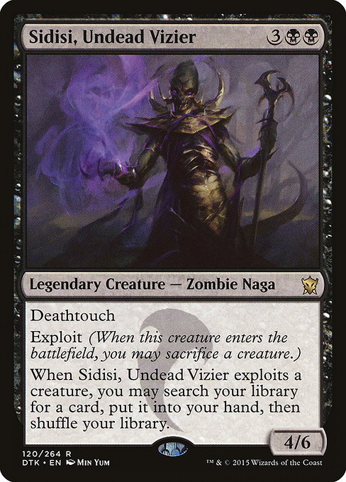
In Dragons of Tarkir, the MTG design team crafted a card frame and typography language that speaks to flavor as loudly as the creature's stats shout from the page. Sidisi, Undead Vizier isn’t just a powerhouse on the battlefield; it’s a case study in how font choices, spacing, and layout convey mood—the perfect synergy of dark ambiance and practical power. 🧙🔥💎 The black mana identity, the stark silhouette of the name, and the ominous watermark all work in concert to signal a control-oriented, exploit-focused strategy before you even read the first line of rules text. Sidisi sits at the intersection of foreboding flavor and precise mechanical storytelling, a design whose typography invites you to lean in and plan your next tutor-like moment with surgical precision. ⚔️
First, let’s talk about the silhouette of the card’s identity. Sidisi costs {3}{B}{B}, giving it a final mana cost of 5 and a formidable 4/6 stat line. The name is rendered in a bold, high-contrast type that stands out against the dark frame, immediately signaling rarity and importance. The rarity marker — rare — nudges you to expect a game-changing effect, and indeed Sidisi’s Exploit ability (When this creature enters, you may sacrifice a creature.) is the kind of line that begs a careful read and even more careful planning. The black mana identity reinforces a tradition of graveyard synergy, hand disruption, and resilient inevitability, all of which are motifs echoed in the card’s art and its Exploit trigger. 🧙🎨
Layout cues that guide your eye
The layout on Dragons of Tarkir carries a crisp, linear rhythm. The name sits at the top in a weighty display font, followed by the mana cost icons on the right edge. Sidisi’s type line—Legendary Creature — Zombie Snake—appears just beneath the art, using a legible gray-black text that ensures readability even in the heat of a match. The watermark Silumgar subtly anchors the card in the Tarkir universe, giving a sense of clan identity without overpowering the readable block of rules text. The card’s body text uses a clean, left-aligned column with generous line height, which makes the combined lines of Deathtouch and Exploit feel like a natural extension of Sidisi’s fearsome silhouette. This careful spacing matters: Deathtouch is a keyword you want to notice immediately, and Exploit is a mechanic that benefits from a quiet, uncluttered presentation to avoid misreadings during quick turns. 🧭
Deathtouch Exploit (When this creature enters, you may sacrifice a creature.) When Sidisi exploits a creature, you may search your library for a card, put it into your hand, then shuffle.
The typography also serves a storytelling function. The name’s scale and weight set Sidisi as a legendary presence, while the body text conveys a compact, no-nonsense explanation of her abilities. The crisp contrast helps players quickly identify the card’s role: a resilient finisher who can tutor up answers once an exploit trigger occurs. The art by Min Yum adds another layer—the visual emphasis on a formidable, serpentine undead figure whose menace is mirrored in the layout’s stark lines and the heavy, almost ceremonial feel of the font choices. The result is a card that reads as confidently as it looks, a rare combination in a set that leaned heavily into clan lore and martial aesthetics. 🎨
Strategic implications embedded in typography
From a gameplay perspective, Sidisi’s Exploit creates a recurring decision point: you may sacrifice a creature to trigger a library search. The typographic clarity here matters. The keyword line is concise, allowing players to process the optional nature of Exploit without sifting through dense paragraphs. This is crucial in multiplayer formats, where clarity under pressure translates to better long-term planning. The ability to search your library for a card and add it to your hand—then shuffle—emphasizes value-thinning decisions and tutor-like precision. In a black-based, midrange or control shell, Sidisi becomes a tutor engine that scales with the board state. The bold type and clean structure ensure that this power doesn’t feel hidden or ambiguous; the rules text is a direct, confident invitation to execute a strategic sequence. 🧠⚔️
And let’s not overlook the collector’s eye. Dragons of Tarkir introduced a batch of iconic artwork and watermark treatments that modernized the look of these cards while preserving the tactile satisfaction of the old frames. Sidisi’s watermarked Silumgar alignment hints at cross-faction synergy and a deeper story arc, rewarding not just a win on the table but an experience of the multiverse. The legend’s role is reinforced by the layout’s emphasis on the name and type, which stands out even in a crowded battlefield of tokens, lores, and combat steps. This is typography doing double duty: you get aesthetic mood and practical readability in one compact package. 🧙♀️
A peek at value and collectibility
As a rare black creature from DTK, Sidisi sits at a sweet spot for collectors who prize both playability and artful design. The card’s foil versions command noticeably higher value on the secondary market, and the nonfoil print is still desirable for Commander decks where a reliable tutor and a deathtouch threat can be a game-changer. The card’s price trajectory reflects its enduring utility and the demand for Exploit-based strategies in modern and eternal formats. If you’re chasing a dose of nostalgia along with competitive upside, Sidisi’s typography and layout deliver on both fronts. 💎
If you’re curious to explore Sidisi in depth on Primer, we’ve rounded up a few related reads that mix market psychology, design critique, and the broader MTG ecosystem. The interconnected conversations around card typography, layout, and collector culture are part of what makes this hobby so endlessly fascinating. 🧙🔥
Interested in a tactile upgrade that nods to modern card design while keeping your phone safe and stylish? Check out the product below—smart, durable, and a perfect desk-side companion for any MTG nerd who loves a good visual pun and a strategic plan.
Clear Silicone Phone Case — Durable, Flexible, Slim
More from our network
- https://blog.digital-vault.xyz/blog/post/wrathful-raptors-bubble-collector-psychology-in-mtg-markets/
- https://crypto-acolytes.xyz/blog/post/gaming-nostalgia-marketing-rekindling-fans-and-boosting-engagement/
- https://crypto-acolytes.xyz/blog/post/the-rise-of-privacy-preserving-trading-platforms/
- https://transparent-paper.shop/blog/post/photography-meets-digital-paper-design-a-creative-fusion/
- https://blog.digital-vault.xyz/blog/post/silver-border-symbolism-in-thalakos-deceiver-parody-sets/