Image courtesy of Scryfall.com
Art, Frames, and Identity: How Alternate Art Variants Shape MTG Creature Perception
When you open a booster or browse a card database, the frame is often the first thing you notice before the card’s text even sinks in. MTG has evolved through many frame styles, and collectors know that a single alt frame can nudge a creature from “nice pull” to “display-worthy centerpiece.” 🧙♂️ The choice between a classic border, a showcase frame, or a borderless variant isn’t just about aesthetics; it influences how we experience the artwork, read the rules text, and imagine the creature’s lore in motion. In this exploration, we’ll zoom in on a blue flyer from Return to Ravnica and use it as a lens to compare alternate frame art variants, how they feel in play and collection, and what fits best with a creature’s vibe. 🔥💎
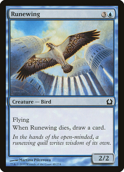
Runewing is a compact study in blue’s elegant pragmatism. For a mana investment of {3}{U}, you get a 2/2Flying Bird whose threat grows when it leaves the battlefield: “When this creature dies, draw a card.” That simple line is all about tempo and card advantage, two of blue’s signature currencies. The card sits in RTR’s common slot, which means it’s accessible to many decks and a perfect candidate for examining how frame choices impact perception rather than raw power. The artwork by Martina Pilcerova captures a nimble feathered messenger, and the flavor text—“In the hands of the open-minded, a runewing quill writes wisdom of its own.”—hints that the bird’s story is as adaptable as the player who wields it. 🎨🪶
In a world where frames shift with new printings, Runewing’s story remains the same, but its silhouette can feel distinctly different depending on the border that carries it. A classic frame emphasizes the quiet, measured glide of blue, while a more dynamic or borderless approach can push the moment of impact when it dies and a card pops back into your hand. ⚔️
So what are the practical differences you might notice across alternate frames? Here are a few touchpoints to consider as you compare variants:
Blue thrives in cooler palettes. A variant that softens whites with cool grays or deepens blues can heighten the sense of airiness around the bird, reinforcing its elusiveness and telegraphed trade-offs. Conversely, a frame that adds high-contrast borders might make the card feel more aggressive at a glance, even if the rules are the same. Some players chase showpiece frames, like showcase or extended-border variants, hoping to elevate a card from “playable” to “display-worthy.” For a common like Runewing, a striking alternate frame can be a gateway to conversation at the table and a tangible nod to the card’s lore. Different frame eras sometimes shift text density or alignment. An alt frame that preserves the card’s layout well can be more comfortable for reading the keyline: “Flying. When this creature dies, draw a card.” That clarity matters when you’re juggling multiple spells on a crowded board.
For fans who enjoy the lore of the RTR era, Runewing’s aura—an agile blue omen with a quill-like runic motif—pairs nicely with more delicate, art-forward frames. The 2003-era frame that houses this art keeps a tidy balance between illustration and text, helping the quill feel like a poised instrument of knowledge rather than a mere decorative accent. The decision to pursue a foil Runewing or a nonfoil can also tilt the perception: foils glow under light and can accentuate the card’s ink lines, while nonfoils maintain a more subdued, desk-friendly vibe. 🧙♂️💎
Delving into the card’s mechanics, Runewing’s candy-floss turn of fate—flying and death-triggered card draw—gives it a soft, strategic edge that doesn’t shout. It’s the kind of creature you want on the battlefield when you’re drafting tempo, then you’re rewarded with a surprise card in hand after it falls. That loop is blue’s bread and butter, and a well-chosen frame can emphasize the elegance of that tempo by keeping the focus where the eye lands: on the creature, its name, and its text. 🎲⚔️
As you explore alternate frames, consider how you plan to use Runewing in your collection or on the table. If your display goals lean toward storytelling, a variant that highlights the quill motif or a pale, watercolor-like backdrop can enhance the vibe of “wisdom writes itself.” If your priority is gaming readability and a crisp league of blue’s edge, a cleaner border or a portrait-like crop may serve best. And if you’re chasing a conversation starter, a bold showcase frame could be the perfect centerpiece to spark discussion about artwork, rarity, and frame history. 🧙♂️🎨
Curious minds can explore more from our network and see how different creators and publishers approach MTG-inspired design across games and media. For inspired reading and practical perspectives, check out these five articles from related outlets, which echo the cross-disciplinary vibe of collectible card art and game design:
More from our network
- https://crypto-acolytes.xyz/blog/post/top-rug-pulls-in-crypto-gaming-and-how-to-avoid-them/
- https://crypto-acolytes.xyz/blog/post/how-procedural-generation-shapes-horror-in-games/
- https://blog.digital-vault.xyz/blog/post/how-to-build-automated-report-generation-systems/
- https://blog.digital-vault.xyz/blog/post/niche-marketing-strategies-that-drive-targeted-growth/
- https://transparent-paper.shop/blog/post/step-by-step-guide-to-creating-editable-business-templates/
If you’re looking to bring a touch of MTG-inspired texture to your desk or stream, consider the practical side of frame choice alongside the card text. And while you ponder, maybe grab a sleek neoprene mouse pad to keep your workflow as nimble as Runewing’s flight—round or rectangular, one-sided print, ready to slot into your setup. Neoprene Mouse Pad Round or Rectangular One-Sided Print