Image courtesy of Scryfall.com
The Frame Frontier: How MTG Card Borders Have Shaped Our Practice and Passion
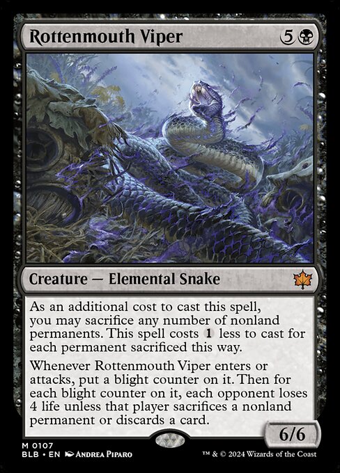
If you’ve been collecting or playing since the early days of Magic, you know that a card isn’t just a creature or a spell—it’s a piece of a conversation about how the game wants to be seen. The borders, the typography, the silhouette of the mana costs, even the way flavor text sits under a creature’s name—all of these tiny design choices whisper about the era that produced them. The Bloomburrow expansion brings a striking case study in that conversation. Rottenmouth Viper, a mythic rarity creature from the 2015-era frame, embodies how Wizards’ frame evolution has fused readability, artistry, and mechanical clarity into a single, iconic package. 🧙♂️🔥💎
From Old Borders to Modern Clarity: A quick tour of a long evolution
Early MTG frames—a product of the 1990s—carved a bold path with compact text, thick borders, and art that sometimes spilled into the margins of the layout. As sets expanded and power levels grew, the need for readability and accessibility grew with them. The 1997–2003 “Updated Frame” era refined the silhouette: a clearer mana cost line, more legible creature type text, and a slightly larger text box. Then came the big turning point in 2015 when the game rolled out the Frame 2015 update, a modernization that softened the borders, enlarged the art window, and standardized fonts for better on-tablet and on-screen play. The result was a frame that still feels distinctly MTG, but with a modern, almost cinematic finesse. The Rottenmouth Viper wears that frame with a dark, confident glare—the art by Andrea Piparo sits within a refined window, and the creature’s ominous presence is conveyed with fewer visual barriers. ⚔️🎨
“Frame design is a conversation between art and rules—every pixel carries a decision.”
Rottenmouth Viper as a frame-forward showcase
Released in Bloomburrow (BLB) on 2024-08-02, Rottenmouth Viper is a Creature — Elemental Snake that riffs on dark tempo and life-drain threats. Its 6/6 stats and {5}{B} mana cost carry a heavy, late-game swing, but the card’s actual play comes alive through a clever template: an optional sacrifice as an additional casting cost, which reduces the spell cost by one for each sacrificed nonland permanent. That mechanic nudges you toward decisive plays and timing—sacrifice enough to gain a cheaper cast, then watch as the blight counters accumulate. Upon entering or attacking, it gains blight counters; for each counter, opponents face a brutal decision—sacrifice a nonland permanent or discard a card to avoid a 4-life sting. The frame’s role here is subtle but real: the modernized typography and cleaner layout keep the complexity approachable, even as the card’s tactical depth grows. 🧙♂️💎
The card’s color identity stays true to black, feeding on deterrence, inevitability, and resource denial. The art by Andrea Piparo delivers a serpentine silhouette that feels both ancient and corrupted, which pairs nicely with the 2015 frame’s sharper contrast and slightly expanded breathing room around the image. The mythic rarity signals a special moment in the game’s lore and design: a standout card that often becomes a centerpiece in Commander queues and themed reprints. The Bloomburrow set symbol and the card’s border treatment reinforce a sense of a cohesive world-building arc within a modernizing frame. ⚔️🎲
What the frame changes mean for players and collectors
- Legibility and speed of play: Frame 2015 standardizes font sizing and spacing so players can parse the critical lines—name, mana cost, type line, abilities—at a glance, even when multitasking on a kitchen table or a crowded tournament hall. 🍽️
- Art and flavor alignment: A larger art window means the artist’s mood and color palette have more impact. Rottenmouth Viper’s menacing composition lands with a sharper edge, enhancing the card’s lore-heavy vibe while keeping the mechanical text crisp. 🎨
- Set identity and collectibility: Mythic rarity, foil options, and a distinctive frame help cards stand out in binders and during top-deck debates. The BLB print—paired with the 2015 frame—becomes a talking point about how the game’s style evolves without losing its soul. 🔥
- Accessibility and inclusivity: Modern frames played a part in improving readability for new players, with friendlier serif choices and better contrast against the black mana symbols. This matters when you’re teaching a stranger at your LGS or streaming a casual draft night. 🧙♂️
Design realities: the card as a product of its era
Rottenmouth Viper is not just about its abilities; it’s a snapshot of how Wizards balanced art, rules text, and the timing of prints. The 2015 frame made it easier to accommodate the token-laden, synergy-heavy mechanics that MTG thrives on in the 21st century. The “As an additional cost to cast this spell” clause sits cleanly in the text box, the blight counter mechanic reads clearly, and the life-loss/ discard-or-sacrifice conditional becomes a natural decision point for opponents. It’s the marriage of mechanical ambition and visual clarity that frame evolution hopes to achieve with every new print. And yes, the card’s in-world menace translates visually—black on black, with a hint of violet menace in the art—so the frame doesn’t just hold the content; it amplifies it. 🧙♂️💎
The road ahead: what current frame design hints at for future cards
Looking forward, frame evolution will keep walking the line between artistry and practicality. Expect ongoing refinements in text readability for complex abilities, subtler border treatments for special promotions, and even more dynamic set symbols that pop without stealing focus from the creature or spell at the center ring. For fans, this is part of the fun: every new frame announcement becomes a rumor about the next big moment in MTG’s visual canon. The Rottenmouth Viper example shows how a modern frame can honor a card’s gravitational pull while inviting players to explore its tactical depth with enhanced confidence. 🧩🔥
For collectors who want a tangible way to blend their love for MTG with everyday utility, the cross-promotional opportunity I’m enjoying lately is a stylish way to carry a piece of the multiverse with you. The Product link below offers a sleek, impact-resistant option that nods to the same sense of durable, enduring design that a well-printed card frame represents in a different dimension of MTG fandom. After all, the game isn’t just played on the table—it travels with us, through sleeves, cases, and everyday life. 💼🎲