Image courtesy of Scryfall.com
Design threads: from paper scarcity to digital clarity
In the crossfade between physical cardboard and digital windows, MTG design teams constantly relearn what players actually notice when a game starts humming at speed. Rip-Clan Crasher, a colorful shard burner from Shards of Alara, serves as a neat case study. This red-green, two-color powerhouse shows how a two-mana creature with haste can feel crisp on a tabletop and equally snap to life on a screen. 🧙♂️🔥 The digital space has pushed designers to optimize readability, streamline mana costs, and emphasize the crisp punch of aggressive creatures—without losing the tactile thrill that comes from seeing a 2/2 figure burn the turn lane. ⚔️
Meet the card: Rip-Clan Crasher at a glance
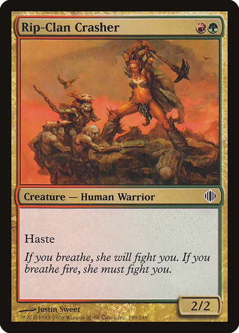
- Name: Rip-Clan Crasher
- Set: Shards of Alara (ALA)
- Mana Cost: {R}{G}
- Type: Creature — Human Warrior
- Power/Toughness: 2/2
- Rarity: Common
- Keywords: Haste
- Flavor Text: If you breathe, she will fight you. If you breathe fire, she must fight you.
- Artist: Justin Sweet
First and foremost, its mana cost communicates a bold, aggressive tempo—a signature move for RG decks that want to slam early and keep the pressure on. In physical prints, that cost sits neatly on the top left; in digital, it becomes an instantly readable badge that’s color-accurate and legible at default zoom. The haste keyword ensures you feel the card in both formats: you swing, your opponent reacts, and the outcome can hinge on a single misstep. The 2/2 body is a pragmatic statline that remains relevant across formats, offering a solid body for a couple of mana while leaving room for red-green synergies to push beyond the card’s raw power. 💎
Digital design: clarity, speed, and color identity
When a card moves from the printed page to the digital arena, several constraints and opportunities come into play. Rip-Clan Crasher illustrates how digital design prioritizes readability and tempo. The card’s color identity—green and red—needs to be instantly recognizable, especially in crowded boards or when users skim their hand. Digital rendering allows the team to preserve that quick read while also enabling subtle improvements: high-contrast text, clean mana symbols, and a predictable layout that reduces decision fatigue during a fast turn. In practice, this means that the card reads as soon as you glance at it, with haste flashing as a visual cue as soon as the card is tapped to attack. 🧙♂️⚡
From a design perspective, digital platforms also tempt experimentation with animation and feedback. A tokenized glimpse of Rip-Clan Crasher charging into combat could be a simple glow or a brief aura to emphasize its Haste ability without bloating the card’s text. That kind of micro-feedback is easier to prototype and iterate digitally, then decide if it should exist in a future physical reprint or remain purely digital polish. The digital space thus nudges designers toward a workflow that values readability first, while leaving room for expressive flourishes that enhance the moment of attack without sacrificing clarity. 🔥
Lore, flavor, and how design respects a card’s voice
The flavor text—“If you breathe, she will fight you. If you breathe fire, she must fight you.”—invokes a fierce, unyielding Ardent Warrior ethos that fits the Shards of Alara era. In both paper and digital, that voice translates into a bold, kinetic image: a warrior who thrives on the clash of elements, embodying the set’s theme of shards colliding in a single moment of choice. Designers must ensure that the card’s flavor resonates across mediums, so players feel the grit of the moment whether they’re drafting in a store or grinding through a ranked match online. The art by Justin Sweet contributes a tactile texture that translates well to the digital canvas, giving players a vivid mental image of a world where ancient instincts meet blistering speed. 🎨
Play patterns: urgency, tempo, and strategic flexibility
Rip-Clan Crasher isn’t just a stat line; it’s a tempo engine. In a typical RG deck, this 2/2 with Haste can kick off a fierce early game that forces opponents to respond immediately. The card invites players to build around tempo—leveraging spells that push extra damage or accelerate into more threats by turn three. In digital play, such tempo plays are often visible in auto-suggester heuristics and strategic tips that the client surfaces during the draft or gameplay. The card’s two-color identity also hints at broader synergy with multicolor strategies: you’re not locked into a single plan, and the card’s aggression can dovetail with red removal or green ramp in later turns. That flexibility is a staple of digital MTG design, where drafting tools and deck builders encourage experimentation with color pairs that can surge ahead in the meta. ⚔️
Collector value and digital-first realities
As a common, Rip-Clan Crasher isn’t a long-tail staple for pure financial speculation, but it holds a charm that fans prize—especially with foil variants that sparkle in a display case or on a livestream table. The digital version makes value accessible through gameplay variety, and its presence in modern-era sets makes it a familiar piece for players who champion fast, aggressive starts. The Mix of RG in Shards of Alara also serves as a reminder that multi-colored themes were a big draw of the block, and that digital presentation often highlights color balance and synergy in a more immediate way than some older print runs could. If you’re collecting nostalgically, you’ll appreciate how the card’s art, simplicity, and speed captured a moment when two colors collided with explosive energy. 💎
The cross-pollination between physical and digital MTG design is ongoing, and Rip-Clan Crasher stands as a microcosm of that evolution: a simple, fast creature that remains legible, flavorful, and dangerously effective across both formats. For players who love the tactile ritual of drafting and the instant feedback of online play, it’s a reminder that good design should feel natural no matter where you tap the table. 🎲
Rugged Phone CaseMore from our network
- https://crypto-acolytes.xyz/blog/post/photometric-signatures-of-star-formation-history-from-a-blue-ob-star/
- https://crypto-acolytes.xyz/blog/post/pokemon-crystal-speedrunning-guide-routes-tricks-and-records/
- https://blog.digital-vault.xyz/blog/post/plague-spores-and-sealed-product-scarcity-mtg-market-dynamics/
- https://blog.digital-vault.xyz/blog/post/foil-frenzy-why-collectors-chase-ingenious-artillerist/
- https://crypto-acolytes.xyz/blog/post/hot-spiral-arm-star-illuminates-stellar-birth-at-235-kpc/