Image courtesy of Scryfall.com
Visual Force and Fragmented Narratives: Rip Apart and MTG Card Art Direction
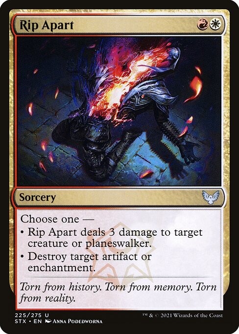
Magic: The Gathering has always thrived at the intersection of playability and visual storytelling, and a card like Rip Apart demonstrates how art direction can elevate a spell beyond its stat line. Released in Strixhaven: School of Mages as an uncommon spell, Rip Apart pairs two iconic colors—red and white—with a very tangible narrative: choose a path and snap the thread of reality, either burning away a foe or tearing down an obstacle in your way. The angular energy of the illustration, the careful balance of light and shadow, and the way the composition guides your eye all speak to a deliberate design philosophy: make the art serve the decision you’re making at the moment you cast the spell. 🧙♂️🔥
At its core, this card is a study in color identity and how it informs composition. The mana cost of {R}{W} signals a Boros impulse—precision, speed, and a certain flare—while the two distinct effects in the Oracle text embody the tension between aggression and disruption. The artwork reconciles those opposing impulses through a dynamic layout: a central burst or rupture that seems to split the frame, with shards or echoes of energy radiating outward. The result is a piece that feels kinetic even in a still image, a moment captured just as power is about to fracture a target. ⚔️🎨
Rip Apart is a spell that can swing a board state in a single moment: deal 3 damage to a creature or planeswalker, or destroy an artifact or enchantment. It’s a compact, punchy choice, and the art direction mirrors that economy. The design doesn’t bog itself down in extraneous detail; instead, it emphasizes a clear focal point—the decision point of the spell itself. This clarity is crucial in both casual and competitive play, where players need to read a card’s impact at a glance across a crowded table. The power of the image, then, lies not just in how it looks, but in how it communicates the stakes of casting it. 🧭
The artist behind Rip Apart—Anna Podedworna—brings a painterly sensibility to the piece that complements Strixhaven’s scholarly, house-driven lore. The flavor of Lorehold—one of Strixhaven’s five colleges, known for its fossilized motifs, historical curiosity, and fiery energy—permeates the composition. The artwork speaks to memory and history in motion, echoing the flavor text, “Torn from history. Torn from memory. Torn from reality.” It’s a visual cue that the spell is not merely about removing an obstacle; it’s about severing threads that tie a moment to the past and forcing a new moment into being. 💎
From a design perspective, Rip Apart also demonstrates the careful balance Strixhaven aims for: a clean text box alongside a rich, narrative-forward image. The card reads well in both a quick glance and a longer study, which matters when the game tempo shifts and players are trying to find the right line of play. The two modes—damage and destruction—also create a natural pairing of visual elements in the art: a charged moment that makes you feel the heat of a spell while implying the mechanical choice you’ll make when you cast it. This is art that respects the card’s function while deepening the story you tell at the table. ⚔️🎲
Even beyond the battlefield narrative, Rip Apart earns its keep as a collectible piece within Strixhaven’s broader art direction. The Strixhaven set is famous for its campus aesthetics, magical-script typography, and the way it makes every card feel like a page from a spellbook. Rip Apart stays visually legible at different sizes and resolutions, which helps it shine in foil and nonfoil finishes alike. As a card with a relatively modest rarity level (uncommon), it often serves as a favorite for players who want a memorable art moment without the premium price of a rare or mythic—while still tipping its cap to the set’s lorehold motif. The result is a card that’s as collectible as it is practical on the battlefield. 🔥
For players who like to think about the artistry behind the deck, Rip Apart offers a perfect case study in how composition and color can support both function and flavor. The red-white pairing invites a warm, aggressive energy; the image reinforces a sense of decisive action; and the lore text anchors the moment in a larger history of magic and memory. It’s no accident that the art’s energy radiates toward the edges of the frame—suggesting that what happens to a target during Rip Apart has implications that extend beyond the card itself, into the ongoing story of a Duel with history, both literal and figurative. 🎨🧙♂️
Enthusiasts who enjoy the tactile experience of MTG—handling a card, feeling the contrast between foil and nonfoil finishes—will also appreciate how Hooks like the Lorehold watermark subtly remind us of MTG’s ongoing world-building. Rip Apart isn’t just a tool in a deck; it’s a window into a university of magic where history is contested, and every spell is a charged moment that could tilt the balance of power. The art direction makes this moment look as sharp as a well-cut gemstone, a tiny stage where narrative and mechanics perform in harmony. 💎
If you’re a fan looking to carry a little of that Strixhaven vibe with you, the cross-promotional product link below offers a stylish way to blend MTG fandom with everyday life. The product isn’t just a case; it’s a statement—an emblem of the collector’s mindset that loves both the tactile and the visual. And who knows? It might be the perfect gift for a friend who appreciates the artistry behind the artifacts and the enchantments that populate our favorite battles. 🧙♂️🎲
Phone Case with Card Holder Polycarbonate Glossy or Matte