Image courtesy of TCGdex.net
Card Frames Through the Generations: Red Card Case Study
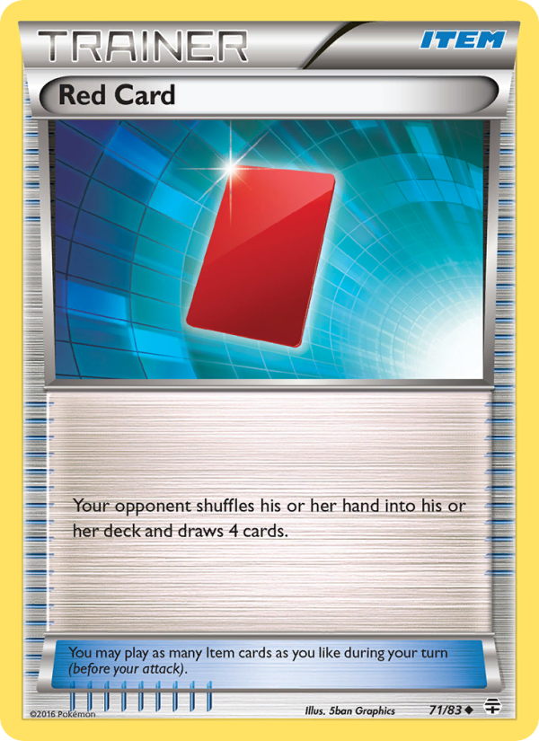
Pokémon TCG card frames are more than decorative borders; they’re a story etched in cardstock about how players read, collect, and connect with the game. The evolution of frame design—from the early, simple white borders to today’s sleek, feature-packed silhouettes—mirrors shifts in printing tech, typography, and the ever-changing balance between aesthetics and legibility. At the heart of this conversation sits a humble yet influential Trainer card: Red Card from the Generations expansion. This Uncommon Item trainer, illustrated by 5ban Graphics, provides a perfect lens for exploring how frame choices guide both play and collection.
Red Card appears in the Generations set as card g1-71, part of a block that emphasized reimagined classics with modern polish. The Generations era—where the frame began embracing sharper set symbolism, more pronounced card names, and improved holo cue—pushed trainers into a design conversation that had long centered on Pokémon basics. While Red Card itself is a straightforward effect card—“Your opponent shuffles his or her hand into his or her deck and draws 4 cards”—the frame around that effect carries meaning. The card exists in normal, reverse holo, and holo variants, signaling how the same card can feel differently in a player’s binder depending on its finish. The art by 5ban Graphics adds an energetic flourish to the frame, with a bold name banner and a compact text box that respects readability even when the card is in a dense deck.
“In the evolution of card frames, clarity and personality must share the same space. Red Card demonstrates how a trainer card can feel both crisp in the moment of play and collectible in the hands of a fan.”
Let’s unpack what this means for gameplay and collection. In earlier eras, frame design prioritized a compact text box and a generous white border, often making the name and type lines feel secondary. As the franchise matured, the frame began to integrate more sophisticated typography, sharper contrast between the text and the background, and subtle set icons. Generations, with its glossy, modern presentation, leans into a slightly larger logo area for the set symbol and a more pronounced rarity indicator, without sacrificing readability. Red Card’s Uncommon status is reinforced in holo and reverse holo variants, where the foil pattern not only signals rarity but also makes the card pop in play areas and display shelves. The trainer type marker—“Item”—is neatly placed to avoid crowding the dramatic illustration while preserving quick recognition during matches. ⚡🔥
From a design perspective, the evolution of the frame has two intertwined goals: readability during fast-paced play and allure during slow, careful collections. The Red Card card art remains a strong example of how a frame can celebrate the card’s purpose. The color palette and border thickness are calibrated so that the card remains legible even when surrounded by the “busy” visuals of a trainer card’s effect text. The Generations frame also leans into a slightly more compact text presentation compared to some earlier trainers, which helps players quickly parse the effect and decide whether to shuffle hands in the heat of a match. This balance between function and flourish is a hallmark of modern frame design. 🎴🎨
For collectors, the frame tells a story beyond the effect. The Uncommon Red Card sits in a tier that invites both casual display and careful grading. CardMarket data and TCGPlayer pricing (as of late 2025) show that while the standard non-holo version holds a modest value—low prices around a few tenths of a euro or dollar on general markets—the holo and reverse holo variants tend to fetch higher premiums, especially as collectors chase complete variant sets. Even so, Red Card remains accessible for those who want to dip their toes into modern trainer frames without breaking the bank. This accessibility, paired with the frame’s polished presentation, makes it a compelling entry point for fans exploring the Generations era’s artistic language. The numbers reflect an approachable market, with holo copies moving appreciably but not prohibitively expensive for determined collectors. 💎
Design threads across the generations
- Border and name placement: Early frames favored generous white borders and compact name panels. Modern frames for Trainer cards compress the text area a touch, ensuring legibility alongside the card’s art and set symbol.
- Set symbolism: The Generations era makes set cues more legible at a glance, helping players identify rarity and origin without reading every line of text. Red Card’s set symbol sits with clear contrast, aiding quick recognition during tournaments.
- Foil treatment: Normal, Reverse Holo, and Holo variants offer distinct tactile and visual experiences. The holo treatment in particular highlights the frame’s shimmering edges, inviting players to admire the frame while strategizing their next move.
- Typography and readability: The move toward cleaner typography reduces the chance of misreading the trainer’s effect under time pressure—a subtle but meaningful improvement for competitive play.
- Illustration integration: 5ban Graphics’ artwork is framed to harmonize with the surrounding text, ensuring the art remains a focal point even as the frame supports the card’s function.
Beyond aesthetics, Red Card’s design also reflects how modern cards “age” in a collector’s binder. The frame’s clean lines and sharp contrasts help the card resist the visual clutter that sometimes comes with dense text layouts. And as with many trainer cards, the frame plays a supporting role to the card’s utility on the table; the visual clarity matches the mental clarity needed to execute the shuffle-and-draw effect with confidence. In short, the evolution of the frame is a quiet engine driving both play and passion. ⚡
For those tracking the practical side of card care and investment, Red Card’s pricing data offer a practical lens on the era’s frame-driven appeal. The G1-71 card’s pricing shows modest base values for the standard version, with holo and reverse holo variants carrying higher but still approachable prices. This pattern mirrors the broader trend in the Generations set: accessible enough for new collectors to complete basic lineups, yet with enough foil variety to thrill seasoned players chasing complete sets. The value metrics, updated through 2025, underscore the enduring appeal of frame design as a collectible driver, not just a play mechanic. 🔎
In the end, the story of Red Card is a microcosm of the Pokémon card frame’s evolution. The progression from simple borders to polished, publication-ready frames mirrors the journey of the game itself—growing, refining, and inviting both new fans and long-time veterans to glimpse the artful side of Pokémon as they shuffle and draw toward victory. As the hobby continues to expand across regions and generations, each frame becomes a breadcrumb trail through time—leading us back to the moment a card moves from the deck to the display case with a little more shine and a lot more character. 🎮💎
Ready to explore the practical side of this cross-era design in your own setup? The Generations Red Card—across its normal, holo, and reverse holo variants—offers a tactile, visual reminder of how far the Pokémon card frame has come, while still delivering the game’s timeless twist: a simple effect that can shift the momentum of any match.
Get the gear to elevate your experience with a stylish desk companion and keep playing in comfort with a non-slip mouse pad designed for gamers and collectors alike:
Non-Slip Gaming Mouse Pad: Smooth Polyester Front, Rubber Back
More from our network
- https://crypto-acolytes.xyz/blog/post/exploring-the-most-innovative-indie-mechanics-redefining-play/
- https://crypto-acolytes.xyz/blog/post/astrometric-signals-reveal-single-or-binary-nature-of-a-37k-k-giant/
- https://blog.digital-vault.xyz/blog/post/timeless-vintage-digital-paper-for-elegant-journal-design/
- https://blog.digital-vault.xyz/blog/post/from-faint-red-dwarfs-to-a-scorpius-blue-white-star/
- https://transparent-paper.shop/blog/post/designing-daily-planner-templates-for-better-focus/