Image courtesy of Scryfall.com
Typography and Card Layout Deep Dive: The Quiet Craft Behind a White Instant
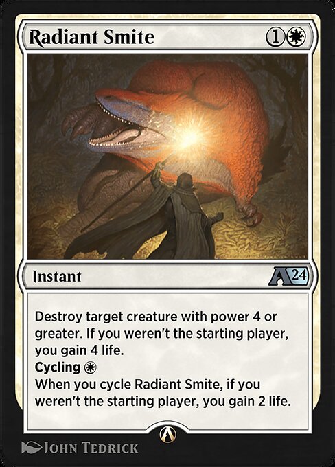
In the Magic multiverse, the typography and layout of a card aren’t just decorative flourishes — they are a pulse that guides decisions, tempo, and emotional response. A well-composed instant from the Alchemy: Ixalan line (a digital-only frame with a modern twist on classic white mana efficiency) demonstrates how type, spacing, and line breaks work together to convey intent at a glance. The white instant we’re examining is a compact workhorse with a cost of {1}{W} and a text block that balances removal with a life swing, then adds a cycling option that keeps the game moving. The whole package sits in a frame that accommodates fast math, quick reads, and a sense of serenity that only white mana can evoke 🧙♂️🔥💎⚔️.
From Cost to Color: How the glyphs tell the story
The mana cost is deliberately simple — one generic and one white mana — signaling a tempo play that doesn’t overcommit. The color identity is White, which is echoed in the typography: the font weight and spacing favor clarity over flash, aligning with white's thematic emphasis on efficiency and order. The rarity is uncommon, a nod to the card’s dual utility: a solid removal spell with a life-gain payoff, plus a cycling option that keeps you drawing into answers when plans stall. In the Alchemy: Ixalan set, this digital card sits among other white instants designed to reward careful timing rather than brute force 🧙♂️🎨.
Text layout: readability, rhythm, and the bite of the cycle
The oracle text reads as a compact two-part beat: first, “Destroy target creature with power 4 or greater. If you weren’t the starting player, you gain 4 life.” Then, “Cycling {W}. When you cycle Radiant Smite, if you weren’t the starting player, you gain 2 life.” The line breaks are crafted to help you scan quickly: the conditional life gain is set apart, so players feel the tempo swing even before analyzing the cycling clause. The line breaks, punctuation, and the inclusion of a cycling keyword are all part of the typographic choreography that makes the card feel decisive in a hurry 🔥⚔️.
- Line length and block structure: Short, digestible lines keep the effect readable at a glance, essential for a card that players will reference during fast turns.
- Whitespace and emphasis: The newline after the first effect creates a visual pause, signaling a shift from creature removal to life gain — a subtle cue that enhances strategic reading.
- Typography balance: A restrained approach—serif-like readability on the smaller text blocks with crisp, clean spacing—lets the mechanic-heavy content breathe, which is critical in a card that contains multiple conditional statements.
Art direction, frame, and the tactile feel of a digital card
The artwork, credited to John Tedrick, sits within a 2015-era frame that carries the hallmark of a traditional design while living on a digital canvas in Arena. The black border and high-contrast image crop support legibility against a variety of backgrounds, a practical choice for a card that often sits in decks relying on quick reads and precise calculations. The visual rhythm of the art, mana symbols, and set emblem all contribute to a serene composition that contrasts nicely with the consequences of its effect — removal on one line, life on the next, and a cycling option that nudges the game forward with momentum 🧙♂️🎲.
Set, mechanics, and the flavor of Ixalan’s Alchemy
As part of the Alchemy: Ixalan collection, this digital card embodies the experimentation spirit of the format: a white instant that scales its value with how you manage the starting-player condition. The cycling ability adds strategic depth: cycling not only draws a fresh card but also triggers a life gain when you weren’t the starting player, turning a midgame draw into a potential life swing and a tempo play that can tilt late-game races. The card’s function is grounded in classic white themes—targeted removal with a fairness-friendly payout—while the cycling mechanic breathes flexible play into a sometimes rigid white shell 🧙♂️💎.
Strategic notes: where this spell shines in your deckbuilding
In terms of gameplay, you’ll want this card in decks that prize tempo and inevitability. Destroying a big creature (power 4 or greater) helps you buy time, while the 4-life gain padding smooths early life totals and stabilizes against aggressive starts. The cycling option is the real curveball: when you’re behind the pace of the game or simply need a fresh answer, cycling becomes a proactive way to refuel your hand and potentially stack another life swing if you weren’t the starting player. This dynamic makes the spell valuable in midrange or tempo-oriented White strategies, especially in Arena environments where the pace can swing quickly🧙♂️⚔️.
Collector perspective: rarity, digital availability, and cultural footprint
Uncommon rarity plus digital-only status characterizes its niche in the Magic ecosystem. In Alchemy: Ixalan, the card exists as a modern print in a set designed around evolving gameplay rules through digital updates. For collectors and players who track Arena-era options, the card’s presence signals design philosophy: clean typography, readable oracle text, and a flexible toolkit that supports multiple lines of play without clutter. Even as a digital card, it echoes the long-standing tradition of white removal in a way that rewards players who plan several turns ahead, a nod to the enduring chess-match that is MTG. If you’re digging into historical printings or exploring Arena’s evolving card pool, you’ll appreciate how the typography supports both speed and nuance in decision-making 🧙♂️🎨.
Practical takeaways for designers and players
- Clarity over complexity: The layout keeps conditional text readable without overwhelming the eye, a principle every design-minded player can appreciate.
- Rhythm matters: The strategic cadence created by the instant’s two modes helps players feel the swing outcomes before they occur.
- Accessibility by design: Clean type, generous line breaks, and color contrast ensure the important parts of the card read correctly on small screens as well as desktops.
- Cross-promo opportunism: This is a perfect stabilizing pick for digital-first audiences while providing a connection to real-world collectibles and product bundles, a gentle nudge toward practical play and collector curiosity 🔥💎.