Image courtesy of Scryfall.com
Visual composition and art direction behind Panic Spellbomb
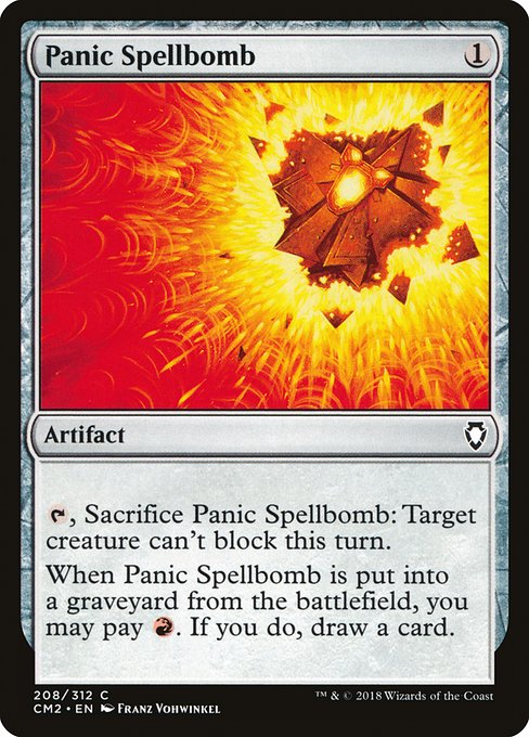
When you first glimpse Panic Spellbomb in the Commander Anthology II lineup, you’re struck by how a modest artifact can carry a whole moment of drama in a single frame 🧙♂️. Franz Vohwinkel’s brushwork transforms a tiny, unassuming device into a focal point that radiates tempo and risk. The piece, rendered in the 2015 frame system, leans into the red-tinged energy of the card’s color identity while staying true to the artifact’s function: a tempo play that can shut down a blocker and potentially draw you a card if you’re willing to pay the red price later 🔥. The result is a compact study in how art direction can amplify game feel without shouting. It invites you to lean in, imagine the moment just before combat, and savor the snap judgment of a swing gone right or wrong ⚔️.
In terms of composition, the image centers a small, gleaming artifact—a compact, almost jewel-like device—against a darker, slightly vignetted backdrop. The lighting is telltale Vohwinkel: crisp geometry, metallic edges catching highlights, and a warm glow that seems to emanate from within the object itself. This glow anchors the eye and communicates the card’s red-aligned risk-reward loop: activate now, deny an enemy’s blocks this turn, and if the moment passes, redeem with a flash of crimson energy later by paying {R} to draw a card. The color palette leans into amber and ruby tones, which not only scream red mana but also hint at the fiery temperament of a spell that can disrupt a plan in a blink 🧨.
The background plays a crucial supporting role. It’s deliberately understated, letting negative space breathe around the artifact. That space makes the metallic surfaces pop and gives the impression that the device exists at the edge of decision—one more tap, one more sacrifice, and the combat math could tilt dramatically. This is art direction that understands readability: the object is unambiguous, the focal point is clear, and the figure’s silhouette is instantly legible even when the card’s text is filled with details. Such clarity matters in a game where players scan dozens of cards per turn, and it’s a masterclass in ensuring that flavor and function align 🧭.
Oracle text: {T}, Sacrifice this artifact: Target creature can't block this turn. When this artifact is put into a graveyard from the battlefield, you may pay {R}. If you do, draw a card.
From a rules perspective, Panic Spellbomb is quintessentially red at heart: a compact mana investment that offers a tempo tool and a potential card advantage engine too. The art’s red glow reinforces that urgency—the artifact feels alive with the possibility of lashing out in the very next moment. The fact that this card is an uncommon but reprinted in a commander-set context underscores how art direction can elevate a simple object into an iconic piece within a larger strategy. The artist’s signature style—clean lines, deliberate specular highlights, and a sense of momentum—translates the card’s mechanical timing into a visual rhythm that players can feel as they glance at the battlefield 🧙♂️.
For aspiring art directors or hobbyists aiming to design similar artifact visuals, the Panic Spellbomb piece offers several actionable takeaways. First, establish a strong, singular focal point. The artifact’s silhouette and glow do the heavy lifting, allowing text blocks to sit comfortably around it. Second, leverage color as narrative—red hues can imply risk, urgency, and potential payoff, while the surrounding environment remains subdued to prevent sensory overload. Third, consider how lighting can imply motion or consequence; even a momentary spark can convey a lot about the card’s play pattern. And finally, respect the card’s lore by letting the artwork speak to its theme—this isn’t just a gadget; it’s a tool that treads the line between offense and defense, tempo and draw, all at once 🎲.
Collectors and players alike appreciate the continuity of presentation—the cm2 reprint maintains the same visual language you’ve come to associate with the Commander Anthology II era. The common rarity doesn’t diminish the art’s impact; if anything, it makes this piece a standout example of how strong composition and a keen eye for color can elevate even a low-cost artifact. The piece’s artist, Franz Vohwinkel, has long been celebrated for his ability to combine crystalline clarity with a sense of tactile materiality—the artifact’s metal surface feels real enough to touch, even in two dimensions. That tactile realism is a big part of the draw for fans, who often revisit these artworks not just for gameplay, but for the stories they remind us of when we first opened a pre-constructed deck and fell in love with a single card’s look 🧡.
Seeing Panic Spellbomb in situ during a game—where you announce a tap, gently smile at the sacrifice, and watch a crucial blocker fall away—reminds us why art direction matters as much as card text. It’s a reminder that Magic’s visual language can be as strategic as its rules. The art doesn’t just decorate the card; it informs your decisions, sets the tempo, and adds a layer of nostalgia that seasoned players carry with them to every match 🔥.
For fans who enjoy collecting a curated set of visuals along with their play strategy, this piece is a prime example of how a relatively simple artifact can be elevated through thoughtful presentation. The combination of crisp metallic detail, warm glow, and controlled composition makes it a card you want to study not only for the tactical choices it enables but also for the craft behind its creation. It’s the kind of artwork that makes you want to reach for the card, inspect the tiny details, and reminisce about the many battles where red mana—freewheeling and dangerous—has shaped the game’s memorable moments 💎.
Interested in physical display or fan-inspired gear? The product link below offers a playful bridge to everyday life—range from posters to practical accessories—bridging the aesthetic of the MTG multiverse with modern design. And if you’re curious about how visual storytelling crosses over into other creative fields, the five articles linked in the network section provide broader context—from AI’s impact on trading to storytelling-driven campaigns and myth-referenced designs 🎨.
Slim Lexan Phone Case for iPhone 16 Ultra-thin Glossy FinishMore from our network
- https://crypto-acolytes.xyz/blog/post/how-ai-is-transforming-crypto-trading/
- https://transparent-paper.shop/blog/post/brainstorm-profitable-digital-product-ideas-a-practical-guide/
- https://transparent-paper.shop/blog/post/story-driven-ad-campaigns-turning-viewers-into-loyal-fans/
- https://crypto-acolytes.xyz/blog/post/minecraft-spider-mobs-types-abilities-and-best-tactics/
- https://blog.digital-vault.xyz/blog/post/acolyte-hybrid-unveiling-real-world-myth-references/