
Image courtesy of Scryfall.com
Typography & Layout Deep Dive in MTG Card Design
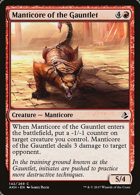
In the world of Magic: The Gathering, typography is more than decorative letters on a card—it's a language that communicates speed, threat, and intent before you even read the first line of rules text. The visual hierarchy guides your eye from mana cost to card name, from creature type to its abilities, all while the flavor text quietly sets the mood 🧙♂️. On a red creature like this one from the Amonkhet era, the typography isn’t just about legibility; it’s about conveying urgency, aggression, and a touch of desert-court drama. The result is a tactile reading experience that feels alive even when you’re staring at a printed sheet or a digital screen 🔥.
Let’s take a closer look at how the layout supports this particular card’s story. The mana cost sits up top, a blazing sequence of four colorless mana and one red symbol, signaling a mid-to-late-game burn creature with a respectable 5/4 body. The color identity is clearly red, which influences not just the tone of the text but also the surrounding frame and set icon. The card’s type line—Creature — Manticore—reads cleanly, with the flavor of a study-of-bestial-fierceness that matches the art by James Paick. The typography pairs with the art to create a sense of motion and heat, a synergy you’ll notice across the AKH block where script-like flavor and blocky rules text coexist without crowding the viewer 🧡🎨.
Design notes for this red behemoth
- Mana cost: {4}{R} (CMC 5) — a curious balance of high power with a cost that rewards tempo and risk. The way the red mana symbol is drawn and spaced helps readers identify the color identity at a glance, even in quick tabletop moments 🔥.
- Type and rarity: Creature — Manticore, common. In the AKH set, “common” doesn’t mean weak—these cards often rely on efficient play patterns and the right moment to swing for value. The font sizing for the name and the body text remains consistent with other commons, keeping the page uncluttered and readable 💎.
- Power/Toughness: 5/4 — a solid stat line that supports aggressive starts and midgame pressure, while the high-contrast layout makes the numbers pop so you don’t misread during a heated clash ⚔️.
- Abilities and text flow:
- “When this creature enters, put a -1/-1 counter on target creature you control.”
- “This creature deals 3 damage to target opponent or planeswalker.”
- Flavor text: “In the training ground known as the Gauntlet, initiates are pushed to practice more destructive techniques.” This line anchors the card in its world and adds a touch of lore that can influence how you view the creature’s role in a red-based deck—and in laid-out art, the flavor text often sits in a lighter, italicized stream that doesn’t overshadow the main rules text 🎭.
In layout terms, the card’s design is a study in contrast: bold, red-forward energy paired with a disciplined typography grid that keeps every word legible under pressure. It’s a small symphony of type and image, tuned to the cadence of a quick combat step 🧙♂️🎲.
Typography specifics and reader flow
Wizards’ internal typography guidelines emphasize readability at a glance. The name sits at the top with a distinct font weight to separate it from the rules text. The mana cost is right-aligned, an eye-catching cue that helps players assess tempo during deck-building and in-game decisions. The rules text uses a clear, compact type to fit on a single or two-line block depending on the card’s wording, with bolded keywords to help players quickly spot crucial terms. Flavor text, when present, is usually set apart in a lighter tone so it doesn’t confuse the primary reading path. The result is a card that feels fluent in motion—exactly what you want when you’re counting damage, planning a swing, or deciding whether to place a -1/-1 counter on a critical target 🔎.
From a collector’s viewpoint, the AKH set’s black bordered frames, nonfoil and foil finishes, and consistent type sizing create a cohesive visual identity. The illustration by James Paick is bold and cinematic, and the layout supports that artistry rather than competing with it. This harmony between art and typography makes the card feel complete in a way that’s satisfying to seasoned players and newcomers alike 🎨.
As a gameplay note, the combination of a 5/4 body with a meaningful enters-the-battlefield trigger makes it a versatile threat in red decks that want to push damage while applying pressure on the board. The -1/-1 counter on your own creature can be leveraged when paired with other cards in a broader red strategy, or simply used to keep your opponent guessing about what you’ll target next. Either way, the type, color, and layout read as a cohesive unit, letting players focus on tactics rather than deciphering text 🧩.
Clear Silicone Phone Case Slim Durable Open Port DesignMore from our network
- https://blog.crypto-articles.xyz/blog/post/nft-data-shadow-eagle-from-dead-golfers-society-collection-on-magiceden/
- https://blog.crypto-articles.xyz/blog/post/nft-data-midevil-1949-from-midevils-collection-on-magiceden/
- https://crypto-acolytes.xyz/blog/post/nft-stats-memilady-189-from-memilady-collection/
- https://blog.rusty-articles.xyz/blog/post/design-driven-custom-neoprene-gaming-pad-for-everyday-precision/
- https://blog.crypto-articles.xyz/blog/post/nft-data-mafiabits-1040-from-mafiabits-collection-on-magiceden/

Manticore of the Gauntlet
When this creature enters, put a -1/-1 counter on target creature you control. This creature deals 3 damage to target opponent or planeswalker.
ID: 82b6ece3-1574-4634-b940-829e54c4f78d
Oracle ID: 3ec1b67a-5ff8-4ce7-8388-d11a23f76f0e
Multiverse IDs: 426844
TCGPlayer ID: 130246
Cardmarket ID: 297188
Colors: R
Color Identity: R
Keywords:
Rarity: Common
Released: 2017-04-28
Artist: James Paick
Frame: 2015
Border: black
EDHRec Rank: 28358
Set: Amonkhet (akh)
Collector #: 142
Legalities
- Standard — not_legal
- Future — not_legal
- Historic — not_legal
- Timeless — not_legal
- Gladiator — not_legal
- Pioneer — legal
- Modern — legal
- Legacy — legal
- Pauper — legal
- Vintage — legal
- Penny — legal
- Commander — legal
- Oathbreaker — legal
- Standardbrawl — not_legal
- Brawl — not_legal
- Alchemy — not_legal
- Paupercommander — legal
- Duel — legal
- Oldschool — not_legal
- Premodern — not_legal
- Predh — not_legal
Prices
- USD: 0.03
- USD_FOIL: 0.10
- EUR: 0.02
- EUR_FOIL: 0.12
- TIX: 0.04
More from our network
- https://crypto-acolytes.xyz/blog/post/nft-stats-bonkfun-576-from-bonkfun-collection/
- https://crypto-acolytes.xyz/blog/post/bp-rp-color-327-traces-thick-disk-origin-at-25-kpc/
- https://articles.zero-static.xyz/blog/post/how-shaders-change-mangrove-sign-appearance-in-119/
- https://crypto-acolytes.xyz/blog/post/minecraft-rare-blocks-guide-find-them-all/
- https://blog.crypto-articles.xyz/blog/post/nft-data-garathos-shattered-169-from-risen-collection-on-magiceden/