Image courtesy of Scryfall.com
Typography and Layout: Reading a Three-Color Masterpiece through the Card’s Design Language
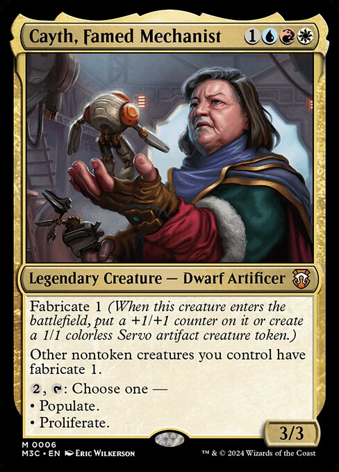
If you’ve ever spent a long afternoon rifling through set boosters, you know that a Magic card is as much a piece of graphic design as it is a playable spell. Cayth, Famed Mechanist from Modern Horizons 3 Commander is a vivid case study in how typography and layout work together to tell a three-color story in one compact frame 🧙♂️🔥💎. The tri-color mana cost — {1}{U}{R}{W} — sits at the top-right with a precision that makes it instantly legible, even when your brain is juggling stack orders and life totals. The bold, uppercase card name anchors your eye, while the three-color identity hints at the mechanical alchemy inside the card text. Graphic balance matters here: the colored mana symbols, the creature type line, and the ability blocks are arranged to lead you through the decision tree without breaking your train of thought 💡🎨.
The layout choices aren’t arbitrary. Cayth’s frame, a black-bordered Modern Horizons 3 Commander design with a classic 2015 frame, signals a bridge between nostalgia and modern complexity. The three color identities blend visually not just through the card’s mana symbols, but through the typographic rhythm as well: Fabricate, Populate, Proliferate — three keywords that carry tempo and strategy in equal measure. The type line “Legendary Creature — Dwarf Artificer” is a compact descriptor that immediately places Cayth in the pantheon of legendary builders, while the subtext of the abilities unfurls like micro-typography on parade. The font weight and spacing are tuned to keep readability high even with the heavy concept density of a commander card 🧩⚔️.
How the Textual Design Reflects Mechanical Flavor
The card’s ETB ability, Fabricate 1, is a canonical example of how a keyword can be both a gameplay mechanic and a typographic anchor. On entry, you either place a +1/+1 counter on Cayth or create a 1/1 colorless Servo artifact creature token. That choice is conveyed in two short phrases that balance conciseness with clarity. The line break between “Fabricate 1” and the two options creates a natural pause, guiding you toward the consequence: a stronger body or a sprightly token army. The subsequent line, “Other nontoken creatures you control have fabricate 1,” expands Cayth’s aura of fabrication to your whole board. This is where the layout shines: a single sentence expands the reader’s mental model of the battlefield, and it does so without forcing an extra mental leap. The result is a tactile sense of momentum baked into the typography 🧭🧰.
Then comes the punchy lines that define Cayth’s layered identity: “{2}, {T}: Choose one — Populate — Proliferate.” The colon introduces a choice, and the bullets are condensed into one crisp decision point. The word Populate immediately conjures tokens, while Proliferate promises a counters-based growth engine. The typography here emphasizes the multitiered decision space you must navigate in Commander games: do you flood the board with servo fodder or push counters across your team? The card’s color identity — red, blue, white — is not just a color aesthetic; it signals a spectrum of tempo, control, and value that Cayth unifies in a single package 🧪🎯.
Color, Craft, and Collectibility: What the Sandpaper-Smooth Text Sets Up
Three colors, three strategic axes, and a three-faceted design aesthetic. Red (R) adds aggression and chemistry; Blue (U) adds counterplay and calculation; White (W) adds order and value through enter-the-battlefield effects like Fabricate and Populate. The typography mirrors that triad: the names and mana icons stand out with a crisp, high-contrast presentation, while the abilities flow in a parallel structure that makes each option feel accessible in the heat of battle. It’s a reminder that a card’s font choices and layout don’t just decorate the page; they serve as a quick-handed translator of complex rules into an intuitive, on-table experience 🎲.
In the lore of Cayth, the Famed Mechanist, the craft of building is as much about legible system as it is about gleaming invention. The art by Eric Wilkerson captures a tinkerer’s ethos, and the on-card attributes — power 3, toughness 3, and the legendary frame — are harmonized by a tidy text block that’s easy to scan during a crowded board state. This is design that respects both the veteran player and the curious new entry, a dual audience that Modern Horizons 3 Commander seems to court with a confident, almost artisan’s hand 🛠️🎨.
Play Patterns and Typography in Action
Strategically, Cayth leverages Fabricate to prime a board with Servo tokens and then leverages Populate and Proliferate to scale your position. Populate can double down on your Servo tokens, creating a swarm that your opponents must answer, while Proliferate turns the +1/+1 counters from any Fabricate-friendly creatures into a growth engine across the battlefield. The card’s layout supports this tempo swing: a compact first line for ETB, a bold reframe for “Other nontoken creatures you control have fabricate 1,” and a decisive, bold ability line for the {2}, {T} activation. The reader’s eye travels smoothly from card to moment to potential play, and that is the magic of well-executed typography in tabletop design 🧙♂️⚙️.
For collectors and players who prize synergy and story, Cayth is more than a combo piece — it’s a narrative in motion. The mythic rarity signals its rarity on the table and in the bindery, with foil and nonfoil finishes offering tactile reminders of the card’s value in a deck built around tempo and growth. As you scan the text and imagine the battlefield, you can almost hear the clink of gears and the whisper of servo motors — a fitting soundtrack for a machine artist who can turn tokens into a tide and counters into a chorus 🎶💎.
In the end, this card is a case study in how typography and layout support a three-color, multi-mechanic engine. Cayth, Famed Mechanist demonstrates that great card design doesn’t shout; it guides. It makes the complex feel approachable, the colors feel cohesive, and the mechanics feel inevitable once you’ve parsed the lines. That’s the truly elegant craft behind a legendary creature that can turn a battlefield into a workshop, one servo at a time 🧰🎲.
Neon Foot-Shaped Mouse Pad with Ergonomic Memory Foam Wrist RestMore from our network
- https://transparent-paper.shop/blog/post/designing-standout-business-card-templates-for-freelancers/
- https://blog.digital-vault.xyz/blog/post/junktown-memes-laughs-from-a-junkyard-artifact/
- https://blog.digital-vault.xyz/blog/post/reckless-reveler-optimal-red-aggro-archetypes-for-mtg/
- https://blog.digital-vault.xyz/blog/post/martyrs-of-korlis-enchantment-and-artifact-interactions-explored/
- https://crypto-acolytes.xyz/blog/post/preventing-minecraft-multiplayer-griefing-tips-for-secure-servers/