Image courtesy of Scryfall.com
Design Language and Rarity: Krark's Thumb as a Case Study
Magic: The Gathering thrives on a careful choreography between playability, flavor, and the quiet drama of rarity. Designers and fans alike read rarity indicators the moment a card is revealed in a new set. The visible cues—expansion symbol, color of the rarity mark, foil treatment, and even the card frame—are more than cosmetic: they signal expectations about power level, scarcity, and collectibility. Krark's Thumb, a legendary artifact from Mirrodin, sits at an interesting nexus of those cues. Its rarity, encoded in gold, tells you you’re getting something distinctly valuable in a set that prizes artifact synergy, mechanical experimentation, and goblin chaos. 🧙♂️🔥💎⚔️🎲
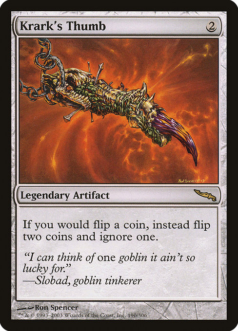
Krark's Thumb costs 2 mana and bears the overhead of a legendary artifact, a strategic centerpiece in many coin-flip or randomness-centric decks. The card text—“If you would flip a coin, instead flip two coins and ignore one.”—is a deceptively elegant design choice. It elevates randomness from a player's private gamble to a shared, sometimes chaotic experience. The rarity indicator aligns with that ambition: rare artifacts in Mirrodin carried a sense of prestige and cautionary power, just enough to spark debates about deck building without tipping the balance into outright brokenness. The flavor text, "I can think of one goblin it ain't so lucky for." by Slobad the goblin tinkerer, reinforces the card’s humorous, tinkering-with-chance theme and invites players to lean into the unpredictable. 🎨💎
“I can think of one goblin it ain't so lucky for.” — Slobad, goblin tinkerer
From a gameplay perspective, the rarity language here is more than a badge. It communicates the card’s role in a metagame where coin-flipping spells and random outcomes can swing games in multiplayer formats. Krark's Thumb is frequently paired with other coin-flip sources or gadgetry that reshapes probability, turning ordinary flips into double or nothing propositions. The rarity cue helps players calibrate expectations: you’re not just paying 2 mana for an artifact—you're inviting a strategic experiment with real value in the right decks. 🧙♂️🎲
Additionally, Krark's Thumb illustrates a design language where simplicity of cost and a clear, crisp effect interact with rarity to create lasting impressions. The card text is short, deterministic in its rule interaction, yet the outcome is inherently dynamic and highly variable. That balance—easy to understand, hard to master—maps neatly onto how designers use rarity to frame a card within the broader ecosystem of Mirrodin’s artifact strategy and beyond. The result is a familiar yet fresh experience, one that rewards experimentation and clever sequencing. 🔥⚡
Rarity as a Narrative Marker
In the broader context of MTG, rarity indicators serve as narrative markers in a sprawling multiverse. A gold rarity symbol signals “this is a rare moment”—an adventure that might tilt a match just enough to be memorable, but not so often that it becomes a routine shot in the dark. Krark's Thumb embodies that promise: a rare artifact designed to catalyze thrilling, uncertain outcomes rather than provide a straightforward tempo advantage. The Mirrodin era’s metallic aesthetic, the black-bordered frame, and Ron Spencer’s distinctive line work all converge to deliver a collectible that feels as much like a puzzle piece in a larger story as it does a playable card. The foil variant, when present, amplifies this narrative by catching the light and echoing the card’s metallic theme. 🔎🔧
For designers, Krark's Thumb offers a compact template: a two-mana artifact with a probabilistic twist that scales with the game’s complexity. The rarity language mirrors that template, ensuring players can gauge risk, value, and potential synergy at a glance. The set’s iconography—its gold rarity symbol, its aligned art direction, and its flavorful text—works together to communicate power in a way that feels earned rather than handed. This is the essence of MTG’s design language: clarity in complexity, and a playful wink to players who enjoy math, probability, and a little arcane mischief. 🧙♂️💎🎲
As we consider design language in an era of increasingly sophisticated digital interfaces, Krark's Thumb remains a reminder of the tactile charm of physical rarity cues. The card’s artwork, signature, and print treatment all echo the same principle: rarity is a signal not just of scarcity, but of the story you’re about to tell with the card in play. The effect on gameplay is immediate—your deck’s trajectory can hinge on a single coin flip—but the effect on culture is long-lasting: Krark's Thumb is a touchstone for discussions about randomness, balance, and the playful chaos that makes MTG so enduring. 🧙♂️🎲💎
Speaking of crafting experiences, if you’re into blending bold aesthetics with tabletop strategy, you might enjoy how physical space can mirror MTG’s design language. A neon mouse pad, for instance, becomes a practical canvas for organizing your play area while echoing the vibrant, high-contrast vibes you might associate with rare artifacts. The product featured here—Custom Neon Rectangular Mouse Pad 9.3x7.8 in—pairs nicely with the card’s spirit of bold, kinetic energy, and it’s a fun nod to how design language translates from card text to desk and display. 🔥🎨
Custom Neon Rectangular Mouse Pad 9.3x7.8 inMore from our network
- https://blog.digital-vault.xyz/blog/post/how-to-create-editable-business-templates-for-teams/
- https://blog.digital-vault.xyz/blog/post/interstellar-extinction-mapped-from-bp-rp-color-index-277-at-268-kpc/
- https://blog.digital-vault.xyz/blog/post/the-future-of-meta-aware-card-design-for-liberating-combustion/
- https://transparent-paper.shop/blog/post/luxurious-digital-paper-for-branding-designers/
- https://blog.digital-vault.xyz/blog/post/heaped-harvest-power-scaling-across-mtg-sets/