Image courtesy of Scryfall.com
From White Borders to Modern Frames: The History Behind MTG Card Frame Design
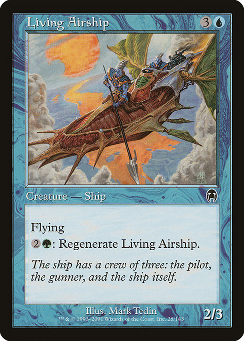
Magic: The Gathering has always been as much a visual journey as a gameplay one. The evolution of card frame designs is a quiet, persistent thread that shapes how we experience a card’s power, flavor, and history. When you flip a Living Airship from Apocalypse, you’re not just reading a 4-mana blue-green flyer with a dash of regeneration—you’re peeking into a snapshot of the late-1990s design language that many players still nostalgically associate with the game’s early modern era 🧙♂️🔥. The card’s frame—noted as “1997” in most databases—hints at a transition period when Wizards of the Coast was balancing readability, art space, and the evolving sense of what a card should “feel” like in hand and on the table 📜🎨.
In the world of MTG frames, optics matter. Living Airship is a creature from Apocalypse (APC), with the iconic mana cost {3}{U} and a compact stat line: a 2/3 flyer that can be regenerated for {2}{G}. The 1997 frame around this design tightens the silhouette: the artwork claims a slightly larger share of the card, the mana symbols sit confidently in their native boxes, and the text box remains legible without stealing the visual drama from Mark Tedin’s illustration. This balance—art, name, type line, and flavor—helped set a standard that many players remember fondly even as newer frames arrived. The frame’s dark border and the layout conventions improved ability to quickly parse a card in the heat of play, which is no small feat when tempo and subtle trickery define so many blue and green strategies 🧭⚔️.
“The ship has a crew of three: the pilot, the gunner, and the ship itself.” — flavor text on Living Airship
That flavor text, along with the card’s Metathran identity, sits in a frame that invites close study. The Metathran creatures, shaded with cool blues, exemplify the era’s fascination with velocity, flight, and clever utility. Living Airship’s flying ability is the archetypal tempo engine for a blue-tinged deck, while its regeneration cost—{2}{G}—hints at a favorable alliance with green mana that could grease the wheel for durable defenses or surprising breakthroughs mid-game. In practice, this card rewards careful sequencing: you tempo an opponent with aerial pressure, then reinforce your defenses or push through with a late-game inevitability. The interplay between blue’s evasion and green’s resilience is perfectly embodied in the card’s design and its frame’s philosophy 🧙♂️🎲.
As MTG moved through the 2000s, frame tweaks began to reflect broader shifts in production, printing, and accessibility. The Apocalypse print of Living Airship sits in a period where Wizards balanced the classic white space aesthetic of the 1990s with the darker chrome of a modern look. The black border around the art and text boxes is not merely cosmetic; it frames color and cadence—the eye’s guide through the complexity of mana costs, abilities, and flavor. In practical terms, this mattered for playgroups that valued speed and clarity: a quick glance tells you the card is a blue-splash creature with a regeneration option, even when other details crowd the layout. That visual clarity is a direct descendant of the 1997 design ethics—maximize readability while respecting the art’s emotional charge 🔍💎.
Living Airship is a common rarity, but the foil version—where it exists—offers a tactile reminder of how far the hobby has come from single-slab card stock to glossy foils with nuanced finishes. Scryfall’s data shows a tangible gulf between nonfoil and foil pricing, a signal that frame era, rarity, and presentation all conspire to make certain prints collectible beyond their raw power. The 1997 frame’s long tail effect—how it ages gracefully into a game’s vernacular—helps explain why APC-era cards, including Living Airship, retain a quiet charm for both collectors and players who love a well-balanced, historically aware play space 💎🔥.
For those who study deck design, Living Airship is a compact case study in how a card’s physical presentation can influence strategic perception. The blue mana in the cost leans into tempo and control archetypes, while the green regeneration clause offers a resilient pivot in long games or amidst token-laden boards. The art by Mark Tedin—a name frequently associated with the richer, more saturated aesthetic of the late 1990s—complements the frame’s mood: a retro-futurist airship that feels both adventurous and slightly gritty. You can almost hear the creak of the hull and the distant rattle of rigging as the ship glides over a sea of ink and imagination 🧙♂️🎨.
In the broader arc of MTG, frame evolution has become a topic of fascination for players who care about narrative continuity as much as mechanical balance. The move toward more uniform typography, clearer mana icons, and gradually refined creature silhouettes was a response to feedback from long-time players who remembered the earlier eras’ idiosyncrasies. Yet the 1997-era frames—the ones that wrap Living Airship—are beloved for their bold confidence and timeless feel. They remind us that a well-designed card is not just a tool for the battlefield; it is a piece of the game’s storied culture, a relic that still feels fresh when you pull it from a binder and slip it into a favorite cube or casual two-player match 🧙♂️💎.
As you curate your own MTG space, small touches matter as much as every draw step. A crisp, responsive playing surface—like the Gaming Mouse Pad 9x7 Custom Neoprene with Stitched Edges—can elevate the experience of poring over the frame history as you draft or reminisce about APC’s era. The pad’s stitched edges and durable surface are a modern counterpoint to a card that has survived decades of tabletop lore, a reminder that design—whether on a card frame or a functional accessory—ages with care and intention. If you’re chasing that perfect blend of nostalgia and practicality, the synergy is clear: frame design informs perception; peripherals enhance play; and Living Airship stands as a beacon of both 🧙♂️🔥.
Why frame design still matters today
- Readability over time: A frame that preserves contrast between text, mana costs, and artwork helps new players pick up the game faster and older players reminisce with clarity.
- Art-space balance: The art increasingly occupies a crown jewel role on the card, inviting you to study the illustration without sacrificing important rules text.
- Collectors’ attention: Frame variants often accompany foil options, border colors, and printing quirks that deepen a card’s collectibility and narrative aura.
- Story through design: Frames become a timeline—signaling shifts in printing technology, typography, and the visual language of MTG’s evolving multiverse.
- Continuity in chaos: Even with dramatic mechanical evolutions, a card like Living Airship anchors players with familiar cues—flying power, a regen option, and a flavorful flavor text that hints at a world where airships and strategems sail hand in hand 🧙♂️⚡.
Five paths via our network
Explore related discussions on visuals, symbolism, and game design across our network—and keep an eye out for the threads that connect older frames with modern play styles:
- https://transparent-paper.shop/blog/post/create-youtube-thumbnail-templates-that-sell-consistently/
- https://blog.digital-vault.xyz/blog/post/unraveling-silver-border-symbolism-in-douse-parody-sets/
- https://crypto-acolytes.xyz/blog/post/dr3-reveals-a-hot-star-illuminating-galactic-archaeology/
- https://blog.zero-static.xyz/blog/post/predictive-data-enhances-unliving-psychopath-deckbuilding/
- https://crypto-acolytes.xyz/blog/post/the-evolution-of-sandbox-mechanics-in-game-design/
To celebrate the balance of history and modern craft, dive into the APC-era vibes and let the frame design talk while you play. 🧙♂️🔥💎⚔️🎨🎲