Image courtesy of Scryfall.com
Typography and Layout: A Deep Dive into MTG Design Elements on a Black Creature
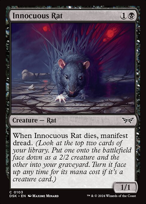
The moment you flip a card like Innocuous Rat, you’re not just reading a line of text—you’re reading a story in a carefully arranged visual language. This little Rat from Duskmourn: House of Horror (set type: Duskmourn, frame 2015, rarity: common) showcases how typography, framing, and text boxes work together to cue mood, mechanic, and strategy all at once. 📜🧙♂️ The card costs {1}{B}, belongs to the black color identity, and stats in at a humble 1/1. But its design speaks volumes about how MTG layouts encode noir-ish dread even before you parse the rules text.
Naming, mana cost, and the frame’s silhouette
Right away, Innocuous Rat presents the classic black mana identity with a crisp mana cost—one colorless and one black symbol—set against a deep, inky aesthetic. In the Duskmourn release, the frame leans into horror-tinged elegance, using a black border and a slightly heavier name band to anchor your eye before your brain processes the card’s function. The name itself sits atop a field that is intentionally legible at a glance, so you can confirm at a glance that this is a Rat creature, not a spell or artifact. The surrounding frame—dark, textured, with hints of baroque ornament—speaks to the set’s mood: a cathedral of creeping dread where even small creatures carry big implications. Manifest dread isn’t just flavor text here—it’s a pointer to the mechanic that shapes your top-deck strategy. ⚔️
The text box: readability, rhythm, and the spread of meaning
Open the text box, and the inked lines march in a predictable rhythm that MTG designers have refined over decades. The primary rules text reads: “When this creature dies, manifest dread. (Look at the top two cards of your library. Put one onto the battlefield face down as a 2/2 creature and the other into your graveyard. Turn it face up any time for its mana cost if it's a creature card.)” The wording is compact, but it’s the layout that makes it sing. The parenthetical expands into a second layer of meaning—hinting at deck-building decisions and how you pace your play. The balance between the death trigger and the manifest mechanic becomes a dance of timing: you’re not just dealing with a 1/1 on the board; you’re orchestrating a future board state that hinges on your top-deck luck and your ability to flip a face-down 2/2 into something monstrous later. The line breaks and punctuation mirror a tempo that rewards careful reading and tactical foresight. 🔎
When this creature dies, manifest dread. (Look at the top two cards of your library. Put one onto the battlefield face down as a 2/2 creature and the other into your graveyard. Turn it face up any time for its mana cost if it's a creature card.)
The manifest keyword—introduced to support the top-deck manipulation—appears here as a thematic and mechanical hinge. The text box uses a slightly tighter line length, ensuring that the information remains legible even at common print sizes. The card’s mana cost and color cues are positioned to minimize cognitive load: you see the cost, your eye moves to the creature type line, and immediately you’re oriented toward the rule text. In a set as atmospheric as Duskmourn, that clarity is a feature, not a flaw. It’s what keeps players from flailing in the late game when a cascade of face-down 2/2s could become a torrent of surprise threats. 🎨
Art direction and flavor against mechanics
Maxime Minard’s illustration for Innocuous Rat leans into the creeping, almost clinical feel of a guildless horror. The art’s palette—muted browns, pale highlights, and shadowy lines—plays off the black frame to emphasize the rat as a quiet antagonist in the game’s micro-drama. The flavor text on a card in Duskmourn often isn’t literal; it’s atmospheric shorthand for what a deck’s strategy will feel like in practice. Here, the rat’s unassuming appearance belies the hidden engine of manifest dread that unfolds when it dies. The contrast between the small creature’s modest base stats and the big-picture impact of its death trigger mirrors the tension between typography’s efficiency and the lore’s mood. It’s a reminder that good card design is as much about what the eye processes quickly as what the brain processes later. 🧙♂️💎
Strategic ripple effects: how typography serves gameplay
From a gameplay perspective, Innocuous Rat fits into a category of black creatures that reward misdirection and tempo. The shared line with manifest dread means your deck can leverage top-deck manipulation to set up a favorable play on turn four or five, turning a modest 1/1 into a battlefield that’s primed for a surprise flip. The cost, rarity, and mana curve are all aligned to keep this card accessible in standard and historic environments, while the art and frame help it stand out when you’re sorting through a cluttered binder or a crowded board. The design ethos here is that typography and layout aren’t just about aesthetics; they’re a silent co-pilot guiding players toward the card’s most impactful moments. 🪄
Collectibility, value, and the tactile experience
As a common in a 2015-frame set with a horror twist, Innocuous Rat isn’t a weighty financial bet—but it’s a perfect example of how a creature can feel “special” through consistent print quality and memorable keywords. The card’s foil option (and non-foil variant) adds a pinch of shimmer to the same expressive frame, with prices hovering in the pocket-size range for binder staples. The art, the mechanic, and the text box all contribute to a cohesive experience that collectors remember, long after a draft is done. The tactile delight of turning over a face-down 2/2 and realizing it’s actually a creature card is a classic MTG moment—one that makes the typography sing even louder in the heat of the game. 🔥🎲
For readers who want a closer look at Innocuous Rat, Scryfall hosts the card page and artwork, including the 2015 frame notes and the Duskmourn set context. If you’re a table photographer or a layout nerd, you’ll notice how the card’s typography and framing keep the focus on the rules text while letting the art do the heavy lifting on mood and theme. And if you’re building a gaming setup that doubles as a reading nook, you can do it in comfort thanks to ergonomic gear that keeps you in the zone between rounds.
Ergonomic Memory Foam Wrist Rest Mouse Pad — Foot ShapedMore from our network
- https://transparent-paper.shop/blog/post/designing-digital-paper-that-evokes-emotion/
- https://crypto-acolytes.xyz/blog/post/the-true-cost-of-operating-a-solana-node/
- https://blog.digital-vault.xyz/blog/post/unyielding-gatekeeper-flavor-driven-lore-behind-the-gate/
- https://crypto-acolytes.xyz/blog/post/craving-coins-the-psychology-behind-virtual-currency-purchases/
- https://transparent-paper.shop/blog/post/youtube-shorts-vs-tiktok-ads-which-wins-for-brands/