Image courtesy of Scryfall.com
Design constraints of Un-set visuals meeting Hagra Sharpshooter
Magic: The Gathering has long thrived on a spectrum of visual language, from the grim, mythic vibes of its traditional fantasy to the playful, tongue-in-cheek vibes of Un-sets. The Un-set path—think Unglued, Unhinged, and their successors—leans into humor, self-referential jokes, and sometimes deliberately quirky art. Those constraints aren’t just about jokes; they shape how a card’s appearance communicates rules, tone, and memory. Silver borders, winking character poses, and bold typographic flourishes become the shorthand by which players instantly gauge the “fun” of a card before the rules text even lands. This design philosophy—tight, playful, and legible under a comic lens—creates a distinctive pressure test for any real-set card that hopes to feel both serious and iconic. 🧙♂️🔥💎
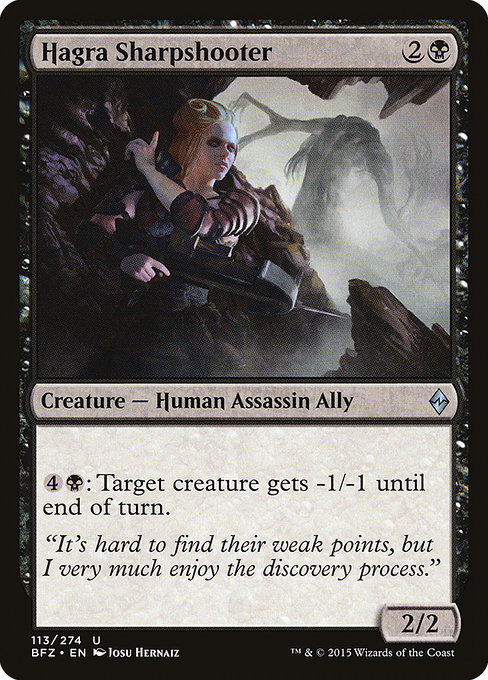
When we zoom in on a card like Hagra Sharpshooter, a few questions crystallize: how do you visually convey a silent, calculating assassin while keeping the image accessible to a broad audience? How does the flavor text—“It’s hard to find their weak points, but I very much enjoy the discovery process.”—play into a look that is menacing without leaning into gratuitous darkness? And how would Un-set visual constraints inform such a card if Wizards were to reinterpret it in a silver-bordered experiment? The answers reveal a careful balance between silhouette, color cues, and typographic restraint. ⚔️🎨
Un-set constraints in practice: what designers chase and what they avoid
- Clarity over clutter: Un-sets favor quick readability because the humor often hinges on a single joke or mechanic. A card like Hagra Sharpshooter uses a straightforward ability, so the art must communicate a poised threat at a glance, not a chaotic collage.
- Humor with restraint: Visual gags exist, but they don’t derail the hierarchy of information. If Hagra Sharpshooter were reimagined under Un-set constraints, you’d expect subtle nods—perhaps a sly smile or a wink in the stare—rather than a slapstick moment.
- Border and typography discipline: Un-sets use silver borders and distinctive typography to signal a lighter, experimental tone. For a BFZ-era card anchored in black mana and menace, the visual language would pivot on high-contrast shading and a crisp, legible font for the reminder text to keep the card’s seriousness intact even within a playful frame.
- Iconography that reads quickly: The card’s stat line and mana cost should be legible even with a playful frame. Hagra Sharpshooter’s 2/2 body and 2B mana cost should be immediate to the eye, while the attack-ready silhouette of a poised assassin communicates intent without words.
- Flavor through restraint: The flavor text of Hagra Sharpshooter is a compact character beat. In an Un-set treatment, designers might lean into a pun or meta-joke, but the core flavor could still land in a way that respects the card’s noir-esque vibe.
In essence, Un-set visuals teach designers to emphasize silhouette, tone, and readability while sprinkling in sly, self-aware humor. The effect ripples outward: even a card rooted in a dark, disciplined theme—like Hagra Sharpshooter—benefits from a design approach that makes its menace feel earned, not overwhelmed by whimsy. 🧩🎲
Hagra Sharpshooter in BFZ: how measured design carries the day
Hagra Sharpshooter is a black-aligned creature from Battle for Zendikar, a set that trades some of the gothic intensity for a gritty survival mood amid Zendikar’s terrain-of-battle chaos. The card’s mana cost of 2 and a black mana commitment (2B) places it squarely in the midrange: three mana to deploy a 2/2 with a single-pump ability that piles on temporary removal. The flavor text hints at a methodical hunter who loves the puzzle of an adversary’s weaknesses, not the thrill of a flashy takedown. This restraint matters in the design language: the card communicates a poised, calculating killer, not a bombastic showpiece. The art, by Josu Hernaiz, leans into a stark, shadow-heavy silhouette that speaks to stealth and precision, while keeping the composition clean enough for quick battlefield reads. In short, BFZ’s design ethos—tough, practical, and grounded—finds a quiet home in a card whose power is in the choice and timing of a -1/-1 swing rather than a flashy dice roll. ⚔️🖤
From a collector’s viewpoint, Hagra Sharpshooter’s uncommon rarity and its reasonable foil price point—roughly a few dollars at market—underscore a design that rewards playability and flavor over limited-run novelty. The card’s balance and repeatable utility—especially in multiplayer formats where tempo is king—align with a visual strategy that favors clarity and menace. The art communicates the idea without resorting to gory spectacle, a nod to both the card’s noir mood and the broader design discipline that anchors BFZ. The tail of that discipline is a reminder: great visuals in MTG don’t shout; they whisper, and when you listen, you hear a plan. 🧠💎
Seeing the promo synergy: a product tie-in and the ways it fits fans’ journeys
Magic fans often curate their own sets of collectibles, and cross-promotional items—like any featured accessory—can deepen immersion. The product linked below is a modern tribute to sleek, protective gear for everyday magic fans who want to keep devices safe while showcasing their passion for the multiverse. The idea of pairing a strategic, low-key card like Hagra Sharpshooter with a premium phone case is a playful nod to how collectors layer real-world keepsakes with in-game lore. The design conversation mirrors that blend: clean aesthetics, smart materials, and a touch of mystique. 🧙♂️🎨
Product link: iPhone 16 Slim Phone Case Glossy Lexan Ultra-Slim
More from our network
- https://blog.digital-vault.xyz/blog/post/nyxborn-courser-token-decks-crafting-endless-tokens/
- https://blog.digital-vault.xyz/blog/post/lumbering-laundry-planeswalkers-dive-into-fanfiction/
- https://crypto-acolytes.xyz/blog/post/before-digital-stores-how-indie-creativity-took-root/
- https://blog.digital-vault.xyz/blog/post/how-to-create-viral-tiktok-challenges-that-catch-on/
- https://crypto-acolytes.xyz/blog/post/rediscover-golden-axe-the-arcade-hack-and-slash-classic/