Image courtesy of Scryfall.com
The Shadow Play: Looming Shade and Magic 2010's Visual Identity
When you crack open a deck from Magic 2010, the promise isn’t just about reliable reprints or a checklist of keywords—it’s about a design language that feels timeless, accessible, and a touch moody. Looming Shade, a common black creature with a modest mana cost of {2}{B} and a 1/1 body, embodies that balance beautifully 🧙♂️. The set’s visual identity leans into the core idea of Magic: the familiar, reimagined with crisp lines, clear silhouettes, and mood that lingers after the playmat is quiet again. The shade’s presence is a quiet menace, a shadow that feels almost inevitable rather than flashy—a guiding thread through the darkness that black mana often represents. The flavor of the art supports the color identity: a creature born of gloom, ready to swing into action when the moment is right 🔥.
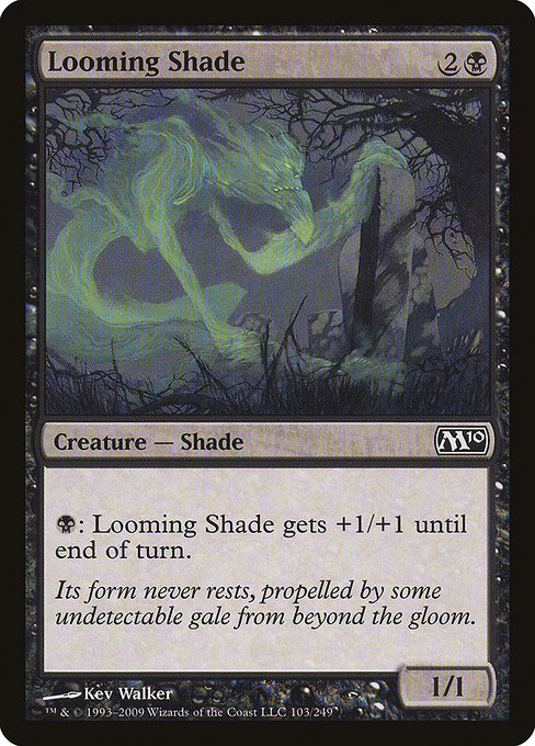
Kev Walker’s art for Looming Shade captures a creature that seems to slide out of the frame, a nameless silhouette whose edges blur into the surrounding darkness. The palette sticks to muted tones—black, charcoal, and shades of gray—so that the creature feels as if it were drawn from a dim corridor rather than a sunlit battlefield. That restrained approach is quintessential to M10’s aesthetic: it favors legibility and atmosphere over excessive flourish, making each card readable at a glance while still offering a narrative for those who linger over the artwork 🎨. The image’s negative space matters; you can almost sense a draft, a breeze from beyond the gloom—a nod to the flavor text’s suggestion of an unseen gale propelling the form forward ⚔️.
Its form never rests, propelled by some undetectable gale from beyond the gloom.
Mechanically, Looming Shade is the embodiment of a black tempo creature: it arrives for a reasonable cost, trades a strong stat line for board presence, and then offers a subtle boost with the activated ability “{B}: This creature gets +1/+1 until end of turn.” That line of text plays with the concept of shade—fleeting power that can surge in darkness, then recede as the shadows gather again. In practice, you’re often looking to leverage that temporary pump to push through a key point of damage or to trade efficiently, all while the target remains in the shadows behind your lines. The art mirrors this: a creature who seems to be leaning forward into the moment, ready to slip back into the shade as soon as the threat is neutralized 💎.
Core sets like Magic 2010 carry a particular cultural memory: they’re about teaching the game’s fundamentals with a sense of continuity. Looming Shade’s design aligns with this mission. It’s simple to understand for new players (a color-identity black creature with a single activated pump), yet it rewards experienced players who appreciate the subtleties of mood conveyed by the artwork. The contrast between the dark figure and the soft, ambiguous backdrop helps ensure the card remains approachable on first glance while still resonating on a narrative level for long-time fans 🎲. In that sense, Looming Shade isn’t just a card; it’s a small portrait of what black mana feels like when you’re learning the game and when you’re revisiting it years later ⚔️.
From a collectible perspective, Looming Shade’s status as a common card in a widely printed core set makes it a familiar, affordable piece for many collectors. The foil variant adds a bit more gloss to Walker’s moody work, while the nonfoil print keeps the design accessible. The set’s overall identity—clean borders, readable art, and a focus on mood and silhouette—helps this card age gracefully. The lore around shades and their ephemeral power resonates with the flavor text and the quiet menace that shadowy creatures bring to the table, reinforcing why black remains a cornerstone of the multiverse’s character design 💎.
Set identity in art: why the silhouette matters
In the broader tapestry of Magic’s sets, a card like Looming Shade serves as a microcosm of visual storytelling. The silhouette approach here isn’t about hiding complexity; it’s about inviting imagination. The viewer fills in the gaps: what is this shade’s origin? What gloom does it serve, and what dawn might threaten it? That collaborative space between art and player imagination is a hallmark of MTG’s design ethos, and Magic 2010 uses it to great effect. The result is a set that feels unified—cards share a mood that’s anchored in the familiar yet designed to spark curiosity 🔥.
As we celebrate the art, we also celebrate the craftsmanship that goes into the set’s presentation. Looming Shade demonstrates how the simplest forms—shaped by light and shadow, bound by a limited color palette—can carry weight beyond their stats. The card’s art doesn’t shout; it whispers, and seasoned players lean in to listen. That’s the power of a well-curated set identity: it becomes a language you hear every time you draw the card, a reminder that magic is as much about atmosphere as it is about mechanics 🎨.
For readers who are balancing MTG with design sensibilities, Looming Shade offers a case study in synergy between illustration, color theory, and game physics. Its black mana foundation, the 3-mana cost for a 1/1, the instantaneous pump—all are grounded in a visual language that communicates clearly and resonates emotionally. It’s a reminder that great card art isn’t merely decorative; it’s a catalyst for strategy and storytelling alike 🧙♂️🔥.
Rugged Phone Case 2-Piece Shield