Image courtesy of Scryfall.com
Harbor Guardian and the Language of Visual Tone
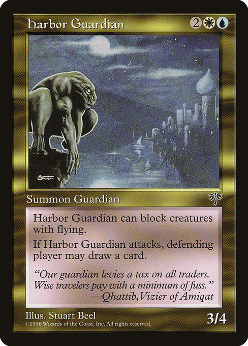
Magic: The Gathering has always trusted its audience to read mood in color, line, and light as much as in numbers and keywords. Harbor Guardian, a blue-white Gargoyle from Mirage, is a perfect case study in how visual tone enriches gameplay emotion. With a mana cost of {2}{W}{U}, this uncommon creature embodies the balance between calculated defense and opportunistic offense—the two colors in MTG that often dance around risk and control. The art, the frame, and even the tiny details of the card’s layout work in concert to tell you what kind of game you’re about to have before you even read the first line of rules text 🧙♂️. It’s a whisper from the perched guardian: cool, calm, and ready to twist the tempo of the match.
Color, Theme, and Emotion
Blue and white in Mirage evoke organized order, maritime lore, and disciplined guardianship—the perfect backdrop for Harbor Guardian. The card’s two-color identity signals safety nets and options, not explosive aggression. When you see the Reach keyword, you immediately sense a tempo that wants to cage enemies while keeping your backline intact. The flavor text, "Our guardian levies a tax on all traders. Wise travelers pay with a minimum of fuss," reinforces the emotional texture: an omnipresent watchfulness that rewards patient, thoughtful play. The art direction—gargoyle form, harbor backdrop, and restrained color palette—feeds a feeling of tactful pressure. This isn’t a thunderbolt moment; it’s a lane-control moment, a breath held as the battlefield tilts inch by inch 🔎🎨.
Gameplay Rhythm and Visual Cues
Harbor Guardian’s combat dynamic is a study in perceived risk. It’s a 3/4 flier-reicher who also has Reach, meaning it can block creatures with flying while threatening ground-based charges. The most evocative part of its text is the attack-triggered draw: when it swings, the defending player may draw a card. That simple line creates a narrative rhythm. The defender contemplates back-and-forths—do I trade, do I draw, do I fire back with a spell that redraws the situation? The two-color palette reinforces the idea that information is a resource to be managed, not a weapon to be unleashed haphazardly. Your opponents feel the beat of the tempo bubble every time Harbor Guardian declares an attack, and that emotional cadence can tilt decisions before the math even crunches 🔥⚔️.
Design, Iconography, and Collectibility
From a design perspective, Harbor Guardian sits at a delicious intersection of function and flavor. Its mana cost keeps it affordable in early to mid-game stages, while its power and toughness give it staying power on the board. The rarity is uncommon, which aligns with Mirage’s broader design goals: cards that bring meaningful value without price-tag chaos. The two-color identity—blue and white—appears in tandem with the gargoyle archetype, a creature type that invites both caution and admiration. The artwork by Stuart Beel captures the era’s sense of maritime mystique: clean lines, practical armor, and a harbor’s glow that suggests both opportunity and peril. Even the card’s border color and the modular frame of the 1997 design language evoke a period when players learned to read the battlefield as much by art direction as by numbers. The result is a card that feels deliberate, collectible, and deeply nostalgic in the best way 🧭💎.
Visual Tone as a Strategic Compass
Visual tone isn’t ornamental; it’s a strategic compass. The Mirage era favored crisp, legible art with a pragmatic approach to color, so players could quickly parse threats and opportunities. Harbor Guardian embodies that ethos: the art communicates maritime vigil, the color pairing invites controlled pace, and the stat line promises a sturdy, punishing when supported by the right spells and creatures. In practice, this means building around Harbor Guardian with protection, card-draw synergy, and tempo-based blue-white control play patterns. The emotional payoff—the moment you swing and your opponent contends with both the card draw and the potential of a clean combat outcome—is the heartbeat of the card’s enduring appeal 🧙♂️🎲.
If you’re chasing that Mirage vibe beyond the table, you can carry a piece of the harbor with you in more than just memory. A sleek, protective phone case can be part of your MTG ritual, echoing the clean, purposeful lines of early-’90s artistry. For fans who love the melding of form and function, a Slim Glossy Polycarbonate Phone Case for iPhone 16 provides a modern-day canvas that respects minimalist design while keeping your device safe during long drafting sessions or tournament weekends.
As the match shifts and the board becomes a tapestry of decisions, Harbor Guardian reminds us that emotion and aesthetics are not separate from strategy—they are, in many ways, the preface to every line of play. The art sets the mood, the colors map the tempo, and the text delivers the leverage you’ll use to tilt the game in your favor. The result is a more immersive, more satisfying experience—one where you feel the magic in both your hands and your heart 🧙♂️💡.
To bring a touch of this Mirage-era mood into everyday life, explore the product linked below. It’s a subtle nod to the same thoughtful approach that makes Harbor Guardian such a memorable card: clarity, durability, and a dash of iconic style.
Slim Glossy Polycarbonate Phone Case for iPhone 16
More from our network
- https://crypto-acolytes.xyz/blog/post/minecraft-crop-farming-tips-for-bigger-harvests/
- https://transparent-paper.shop/blog/post/selling-digital-zines-and-pdf-artbooks-a-simple-guide/
- https://transparent-paper.shop/blog/post/create-mood-tracker-templates-for-digital-journals/
- https://crypto-acolytes.xyz/blog/post/minecraft-redstone-traps-clever-designs-that-work/
- https://blog.rusty-articles.xyz/blog/post/binary-motion-of-a-hot-blue-star-from-7040-light-years/