
Image courtesy of Scryfall.com
Evolution of MTG Card Frame Design: A Look Through Symbol of Unsummoning's Era
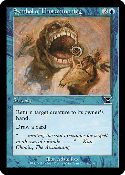
If you’ve ever picked up a classic blue spell with the unmistakable 1997-era border and thought, “This frame has stories to tell,” you’re not imagining things. The evolution of Magic: The Gathering’s card frames is a quiet, almost architectural history of how the game has balanced readability, artistry, and a sense of nostalgia. At the heart of this conversation sits Symbol of Unsummoning—a blue common from Masters Edition IV that arrives in a printed frame many players affectionately call “old-school.” This sorcery costs {2}{U}, is a simple yet sly tempo play—returning a creature to its owner's hand and drawing a card—yet its appearance offers a doorway into how MTG’s visuals have matured alongside its gameplay. 🧙♂️🔥
In the early days, MTG frames were bold and border-heavy, with a compact text box and a heavy emphasis on legibility over flourish. The 1997 frame, which you’ll see in Symbol of Unsummoning, marks a widely recognized shift: more breathing room around the art, a more generous card name font, and a layout that balanced the mana cost, type line, and rules text with a newfound ease of scanning during a fast-paced match. This era gave us a look that fans still associate with “classic” MTG aesthetics—a blend of nostalgia and functional clarity. The Master Edition IV reprint itself is a nod to that era, preserving the feel of older sets while bringing the card to a broader audience in a modern context. 💎
As the game evolved through the 2000s, Wizards of the Coast experimented with the frame to improve readability for more complex text and longer abilities. The 2003-2009 period introduced a streamlined approach: cards kept the core 1997 flavor, but the typography, spacing, and color balance were fine-tuned to reduce clutter on the page. In practice, that meant better separation of card type, mana costs, and the often-verbose Oracle text of multicolor and newer mechanics. For Symbol of Unsummoning, the blue mana symbol sits comfortably in its corner, the name is clearly legible, and the text box presents the bounce-and-draw effect with crisp, accessible type. The result is a frame that ages gracefully—from casual reunions on kitchen tables to competitive play in MTG Arena-era practice—while still feeling like a link to a golden era of the game. ⚔️🎨
". . . inviting the soul to wander for a spell in abysses of solitude . . . ." — Kate Chopin, The Awakening
Beyond pure aesthetics, frame design influences the way you experience a card’s lore and strategy. Symbol of Unsummoning is a quintessential tempo tool in blue decks: it buys you a turn by bouncing a threat, and it refuels your hand with a fresh card. On a battlefield where every decision costs a fraction of a mana, the frame’s generous line height and spacing make this two-part effect easy to parse at a glance—first the return, then the draw. The synergy between mechanics and frame becomes particularly evident when you compare older-border reprints like this Me4 card to newer, borderless or radically revised frames that debuted in other eras. The magic isn’t just in the text—it’s in the rhythm the borders set as you read, plan, and execute. 🧙♂️💎
Symbol of Unsummoning also serves as a bridge to the broader story of Masters Edition IV, a set that curates a millennium of MTG’s visual language into a single collection. As a common card, it’s accessible to many players, yet it carries the aura of an earlier print run: a time capsule of the 1997 frame within a modern reprint framework. The art, by Adam Rex, sits within a design that respects the page’s geometry while letting the illustration breathe, and the card’s color identity remains unmistakably blue. For collectors, that combination—classic frame, reprint status, and a flavorful flavor text that nods to literature—adds a layer of sentiment to the frame’s evolution. The story of the border becomes part of the card’s lore, alongside its in-game value. 🎲
Design, art, and the tactile thrill of a complete set
As printing technology and high-resolution art advanced, the MTG community started to value subtle frame refinements—thinner outlines, adjusted margins, and more faithful color reproduction. These changes aren’t merely cosmetic; they affect how the image and text coexist on a single card. The Symbol of Unsummoning print—common, blue, with a straightforward two-color mana cost—relies on the frame to maintain readability despite a potentially dense effect text. The perspective on “how a card feels in your hand” shifts as frames grew more generous, then, in later years, drifted toward borderless or near-borderless designs for some sets and restricted foils. The arc is simple: readability, artistry, and a touch of nostalgia all coexisting on the same card bathes in the glow of MTG’s evolving frame vocabulary. 🧙♂️🎨
For players who relish the tactile aspect of the game, a well-worn Me4 print in a stack of other classics is a reminder that frame design is part of MTG’s storytelling. It’s not just about what the card does; it’s about how the card presents itself while you contemplate counterspells, tempo plays, and the thrill of topdecking a fresh card. The evolution of frames—from cramped beginnings to the era of refined readability—parallels MTG’s own growth: more choices, more accessibility, and a continued reverence for the game’s artistic roots. ⚔️💎
Non-slip Gaming Mouse Pad — Smooth Polyester Rubber BackMore from our network
- https://blog.crypto-articles.xyz/blog/post/nft-data-im-a-pancake-143-from-im-a-pancake-collection-on-magiceden/
- https://wiki.digital-vault.xyz/wiki/post/pokemon-tcg-stats-pokemon-catcher-card-id-swsh1-175/
- https://crypto-acolytes.xyz/blog/post/understanding-liquidity-provisioning-in-new-token-launches/
- https://crypto-acolytes.xyz/blog/post/timeless-tracks-classic-mario-kart-titles-revealed/
- https://wiki.digital-vault.xyz/wiki/post/pokemon-tcg-stats-flaaffy-card-id-svp-015/

Symbol of Unsummoning
Return target creature to its owner's hand.
Draw a card.
ID: c49f9400-9359-409c-9886-ea28e24257a8
Oracle ID: c44f1a81-269b-4f05-8ff2-e7ce19a93937
Multiverse IDs: 202579
Colors: U
Color Identity: U
Keywords:
Rarity: Common
Released: 2011-01-10
Artist: Adam Rex
Frame: 1997
Border: black
EDHRec Rank: 26931
Penny Rank: 13453
Set: Masters Edition IV (me4)
Collector #: 65
Legalities
- Standard — not_legal
- Future — not_legal
- Historic — not_legal
- Timeless — not_legal
- Gladiator — not_legal
- Pioneer — not_legal
- Modern — not_legal
- Legacy — legal
- Pauper — legal
- Vintage — legal
- Penny — legal
- Commander — legal
- Oathbreaker — legal
- Standardbrawl — not_legal
- Brawl — not_legal
- Alchemy — not_legal
- Paupercommander — legal
- Duel — legal
- Oldschool — not_legal
- Premodern — not_legal
- Predh — legal
Prices
- TIX: 0.06
More from our network
- https://blog.crypto-articles.xyz/blog/post/croconaw-tcg-art-spotlight-fans-praise-the-illustrators-style/
- https://blog.digital-vault.xyz/blog/post/unfriendly-fire-in-the-sideboard-mastering-burn-matchups/
- https://blog.crypto-articles.xyz/blog/post/nft-data-lnl-2624-from-long-neck-legends-collection-on-magiceden/
- https://crypto-acolytes.xyz/blog/post/nft-stats-memilady-190-from-memilady-collection/
- https://articles.digital-vault.xyz/blog/post/what-fans-want-in-the-resident-evil-village-sequel/