
Image courtesy of Scryfall.com
Frame by frame: Fountain Watch as a milestone in MTG’s visual language
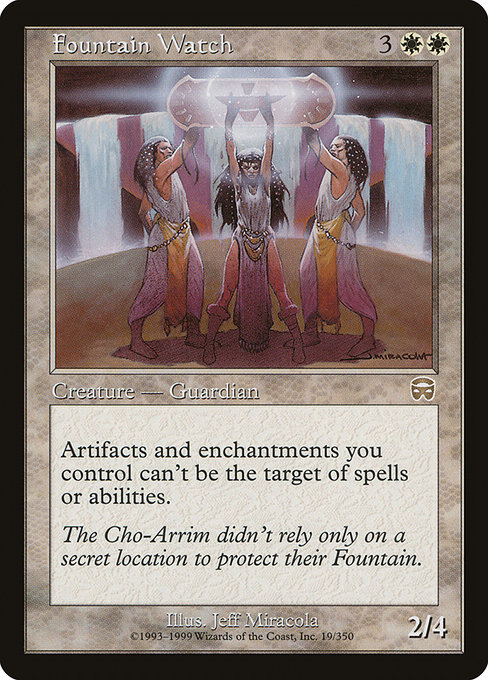
Magic: The Gathering has always been more than spells and creatures; it’s a living museum of art, typography, and frame design that tells a story almost as loud as the cards’ text. When you look at Fountain Watch, a rare from Mercadian Masques released in 1999, you’re peeking into a crossroads where the game’s frame philosophy started to crystallize into the modern look we recognize today 🧙♂️🔥. The card itself is a white Cleric, a 2/4 for {3}{W}{W}, with a crisp black border and a frame labeled 1997. Its ability—“Artifacts and enchantments you control have shroud”—isn’t just a neat trick; it’s a design decision that hinges on the frame’s readability and the way players perceive protection. The art by Jeff Miracola captures a serene, sturdy tone that matches the era’s approach to white mana: protective, measured, and a touch ceremonial. The card’s rarity is rare, and its presence in MMQ helps anchor a niche that cared deeply about both flavor and function.
Frame evolution in MTG has always mirrored the balance between aesthetics and practical readability. Early 1990s frames were bold and compact, with the set symbol, mana cost, and name occupying compact real estate. By the late 1990s, the 1997 frame—on which Fountain Watch rests—softened lines, refined the art box, and standardized the layout in a way that made each card feel like part of a cohesive gallery rather than a jumble of metaphor and text. This was a period when designers began thinking more deliberately about how the eye travels across a card: art on the left, name and mana cost on top, and rules text in a tidy block below. The result is a frame that still feels familiar to modern MTG players, even as subsequent decades brought subtle but meaningful refinements 🧙♂️.
Fast forward to the 2000s and beyond, and the frame has continued to evolve: darker borders for better contrast, revised typography for clearer numbers and keywords, and changes to set symbol placement that reduce confusion during fast turns. Fountain Watch sits squarely in a transitional beauty—the 1997-era frame that many collectors associate with the “golden-era” of frame design—while foils and reprints began to diversify how frames could play with light and texture. In a sentence: Fountain Watch is a lens through which we can observe a period when MTG’s visual language started to codify into a system that’s still recognizable today, even as the frame itself continues to modernize 🔥💎.
“The Cho-Arrim didn’t rely only on a secret location to protect their Fountain.” The flavor text on Fountain Watch hints at guarded sanctuaries and layered protection—an idea that resonates with the card’s mechanical aura of shroud for your artifacts and enchantments. The art and the frame work hand in hand to deliver that sense of guarded power. 🎨
Let’s unpack how the card’s mechanical identity interacts with frame design. Fountain Watch costs a respectable five mana for a 2/4—solid enough on rate, but the real payoff comes from its global shield for your artifacts and enchantments. In a world where protection is often a luxury, shroud is a powerful, limited form of defense: you can’t be targeted by spells or abilities, which pairs nicely with the frame’s clear text box and the white mana’s aura of fortification. A frame that presents this information cleanly helps players recognize the card’s strategic potential at a glance, a design virtue that has only grown more important as MTG has expanded to include more complicated combat tricks and color interactions 🧙♂️⚔️.
From a collector’s perspective, Fountain Watch also highlights how frame choices affect perceived value. The card’s MMQ rarity, combined with a 1997 frame, makes foil copies particularly sought after, while non-foil prints map to a different but equally important scarcity curve. The 1999 release date sits at a sweet spot where the frame feels vintage yet still readable on modern scanners and sleeves, which matters when you’re sorting through binders and display shelves. For players who remember the era, Fountain Watch is a reminder of how far frames—and the game itself—have come, while for newer players it serves as a window into MTG’s evolving visual grammar. The result is a card that’s as much a design artifact as a battlefield asset 🧩💎.
In practice, appreciating fountain-themed frames isn’t limited to nostalgia. The shift toward more generous margins and bolder art in later frames improves live play readability when multiple cards are in view. That clarity matters in games that rely on quick recognition of abilities like shroud, list-of-abilities, and timing windows. Fountain Watch’s own frame provides ample space for the text box so you can parse “Artifacts and enchantments you control have shroud” without squinting, while the elements around it—the mana cost, the creature type, and the flavor—remain legible and aesthetically balanced. It’s a small victory in a long arc of design improvements that MTG fans have tracked across decades 🧙♂️🎨.
Frame evolution in a nutshell
- Early 1990s: Bold borders, compact layout; the game’s graphic language is still finding its stride.
- Late 1990s (1997 frame era): Smoother lines, more standardized spacing; Fountain Watch sits as a representative example of the era’s cohesive look.
- 2000s: Streamlined typography and improved contrast; foils and reprints begin to push aesthetic boundaries.
- 2010s–present: Modern frames with refined font, better legibility, and rim-lighting on foil variants; not just collectible, but functionally friendlier at the table.
For fans who relish the tactile and textual aspects of MTG, the evolution of card frames is a pilgrimage of sorts. Fountain Watch invites us to pause and think about not just what a card does, but how its presentation communicates its story. The artwork, the rarity, and the frame conspire to create a moment of clarity: protect what you value, and keep your important pieces out of reach of meddling foes. It’s a philosophy as timeless as white mana itself 🧙♂️💎.
To bring a touch of that energy to your desk while you ponder a turn, consider this shop pick: Neon Gaming Non-Slip Mouse Pad — a sleek, practical piece that fits the modern gamer’s setup as neatly as Fountain Watch fits its era. It’s a small reminder that sometimes the frame we live in matters just as much as the card we play.
Neon Gaming Non-Slip Mouse PadMore from our network
- https://blog.crypto-articles.xyz/blog/post/nft-data-solle-152-from-solle-collection-on-magiceden/
- https://transparent-paper.shop/blog/post/create-stunning-product-mockups-for-digital-downloads/
- https://wiki.digital-vault.xyz/wiki/post/pokemon-tcg-stats-lotad-card-id-bw8-29/
- https://blog.zero-static.xyz/blog/post/rainbow-six-siege-how-legacy-shapes-its-loyal-fanbase/
- https://crypto-acolytes.xyz/blog/post/nft-stats-gamba-dog-9107-from-gamba-dogs-collection/

Fountain Watch
Artifacts and enchantments you control have shroud. (They can't be the targets of spells or abilities.)
ID: 690daa19-1842-4605-9bda-bf67e4ede3c4
Oracle ID: e6527ba3-3293-4a29-a2f9-7a81f8f27b7c
Multiverse IDs: 19784
TCGPlayer ID: 6537
Cardmarket ID: 11392
Colors: W
Color Identity: W
Keywords:
Rarity: Rare
Released: 1999-10-04
Artist: Jeff Miracola
Frame: 1997
Border: black
EDHRec Rank: 14250
Set: Mercadian Masques (mmq)
Collector #: 19
Legalities
- Standard — not_legal
- Future — not_legal
- Historic — not_legal
- Timeless — not_legal
- Gladiator — not_legal
- Pioneer — not_legal
- Modern — not_legal
- Legacy — legal
- Pauper — not_legal
- Vintage — legal
- Penny — not_legal
- Commander — legal
- Oathbreaker — legal
- Standardbrawl — not_legal
- Brawl — not_legal
- Alchemy — not_legal
- Paupercommander — not_legal
- Duel — legal
- Oldschool — not_legal
- Premodern — legal
- Predh — legal
Prices
- USD: 1.75
- USD_FOIL: 28.12
- EUR: 1.03
- EUR_FOIL: 8.40
- TIX: 0.36
More from our network
- https://blog.rusty-articles.xyz/blog/post/how-star-wars-jedi-fallen-order-redefined-open-world-exploration/
- https://blog.crypto-articles.xyz/blog/post/nft-data-solle-112-from-solle-collection-on-magiceden/
- https://blog.crypto-articles.xyz/blog/post/trump-era-doe-cancels-over-700m-in-manufacturing-grants/
- https://blog.crypto-articles.xyz/blog/post/top-metang-partners-for-a-psychic-metal-tcg-deck/
- https://10-vault.zero-static.xyz/d12b2488.html