Image courtesy of Scryfall.com
Un-set Visual Constraints: A Maulfist Challenge
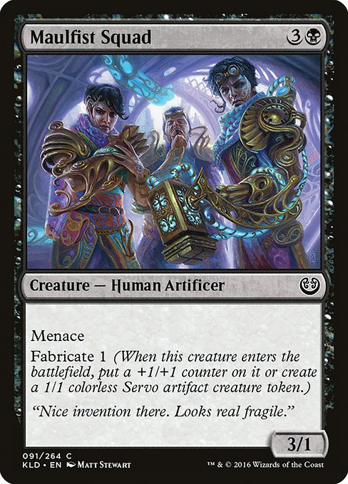
Designing Un-set visuals is less about painting a pure scene than about choreographing a wink to the audience. It’s a balancing act between bold, legible storytelling and the delightful chaos that fans expect from a silver-bordered playground. Maulfist Squad—the crafty Black mana 3/4 who slides into a board with menace and a little mechanical mischief—serves as a perfect case study. On paper, you’ve got a creature that screams “inventor with a penchant for trouble” thanks to its Fabricate 1 ability and its aggressive presence on the battlefield. In Un-set visuals, that same concept must be distilled into a design language that reads instantly, jokes just a touch, and never overshadows the card’s mechanics. 🧙♂️🔥💎
Kaladesh gave Maulfist Squad a polymer-brass aesthetic, a vibe of steam-powered tinkering clashing with battlefield grit. Translating that into Un-set visuals requires a careful bypass of realism in favor of punchlines and prop-humor. The constraints become rules: keep the silhouette readable at a glance, convey the “fabrication” engine visually, and ensure the token mechanic—Fabricate 1, which creates a Servo token or puts a +1/+1 counter on the inventor—reads as more than a clever flavor line. In practice, this means exaggerating tools, gears, and labels that nod to a patent-office aesthetic rather than grim, cathedral-black realism. The result? A card that reads as both genius and gadgetry—an invitation to fans to grin and parse the joke as they play. ⚔️🎨
Visually signaling Menace and Fabricate
Maulfist Squad’s text layout is a design mine for Un-set visual constraints. The word “Menace” must survive the quick skim, so the art should foreground a sharp, predatory silhouette—think scouted shadows, gleaming jaws of a gear-teeth maw, or a toolbar of implements arranged like an ominous sparring partner. The Fabricate 1 aspect invites a visual cue: maybe a half-constructed Servo token peeking through the inventor’s coat, or a set of blueprints with a servo silhouette emerging as if the card is drafting itself into reality. The challenge is to avoid clutter; the Un-set approach favors playful, non-functional signage rather than realistic, glossy machinery. The result is a card that feels like a page from a mad-scientist’s notebook rather than a sterile blueprint. 🧪🧰
Flavor text — “Nice invention there. Looks real fragile.” — anchors the humor, and the visual treatment should reinforce that the invention is ambitious but cheekily unreliable. In Un-set design, you want the joke to land without overpowering clarity. The art might show the inventor with a quizzical expression, gears spinning, a servo token pawing at the air, and a label that reads something like “Prototype v3.7” in a jaunty font. It’s a playful contradiction: the device looks impressive, yet the text nudges you to suspect it won’t survive a single combat step. That tension—impressive design that’s just a touch goofy—defines Un-set aesthetics. 😄🧭
Color, Contrast, and Readability
Black-mana cards carry a certain gravity, and Maulfist Squad’s identity sits in that contrast. In Un-set visuals, the color palette should lean into bold blacks, brass-gold highlights, and a dash of electric blue for the invention’s magical spark. The silhouette must pop against the background; the servo unit should feel like a visual foreground, not a quiet afterthought. Readability is the north star: the name, the mana cost, and the key abilities need to be legible at a glance, even with the gag-heavy borders and quirky typography. The Un-set constraint here is to weave humor into the art without sacrificing legibility—so you get both a giggle and a clear read of Fabricate 1 and Menace. This tactful tension is what keeps Un-set cards collectible while still functioning as games pieces. 🧩💡
The Token Twist: Servo as a Visual Beat
One of Maulfist Squad’s core hooks is its Fabricate 1 ability, which creates a Servo token. Un-set visuals love tokens and easter eggs—tiny, silly, never-overbearing. Imagine a Servo token with a comically oversized bolt for a head, or a tiny, smiling servo being coaxed into existence by the inventor’s wry grin. The visual beat then becomes: when the card enters the battlefield, you’re not just getting a 3/1 with menace; you’re witnessing a small, humorous machine coming to life—one that looks like it could be disassembled and reassembled into something even more ridiculous the next turn. This is where Un-set visuals shine: the audience is invited to notice the joke as they play, but the token also remains a legitimate board presence. 🎲🤖
From a collector’s lens, Maulfist Squad’s common rarity in Kaladesh already makes it accessible; Un-set visuals add a layer of novelty that can drive early, cheerful engagement. The humor doesn’t need to shout; it can whisper through clever signage, a wink of the illustrator’s brush, and the sly interplay of contraption with creature. The art should honor Matt Stewart’s original design while playfully reframing it for the Un-set stage. That respect for the source—without losing the freedom to joke—keeps the card both nostalgic and fresh. 🏷️✨
While we imagine high-spirited visuals, you can take a quick breather and keep your desk organized for bolder drafts. A sturdy phone stand can be a quiet hero during long planning sessions. The featured product is a practical, two-piece hardboard desk accessory designed to cradle devices as you fine-tune your Un-set concepts—a tiny, real-world gadget that mirrors the care you pour into your cards. If you’re sketching jokes and layouts late into the night, it’s the kind of tool that earns a smile between color swatches and reference notes. 📱🎨
Design Takeaways for Un-set Maulfist Squad
- Readability first: bold silhouettes, clear mana cost cues, and a legible font treatment that survives border jokes.
- Humor with purpose: jokes should reinforce the Fabricate mechanic or the “prototype” flavor, not obscure it.
- Iconic token design: a Servo that communicates both function and whimsy, without muddying the board state.
- Flavor that sneaks in: the flavor text is a door to the joke—let it be sharp but not obtrusive.
- Crafted polish: even in Goofy-in-Glass territory, the art should feel intentional, not slapdash.
“Nice invention there. Looks real fragile.” — a line that encapsulates the playful tension between invention and instability, perfectly suited to Un-set experimentation. 🧙♂️
As you explore these constraints, remember that Un-set visuals celebrate the wonder of imagination as much as they celebrate the game itself. Maulfist Squad, with its menace and its fabricate spark, stands as a witty bridge between serious card design and the bright, zany energy that makes MTG’s lighter corners so beloved. The end result should invite a smile, a second look, and a quick game turn that proves humor and strategy can ride the same flying gears. 🔥🎲
Phone Stand for SmartphonesMore from our network
- https://blog.digital-vault.xyz/blog/post/renegade-freighter-mtg-print-scarcity-and-collector-trends/
- https://crypto-acolytes.xyz/blog/post/how-to-shine-at-the-minecraft-official-championships/
- https://crypto-acolytes.xyz/blog/post/when-pixels-tie-the-knot-in-game-marriages-and-virtual-relationships/
- https://transparent-paper.shop/blog/post/creators-practical-guide-to-copyright-takedowns/
- https://crypto-acolytes.xyz/blog/post/estimating-lifetimes-from-precise-astrometric-parameters-of-hot-blue-giant/