Image courtesy of Scryfall.com
Art Style Trends Across Decades: Wispmare as a Window into MTG Illustration
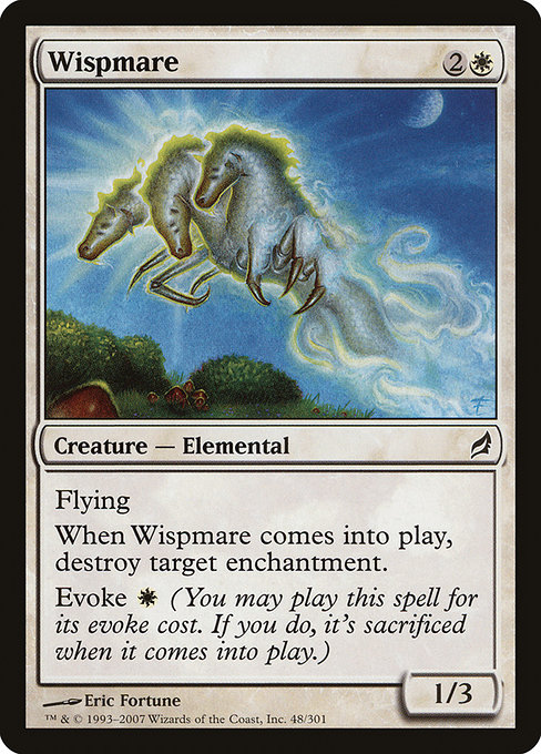
Magic: The Gathering has always been a living gallery, a place where designers test new palettes, brushes, and moods with each expansion. Wispmare, a humble white elemental from Lorwyn, sits at a fascinating crossroads in this ongoing conversation about artwork and mood. When you look at its {2}{W} mana cost, its 1/3 body, and its lithe, winged silhouette, you don’t just see a creature—you see a snapshot of a particular moment in MTG’s art history. 🧙♂️ The piece by Eric Fortune captures a daylight dreaminess that Lorwyn is famous for, a softness that feels almost tactile to the eye. The result is not just cute flavor; it’s a deliberate shot across the bow of how white magic could glow on the page in the mid-2000s, and how that glow still resonates with players today. 🎨
Within Wispmare’s card text, you can trace a philosophy that threads through multiple decades: a sense that enchantments and auras shape the battlefield as much as creatures do. Wispmare’s enter-the-battlefield trigger, destroying a target enchantment, is a quintessential white tempo answer—efficient, elegant, and thematically right. It embodies the white desire to restore order and purity by dispelling lingering magical effects. The Evoke ability—you may cast Wispmare for its evoke cost (here, W), sacrificing it as it enters—also reflects a design philosophy that likes to reward timing and decision-making. Evoke isn’t just a fancy mechanic; it’s a narrative device, offering the option to bend tempo for a moment of wonder and then convert it into real board impact. ⚔️
Artwise, Lorwyn arrives with a particular aesthetic contract: lush, sun-dappled landscapes, soft edges, and a celebration of fairies, elves, and other luminous beings. Wispmare sits squarely in that lane, its wings catching a glimmer of morning light, the color palette skewed toward pale yellows, pinks, and turquoise hints that make the white mana feel almost edible. This is the era when color and atmosphere weren’t just about what a spell did, but how it felt when you cast it, how it looked in a fever-pue moment of play, and how it aged on the shelf as a collectible. The minimalist beauty of the creature’s lines—one relies on silhouette to communicate speed and altitude—speaks to a design principle that would echo in later decades: you don’t need to shout to tell a story; you let the light and the space do the talking. 💎
The Lorwyn Moment: Soft Light, Strong Story
Eric Fortune’s illustration for Wispmare is a masterclass in gentle fantasy. The Lorwyn set was famous for avoiding stark contrasts in favor of a warm, almost lullaby-like glow. Compare Wispmare to earlier dualist artworks—where color contrast was a rider and motion was often a roar—and you’ll hear the evolution: a shift from dramatic chiaroscuro to narrative luminosity. That isn’t to say one approach is “better”; it’s a reflection of the market’s evolving taste and a recognition that players engage with cards on multiple levels—the play experience, the lore, and the art’s ability to spark a memory or a dream. In Wispmare’s case, the result is a creature you might imagine gliding through a glade while a faint chorus of woodland magic hums in the background. The art remains approachable, collectible, and endlessly shareable—a trifecta that helps explain why Lorwyn-era pieces continue to be revived in modern discussions and why they remain desirable in both foil and nonfoil forms. 🧙♂️🎨
From a collector’s perspective, Wispmare’s rarity (common) and its foil presence make it a lovely yet accessible entry point into the Lorwyn aesthetic. The card’s printed power isn’t world-shattering, but its flavor and visual identity have become emblematic of a broader stylistic heartbeat: a time when MTG art favored lyrical pastoral fantasy as opposed to stark, high-contrast epic scenes. The result is a sense that the game’s world is a shared, living storybook—one where even a 1/3 flyer can carry a memory of light and translation between rules and romance. For newer players, Wispmare offers a gentle gateway into a set family that prizes atmosphere as much as mechanics; for veterans, it’s a reminder of the era when the art team chased quiet, luminous magic rather than the maximalist spectacle of some later cycles. ⚡💎
As the decades rolled forward, digital tools and global artist networks broadened who gets to contribute to MTG and how those contributions look on a card. Yet Wispmare’s enduring charm signals a lasting truth: the most enduring art in MTG often blends clear rules with painterly mood—the kind of balance that invites both tactical analysis and nostalgic daydreaming. In this sense, Wispmare isn’t just a card; it’s a small, shimmering indicator of art’s evolving language within the game. And in every sealed product, sleeve, or high-res image, that language continues to speak to players across generations. 🎲
Bridging Eras: Why Decades of Style Still Matter
Today’s MTG art roams across a wider spectrum of influences—from retro-futurism to hyper-detailed realism—but Wispmare reminds us that a restrained palette and clean composition can carry as much weight as a thousand colors. The interplay between the card’s Evoke mechanism and its elegant production design demonstrates how a single piece of art can influence how players think about casting timing, resource management, and thematic consonance. When you see Wispmare’s wings catching light, you’re not just admiring an illustration; you’re witnessing a design philosophy that values atmosphere, timing, and a bit of whimsy. And that, dear readers, is the magic that makes MTG’s art a living archive—season after season, decade after decade. 🧙♂️🔥
To celebrate this ongoing journey, many players pick up Wispmare not only for its playability in modern formats but for its role in a broader art conversation—one that has evolved from bold, painterly fantasy to a more nuanced, luminous storytelling approach. Whether you’re drafting with friends or curating a personal gallery, Wispmare serves as a friendly ambassador from an era when MTG’s illustrations were as much about welcoming you into a mood as about winning a game. The result is a card that’s easy to love, even before you consider its gentle, contagious charm. 🎨💎
Custom Gaming Mouse Pad 9x7 Neoprene High-Res ColorMore from our network
- https://blog.digital-vault.xyz/blog/post/recurring-characters-surrounding-wrap-in-vigors-lore/
- https://blog.digital-vault.xyz/blog/post/crafting-a-brand-identity-for-digital-goods/
- https://blog.digital-vault.xyz/blog/post/estimating-temperature-of-a-35394-k-distant-giant/
- https://transparent-paper.shop/blog/post/ai-driven-asset-generation-boost-efficiency-and-speed/
- https://blog.digital-vault.xyz/blog/post/grading-revered-unicorn-authenticity-tips-for-mtg-collectors/