Image courtesy of Scryfall.com
Decades of MTG Art: How Deadly Designs Mirrors the Shifts in Style
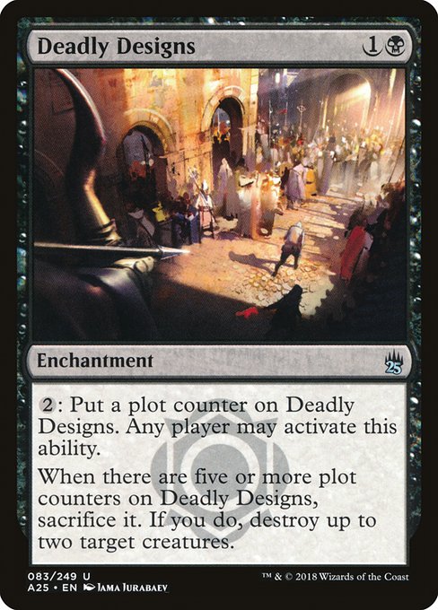
Magic: The Gathering has always been a visual chronicle as much as a strategic one. Across decades, the art direction has swung between painterly warmth and razor-edged digital polish, mirroring broader shifts in fantasy illustration and the ways players experience storytelling at the table. The enchantment Deadly Designs, a Masters 25 standout by Jama Jurabaev, is a compelling snapshot of this evolution. With a single {1}{B} mana investment, the card moves players to add plot counters, then, at five counters, sacrifices itself to destroy up to two target creatures. It’s a quiet reminder that in MTG, design and art walk hand in hand, each century ushering in new tools and new moods. 🧙♂️🔥
Gothic Roots: The 1990s and Early 2000s
The earliest MTG art world was a patchwork of hand-painted textures, luminous spell effects, and painterly storytelling. Icons like Richard Garfield-era pieces, and later artists who favored dense linework and atmospheric lighting, created a sense that the battlefield was a stage where both prophecy and peril could unfold in a single frame. The color palette tended toward earth tones and jewel-like highlights, crafting a tangible, tactile fantasy where creatures and environments felt almost touchable. In that era, the drama lived in the brushwork—the way shadows curled around a figure, the way magic braided through air with a smoky halo. Deadly Designs sits at a distance from that era in terms of production technique, but its black mana identity and the notion of a creeping, counter-driven plan resonate with the era’s love of dark, patient design. ⚔️
Digital Dawn: The 2000s to 2010s
As printing and production pipelines matured, MTG art increasingly embraced digital tools. The mid-to-late 2000s and into the 2010s saw sharper silhouettes, high-contrast lighting, and cinematic composition that could tilt the viewer’s gaze with a single red flare or a glint of metal. Color became less about one-off tones and more about mood—ultra-saturated glows in spell effects, cool blues to imply distance, or sepia undertones that hint at ancient secrets. Masters 25—where Deadly Designs appeared—marks a bridge phase: the set leans into a modern, polished finish while paying homage to the game’s historical roots. Jurabaev’s work on this piece exemplifies that blend: a contemporary print with a distinctly cinematic feel that still respects the quiet, cerebral force of black mana. 🎨
A Case Study: Deadly Designs in the Modern Era
What makes Deadly Designs a compelling study is not just its text but its art direction. The card’s blue-black “plot” motif—counters that accumulate until a dramatic sacrifice—parallels a narrative throughline you can feel in the illustration: strategy mounting, tension tightening, a reveal that the plan had a price. The image, anchored by Jurabaev’s sleek, modern aesthetic, conveys a sense of controlled danger without sacrificing readability. This is quintessential Masters 25 in spirit: a well-crafted, collectible moment that nods to the past while embracing current capabilities. The art’s meticulous detailing—glints on metal, subtle textures on cloth, and a stormy, ominous ambiance—invites a second look and a deeper appreciation for how design choices guide a player’s interpretation of the card’s function. 🧙♂️💎
Thematic Threads: Plot Counters, Sacrifice, and Black’s Flavor
Deadly Designs embodies a recurring theme in black or “B” cards: patience, removal, and the potential cost of ambition. The ability to place plot counters—an optional, player-activated mechanic—encourages a game-long loom of influence, a slow-burn plan that can flip the board when the counters tick up to five. The eventual sacrifice to destroy up to two targets is a classic black payoff: trade a persistent enchantment for a decisive removal of threats. In gameplay, this fosters a tempo shift that rewards players who can manage resources and timing, while the art reinforces the mood—an elegant, almost surgical design that whispers of a master plan behind the curtain. That synergy between text and image is a hallmark of MTG’s design ethos: aesthetics that teach you how to think about the game as you play. 🧙♂️⚔️
Design, Collecting, and the Value Curve
From a collector’s lens, Deadly Designs sits in Masters 25 as an uncommon with foil options, expanding the horizon for those who relish both nostalgic frames and contemporary polish. Its price on the secondary market has demonstrated how a modern card with a strong art direction and a clever mechanic can remain accessible for new players while remaining alluring to seasoned collectors. The card’s black identity and thematic depth—coupled with Jurabaev’s reputation as a versatile concept artist—make it a standout piece in a balanced, counter-heavy deck or a thoughtful centerpiece for a display that celebrates art across decades. The elegance of a well-designed enchantment lies not only in its effect but in how that effect feels when you look at the card—Deadly Designs invites you to savor the moment when a long game’s plan finally comes into focus. 💎🧙♂️
As a bridge between eras, Deadly Designs also signals the enduring collaboration between card text and visual storytelling. The artwork isn’t just a pretty frame; it’s a narrative cue that nudges players toward the strategic pathways that the card opens. The Masters 25 era stands out for blending more polished digital execution with reverence for traditional fantasy iconography, and this piece is a vivid example: a modern enchantment that pays homage to the game’s roots while projecting confidence about where MTG art is headed next. 🎲
Clear Silicone Phone Case – Slim, Durable Open Port Design 2More from our network
- https://transparent-paper.shop/blog/post/how-a-space-survey-unveils-five-stellar-parameters-of-a-distant-giant/
- https://blog.digital-vault.xyz/blog/post/designing-ai-powered-tools-for-smarter-creativity/
- https://blog.digital-vault.xyz/blog/post/distant-blue-giant-in-crux-reveals-naked-eye-limits/
- https://blog.digital-vault.xyz/blog/post/from-munchlax-to-snorlax-evolution-design-across-the-line/
- https://blog.rusty-articles.xyz/blog/post/dramatic-entrance-etb-disruption-counterspells-and-bounces/