Image courtesy of Scryfall.com
Typography and Layout in Cemetery Gate
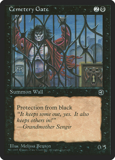
If you’ve ever wondered how a single card’s typography can shape your reading of a scene, Cemetery Gate from Homelands is a quiet masterclass. This common Wall, costed at {2}{B}, arrives with a compact, no-nonsense shell that forces the eye to travel first to the mana cost, then to the creature type, and finally to the rules text and flavor. In the world of MTG card design, where every pixel earns its keep, Cemetery Gate demonstrates how a few deliberate choices—particularly in a late-1990s frame—can balance function, lore, and mood with surprising grace. 🧙♂️🔥💎
Card anatomy: what the eye greets at a glance
- Name and mana cost: The card’s name sits confidently at the top, followed by the mana cost icons for {2}{B}. The white space around them is generous enough to prevent the cost from clomping into the name, a subtle nod to readability over flash.
- Type line and rarity: “Creature — Wall” is a restrained header that signals both identity and function. The border and the boldness align with the Homelands era, where the black border framed a mature, almost brooding silhouette for a defensive behemoth.
- Rules text: The Defender line—“Defender (This creature can't attack.)”—is followed by “Protection from black.” The phrasing is tight, with line breaks that feel like footsteps along a stone corridor, guiding players through the wall’s capabilities without shouting them out loud.
- Power/Toughness and flavor: Power is 0, toughness 5—an impenetrable stance in the face of early-game aggro. The flavor text, quoted as “It keeps some out, yes. It also keeps others in!” —Grandmother Sengir, sits separated in italics below the rules box, acting as a whispered aside that adds atmosphere rather than mechanical value.
“It keeps some out, yes. It also keeps others in!” —Grandmother Sengir
The Defender design choice and its layout implications
Defender is a keyword that instantly shapes how you read Cemetery Gate. Because this card cannot attack, the layout shifts your mental model toward obstruction and defense. The text box reinforces that identity: the rules line is concise, and the italics for flavor text sit as a literary counterpoint to the battle-ready jargon elsewhere on the card. The typography mirrors the card’s role in a game where timing, not aggression, is the currency. The defender tag also influences deck-building stress tests; in a black-heavy environment, a five-toughness wall demands answers that are often scarce in limited reprints ages ago, making the card a reliable wall of text and a tool for pacing. 🧙♂️⚔️
Color identity, protection, and the visual grammar of black
Historically, black frames a particular aesthetic: stark contrast, somber mood, and a bit of ink-on-paper gravitas. Cemetery Gate’s color identity is blue-black in effect only on this card’s face, since it’s a mono-black card with the letters B in its mana cost. The “Protection from black” clause functions as a design device that emphasizes a thematic boundary—the gate both repels and contains, a visual metaphor writ large in the card’s typography. The reader’s eye flows from the name, to the mana symbols, to the defender rules, and finally to the protection clause—each section distinct enough to be legible at glance, even during fast-paced draft rounds. The result is a reading rhythm that feels heavy with consequence even before you compute any actual board state. 🔥
Typography, flavor text, and the era of Homelands
Homelands is a period that’s often celebrated for its storytelling and its bold, serif-dominated text blocks. Cemetery Gate uses a serif showcase for the card name and body text, with flavor text in a softer cadence that invites a mood read rather than a mechanical parse. The font choices—paired with the 1993 frame and classic border—help evoke a gothic, ancestral atmosphere. This isn’t just a card about a wall; it’s a page from a story about gates, hospitality, and the uncanny. The art by Melissa A. Benson, with its stone gargoyles and archways, harmonizes with the typography to stage a scene where defense is aesthetic as much as function. 🎨🧱
Layout as storytelling: rhythm, emphasis, and the cueing of memory
Layout decisions in Cemetery Gate do more than separate lines of text; they cue memory. The separation of the flavor text from the mechanic text mirrors how a player often recalls lore after a block of rules—first you read the card’s capabilities, then you feel the vibe. The emphasis placed on the defender declaration, followed by the more potent Protection from black, creates a layered reading experience: you first understand what it doesn’t do (attack), then what it actively resists (black magic and influence). It’s a small lesson in how a card’s typography can nudge you toward strategic interpretation, a skill that becomes second nature with time and repetition. 🧙♂️🎲
From table to gallery: collecting, display, and value in a shared space
Even though Cemetery Gate is a common rarity, its design quality makes it a beloved piece for both players and collectors who appreciate historical layout cues. The card’s texture—nonfoil, black border, and a tasteful illustration—reads well in binder pages or on a display shelf. The card’s price point, while modest, hides a surprising depth: it’s a window into how a single print run can influence perceptions of typography, layout discipline, and the evolution of MTG’s visual language over the years. If you’re a fan of card design, Cemetery Gate is a compact case study in how simplicity can carry atmosphere with clarity. 💎
While you’re pondering the timeless tension between offense and defense on the battlefield, you might also be planning how to protect the real-world pieces of your hobby. If you’re looking for ways to showcase your MTG collection in style and keep it safe while you scroll through vintage card art and layout debates, consider complementing your display with a high-quality phone case. The Neon Slim Phone Case Ultra-thin Glossy Lexan PC offers a sleek, durable home for your everyday carry—perfect for trips to your local game store or a cozy night of replays with friends. It’s a small nod to the tactile pleasures that accompany the digital and paper worlds we love to traverse. 🔥🎨