Image courtesy of Scryfall.com
Bewilder Texture Realism in High-Resolution MTG Reprints
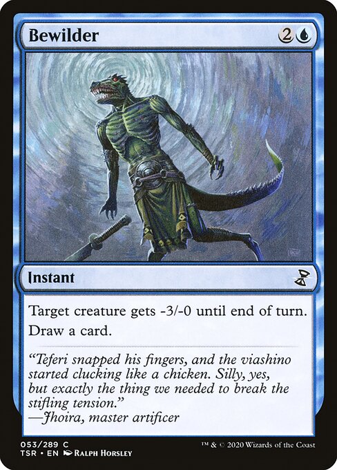
Texture isn’t just a tactile detail; it’s a bridge to the stories, brushwork, and bold decisions that define a Magic: The Gathering card. When Time Spiral Remastered reprints a familiar blue instant like Bewilder, the high-resolution scans bring the aura of the original art to life with a precision that feels almost magical. 🧙🔥 The subtle grain in Ralph Horsley’s illustration, the glint of the blue mana, and the crispness of the oracle text—these are the moments where aesthetics meet gameplay in a whisper-quiet, pixel-perfect way. For collectors and players alike, TSR’s approach to texture realism is a reminder that a card’s surface can be as evocative as its rules text. 💎
Bewilder, a common instant from Time Spiral Remastered, is a compact, tempo-friendly spell that costs {2}{U}. Its effect—Target creature gets -3/-0 until end of turn, then draw a card—epitomizes blue’s knack for tempo plays: you slow the board just enough to stabilize, then refill your hand. The card’s rarity as a common doesn’t diminish its design elegance; it highlights how even a modest stat line can carry strategic depth when paired with timing and card advantage. In high-resolution reprints, that depth becomes more apparent. You can almost hear the tension of Teferi’s era of impermanence and lockstep planning, as Jhoira’s flavor text ties the moment to a broader tale: “Teferi snapped his fingers, and the viashino started clucking like a chicken.” A silly image, perhaps, but it’s precisely the kind of texture that makes reprints feel like a living archive. ⚔️
What makes Bewilder stand out in a high-res reprint
- Art texture and line work: The highres scan in Time Spiral Remastered preserves fine linework and brush strokes that define Horsley’s composition. The feathering of blue tones, the subtle shading on the creature’s skin, and the quiet cadence of the spell’s motion all read with surprising clarity when you zoom in, even on common rarities.
- Frame and typography fidelity: TSR uses a 2015-era frame with a black border that feels contemporary yet echoes the vintage mood of its original printings. In a high-resolution view, the font edges and spell text appear crisp, which enhances readability and reduces the “card feels printed on a desktop” disconnect many reprints suffer from.
- Artful depth vs. foil glare: While Bewilder is listed as both nonfoil and foil, TSR reprints maintain a balanced approach to texture. The nonfoil version presents a calmer texture palette that emphasizes the art’s atmosphere, while foils pop with reflective variance that mirrors the original production, giving collectors a tangible sense of value in a digital age. 🎨
- Flavor and storytelling texture: The flavor text from Jhoira anchors the card in a moment of experimental tinkering, adding depth to the blue spell’s pragmatic effect. In high-res reprints, the typography alignment and spacing contribute to an immersive reading experience, almost like turning a page in a well-worn tome. 🧭
Gameplay wise, Bewilder is a neat illustration of blue’s versatility. It’s not a game-ending bolt, but a reliable tempo tool: you blunt a threat a turn earlier than your opponent expects, then refill your hand to keep your options open. In a meta where instant-speed interaction matters, such a card becomes a reliable glue between defensive posture and aggressive play. The high-resolution reprint doesn’t change the math, but it does sharpen the perception—you notice the crisp mana-symbols, the ink density, and the precise kerning that codifies the card’s identity in your mind. This is texture realism at its finest: not flashy gimmick, but a quiet elevation of how you experience a familiar spell. 🧙🔥💎
Beyond the play patterns, the artwork’s texture invites a new appreciation for the artist’s choices. Ralph Horsley’s depiction, with its confident brushwork and evocative composition, rewards close inspection. The high-resolution scan preserves the tactile impression of the scene—the way the blue hues blend, the way light might bounce off the spell’s surface, and the subtle texture of the viashino figure’s environment. It makes you reevaluate the card’s place in a collection, not just in a deck. It’s the kind of detail that fuels conversations with fellow players and fuels nostalgia for older print runs. 🎲
For fans who want to blend modern collectibility with practical play, TSR’s Bewilder demonstrates how high-resolution reprints can serve as both reference anatomy and performance boosters. The card’s mana cost remains modest, its effect reliably incremental, and its flavor texture remains intact—an excellent trifecta for a blue instant that’s been reimagined with care. If you’re building a cube or a casual control shell, Bewilder’s mana efficiency and card draw rhythm pair nicely with other tempo‑oriented blue cards from the Time Spiral era. And if you’re a purist who savors the linework and color gradients, the high-res reprint is a small treasure you can admire while you plan your next move. ⚡
On a practical note for readers who relish cross-promotional content, protection and portability go hand in hand with MTG fandom. If you’re browsing between games and gatherings, a sleek phone case can be part of your ritual—keeping your gear safe as you shuttle between tournaments, local shops, and coffee shops where strategy comes alive. In that spirit, consider a slim Lexan phone case for iPhone 16—glossy and ultra-slim—perfect for keeping your devices as sharp as your plays.
Slim Lexan Phone Case for iPhone 16 Glossy Ultra-SlimMore from our network
- https://crypto-acolytes.xyz/blog/post/the-future-of-nfts-in-gaming-ownership-redefined/
- https://crypto-acolytes.xyz/blog/post/why-children-make-horror-games-scarier-for-players/
- https://crypto-acolytes.xyz/blog/post/exploring-minecrafts-growing-biome-expansion-news/
- https://crypto-acolytes.xyz/blog/post/inside-algorands-dex-ecosystem-defi-growth-and-opportunities/
- https://blog.crypto-articles.xyz/blog/post/spectroscopic-crossmatching-of-a-blue-giant-in-scorpius/