Image courtesy of Scryfall.com
Typography and Layout in Attended Socialite
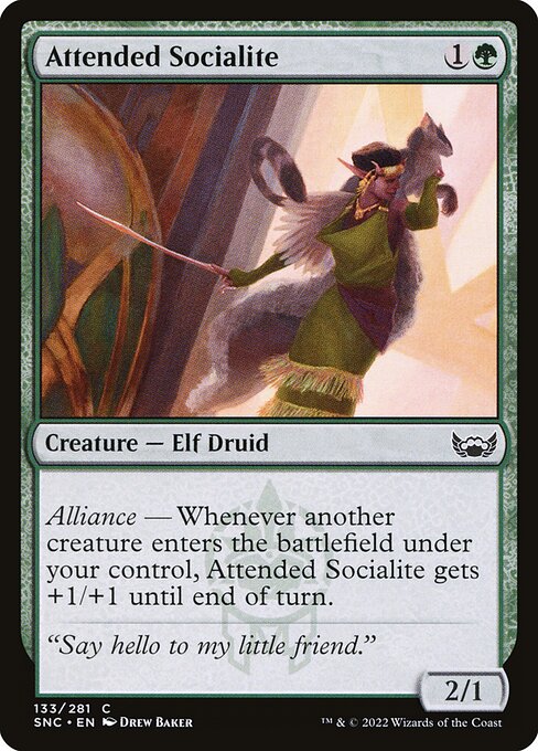
Magic: The Gathering cards are a blend of art, lore, and typography, and the Streets of New Capenna block is a masterclass in how a card’s type, frame, and text interact with a designer’s eye for readability. Attended Socialite, a green-aligned Elf Druid with Alliance, wears its typography and layout like a well-tailored suit. The green mana symbol on the top-right, the bold name at the top, and the compact rules text below all contribute to a reading rhythm that’s as satisfying as tapping a forest for mana 🧙♂️. The design doesn’t just convey power; it tells a story through spacing, color balance, and the cadence of words on a small rectangle of cardboard 🔥💎.
The Name, Mana Cost, and Color Identity
The card’s name—Attended Socialite—sits at the apex with a pixel-perfect balance against the mana cost to its right. The cost of {1}{G} immediately signals a quick, early-game presence and a commitment to green’s growth archetypes. In typography terms, the name uses a strong, legible typeface that remains distinct even at a quick glance, while the mana cost uses color cues (green) that readers subconsciously associate with growth and nature. This is more than ornament; it’s a fast-read cue that primes players for the card’s Alliance-centric play pattern 🧙♂️.
Type Line and Keyword Hierarchy
The type line—Creature — Elf Druid—is compact, with a clean hierarchy that preserves legibility across various frame sizes. The Alliance keyword is a subtle but important typographic cue, often set in bold or visually distinct rhythm to separate it from the core rules text. In Attended Socialite, the alliance mechanic is introduced as a real-time flow of information: when another creature you control enters, this one receives +1/+1 until end of turn. This creates a cadence where the reader’s eye travels from the name to the type to the keywords, then down to the ability text. The effect text itself is concise, making it easy to parse during a game, which is precisely what a designer aims for in a card that expects quick scanning between turns 🎨⚔️.
Rules Text, Flavor, and Readability
The ability text is a single Alliance clause, followed by the standard rule phrasing. In typography, this is a delicate balance: you want the keyword to stand out enough to prompt recognition, but the longer flavor of the card’s identity—how a socialite elf fits into the Cabaretti cabaret guild—remains a secondary, evocative read. Attended Socialite’s flavor text—“Say hello to my little friend.”—is a wink that sits a touch below the main text, often italicized to differentiate from the mechanics. This separation is more than style; it helps the brain separate rules from lore, which is especially valuable in a set where the flavor and the mechanics are tightly interwoven 🧙♂️🔥.
“Say hello to my little friend.” — Flavor text on Attended Socialite adds a dash of Cabaretti swagger to the layout, a reminder that green can be as performance-driven as red, as social as black, and as cunning as blue.
Layout Cues: Frame, Watermark, and Set Identity
Streets of New Capenna introduces a frame language and a Cabaretti watermark that influences how the card reads on the battlefield and on the table. The 2015-era frame used here supports a calm, readable distribution of elements: name at the top, mana cost to the right, type line just below, and rules text following. The Cabaretti watermark—subtle yet present—anchors the card in its thematic milieu: a guild known for performance, elegance, and a splash of spectacle. Typography, color, and watermark together create a sense of place even before you read the ability: you are stepping into a social scene where alliances and buff effects can snowball with the arrival of each creature 🧙♂️🎨.
Color, Theme, and Deckbuilding Implications
Green’s identity on Attended Socialite isn’t just about mana; it’s about growth, tribe, and the thrill of collaborative power. Alliance makes this elf druid a tempo engine when you flood the board with creatures. The card’s 2/1 body for a mana cost of 2 means it’s not a slam-dunk beater, but the real value comes from its synergy with others entering the battlefield. The text’s layout emphasizes the trigger in a clean, repeatable pattern: you play a fellow creature, Attended Socialite glows bigger for the turn. This pairing invites you to imagine board states where every new creature nudges the team just a little further, a hallmark of green’s breed of incremental advantage 🧙♂️⚔️.
Collector’s Pulse: Rarity, Rarity-Driven Design, and Market Pulse
As a common from Streets of New Capenna, Attended Socialite sits at a price point that favors casual play and collection curiosities. The foil versions—when available—accentuate the card’s bold typography and emblematic Cabaretti watermark, making a foil print a tempting centerpiece for display and deck-building alike. Scryfall’s data give a practical sense of value, with the card’s non-foil price in the cent range and foil slightly higher. For players who chase thematic synergy, this card’s Alliance mechanic provides a useful blueprint for a green-centered, creature-heavy strategy—easy to slot into many EDH or Pioneer decks, provided you align with the set’s rules and local tournament formats. The beauty of MTG’s economy is that typography and layout can influence perception as much as power, nudging casual players toward a card that looks and reads as smoothly as it plays 🧙♂️💎.
Art, Flavor, and Creative Expression
The illustration by Drew Baker captures a socialite’s flourish with a whimsical, high-society energy that pairs nicely with the Cabaretti vibe. The art direction complements the typography: the socialite’s elegance is mirrored in the clean, confident type hierarchy, making the card feel like a moment captured in a glossy street scene. The balance between text blocks and the art itself—space allocated for flavor, rules, and the watermark—demonstrates how a great card can be both readable and immersive, a rare skill in a game where information is dense and decisions must be swift 🎲.
Practical Design Takeaways for Players and Designers
- Hierarchy matters: Clear separation between name, mana, type, and rules text helps players quickly orient themselves during play.
- Keywords as typographic anchors: Alliance and other keywords should be visually distinct to cue strategic concepts at a glance.
- Frame and watermark as storytelling: The set’s identity should seep into the typography and layout, not just the art—Cabaretti’s allure is felt in how the card is framed.
- Flavor text as punctuation: Flavor text adds personality without cluttering the rules space, preserving readability for crucial game decisions.
Whether you’re a veteran of green stompy or a collector chasing the thrum of Cabaretti’s nightlife, Attended Socialite demonstrates how typography and layout can elevate a card from simple haste to a memorable design moment. And if you’re nerding out over the tactile joy of premium accessories, this is a great moment to check out something comfy for your desk—like a foot-shaped mouse pad with a wrist rest—perfect for those long drafting sessions or late-night skin-wrawls of color and mana 😎🔥💎.
Want to bring a little theater to your desk and keep your hands comfy while you draft? Check out this product that blends form and function, and elevate your setup while you explore more MTG gems in Streets of New Capenna and beyond.