Image courtesy of Scryfall.com
Typography and Layout Analysis: Alter Reality
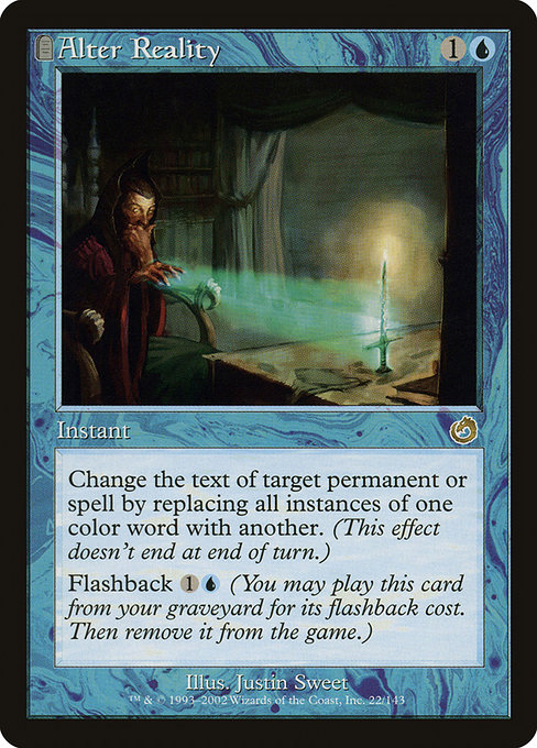
When you crack open a Torment pack and glimpse a blue instant with the elegance of a late-90s frame, you’re treated to more than just a spell that tucks a coloristically tricky effect under a clever label. You’re looking at a tapestry of typographic choices and layout decisions that tell you what era Magic was screaming at the time—about how information should be presented, read, and acted upon in the heat of a match 🧙♂️. Alter Reality, a rare gem from Torment, is a perfect specimen for teasing out how MTG’s typography informs strategy, readability, and the card’s personality at a glance 🔎.
Frame, color, and the visual tempo
Alter Reality sits in a tombstone-era frame that Wizards used around the turn of the millennium. The black border, the stark white text box, and the organized blocks of information create a rhythm that is almost musical: tempo, punctuation, pause. The mana cost sits up top—{1}{U}—and its placement is a cue familiar to seasoned players: the minimum barrier to casting, a moment that signals your early-game tempo decisions. The color identity is blue, and the card’s layout uses ample white space around the text to keep blue’s penchant for precision and counterplay readable in a hurry. This emphasis on clarity remains essential for a card whose primary trick is text manipulation rather than brute force 🔷.
Typography choices: legibility meets flavor
Torment’s typography leans toward serifed, compact text that prioritizes legibility over flamboyance. The oracle text is broken into two lines that carry distinctive weight—first the functional instruction, then the secondary ability. The words themselves, “Change the text of target spell or permanent by replacing all instances of one color word with another,” read like a legal clause, and the font choice ensures players can parse a potentially game-changing effect without squinting. The parentheses for the flashback ability—“Flashback {1}{U} (You may cast this card from your graveyard for its flashback cost. Then exile it.)”—feel almost like a footnote, quietly signaling an extra lane of strategy you can exploit later in the game. Even the keyword Flashback is set apart by its own typographic cadence, reminding you that this is a spell with a second life in the graveyard 🧭.
Text hierarchy: guiding the eye to the important bits
- Mana cost and color: The foil of [1][U] anchors the card economically, indicating instant-speed tempo and the blue color’s reliance on counterplay and manipulation.
- Type line and rarity: “Instant” sits beneath the mana cost, followed by the rarity tag—rare—that signals scarcity and potential deck-building value. The rarity badge isn’t just bling; it cues you to rarity-driven lines of play and price considerations in the secondary market.
- Oracle text block: The central engine of the card, presented in a tightly packed block that keeps each term legible under the stress of a competitive game.
- Flavor and attribution: The artist line and set emblem, while smaller, anchor the card in its lore and era, letting the typography do the heavy lifting while the art and flavor provide mood.
The logic of color words and a blue-tinged counterplay
Change the text of target spell or permanent by replacing all instances of one color word with another. (This effect lasts indefinitely.) Flashback {1}{U} (You may cast this card from your graveyard for its flashback cost. Then exile it.)
On Alter Reality, the typography matches the mechanic’s dual-layer complexity. The main effect is a text aura—literally a metamorphic rule—that can flip the color identity of a spell or permanent. The font and line breaks help you quickly identify the operative verb—the change—before you parse the qualifier—“the text of target spell or permanent” and the rule that it lasts indefinitely. The Flashback portion is set apart but still comfortably within reach for a quick read after you’ve imagined the battlefield’s possibilities for your next attack or defend-and-draw turn. The careful spacing makes the concept of “color word” stand out as a conceptual hook, a design choice that nudges you toward recognizing color interactions in your own deckbuilding and sideboard plans 🎯.
Art, flavor, and the rhythm of color in print
Justin Sweet’s illustration anchors Alter Reality with a sense of weight and mystery. The art’s mood—cool blues and shifting shapes—echoes blue’s core identity: problem-solving and adaptability. Typography and art collaborate to convey a feeling of transformation. When the card announcer says “change the text,” the viewer’s eye is trained to anticipate a shifting landscape. The frame’s tombstone accent, along with the color-coded mana iconography, reinforces a vibe of strategic depth—perfect for a blue mage who loves to outthink an opponent and bend the rules of the game itself 🔮.
From layout to deck-building: practical takeaways
Design-wise, Alter Reality demonstrates how a single card can be a case study in readability under pressure. The grid-like alignment of the mana cost, type line, and oracle text ensures you can scan for the key traits—cost, type, ability—without losing track of the narrative thread. For players, the card is a reminder that the most dangerous spells often ride on meticulous typography: where a line breaks, where emphasis is placed, and how the terms are parsed in a tense moment. For designers, it’s a masterclass in balancing dense mechanics with clean presentation, ensuring that even complex effects feel approachable on paper and in your head as you sit across from an opponent in a high-stakes game 🔥🎨.
Collector value, reprints, and the long game
As a Torment rare from the 2002 era, Alter Reality sits at a nostalgic crossroads for collectors and current players alike. The Torment set’s distinctive frame and the blue “color swap” mechanic give it a specific fingerprint that is recognizable even when the modern MTG aesthetic drifts toward borderless and alternative frames. With an overall relatively affordable market footprint, this card remains a subtle but meaningful addition to blue-focused stacks, especially for players who enjoy spells-with-sspludes-style effects and the recurring joy of Flashback activation in the late-game melt. The typography, meanwhile, continues to hold up as a proof of concept: a compact, legible, and thematically coherent display that makes a tricky concept feel accessible at a glance 🧩.
For readers who want to bridge MTG curiosity with practical gear, it’s a nice reminder that taking care of your collection—and your decks—can be as stylish as the cards themselves. If you’re curating a tabletop setup that travels with you to events or casual jams, consider a practical home base that shields your artifact-laden staples—and yes, even a MagSafe case can keep your key accessories in place between matches. The modern world loves cross-promotional aesthetics, and magic loves cross-pollination of ideas—board game design, typography, and even product design can dance together in the margins 🧙♂️💎.
- Typography supports gameplay: legibility, hierarchy, and the flow of information matter in clutch moments.
- Layout reinforces concepts: color-word manipulation is easier to grasp when the text blocks breathe.
- Art and frame signals tone: Torment’s frame and Justin Sweet’s art shape the card’s mood just as much as its words.
- Collectibility isn’t just about crunch numbers—it’s about stories, nostalgia, and design fidelity across eras.
If you’re ready to extend your MTG journey beyond the cards, explore practical, real-world gear that complements your gaming lifestyle—and yes, you can even pair your deck with a stylish accessory for daily carry. And when you’re ready to grab something for the game and beyond, this product link keeps you covered: MagSafe Phone Case with Card Holder — a nod to the everyday magic of carrying the essentials with style.